
- Messages
- 4,263
- Edit My Images
- Yes
I have just returned from long weekend caravaning up at Whitby and Have had a go with some Landscape photography (first time really) I was only using a phone camera and the conditions were not great although the skies were quite interesting. in my view the contrast on the shots is a little poor but I'm not sure if this was just the limitations of the camera or whether using a different metering method may of helped (this was an after thought and the camera was set at centre weighted average). Please let me know what you think and how I may have improved them. The last shot was just a bit of fun and had to be taken !!. I did a little editing to size the photos for posting and to try and increase contrast.
One

Two

Three

Four
Four
One
Two
Three
Four
Four
Last edited:


 Not my shot 2018-15
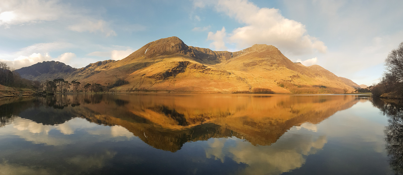 Buttermere panorama
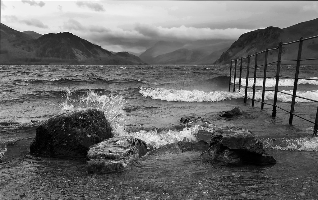 Ennerdale-splash-2