Critique Product shots on white

Messages
493
Name
Craig
Edit My Images
Yes
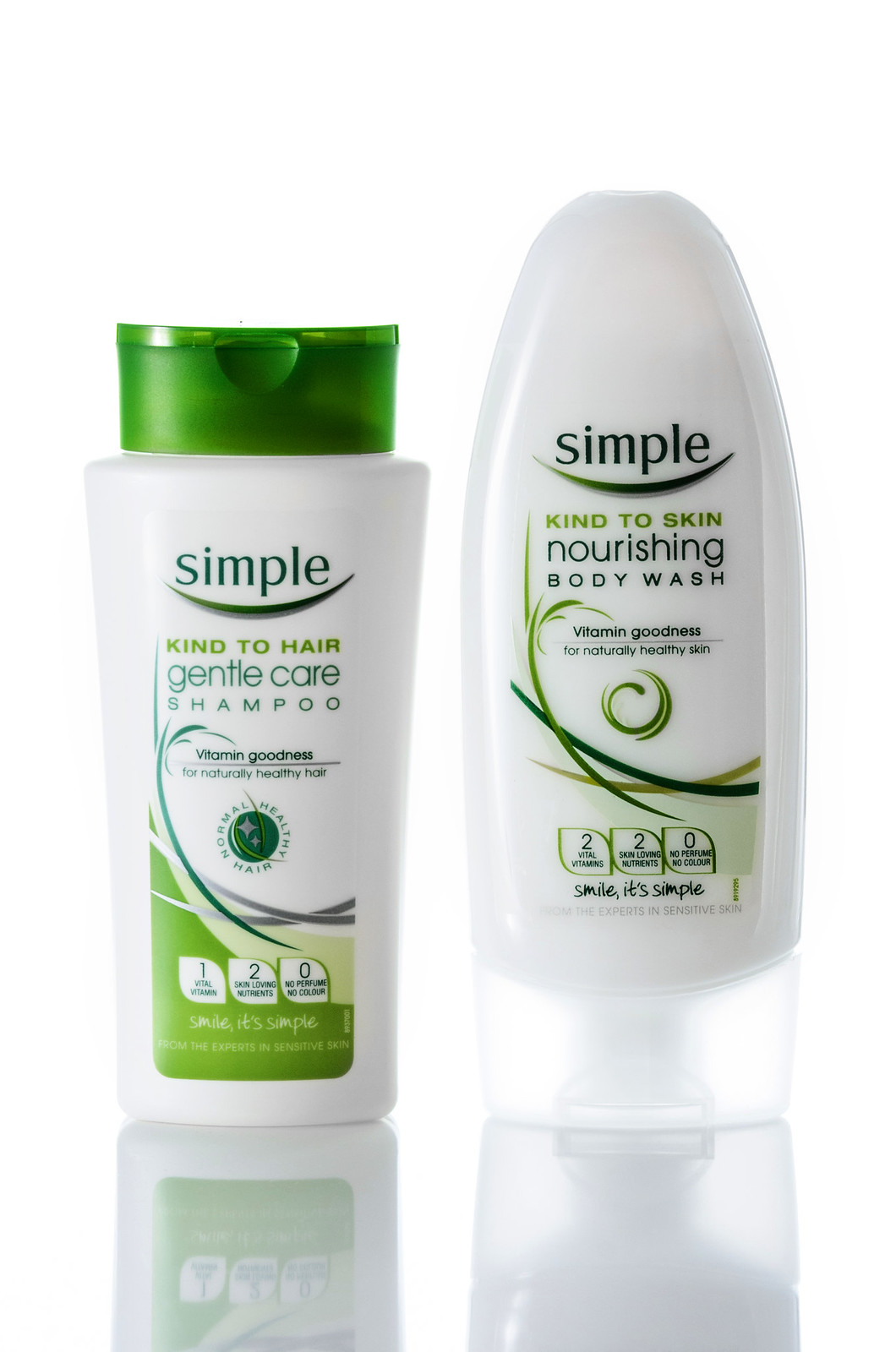
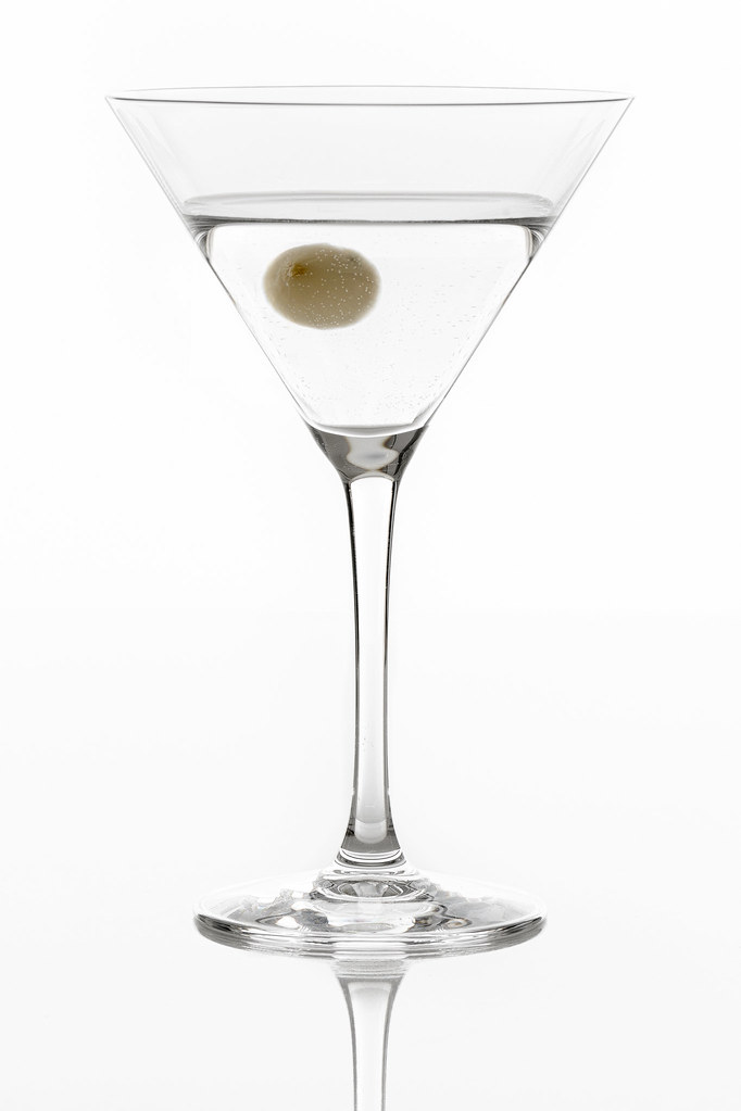
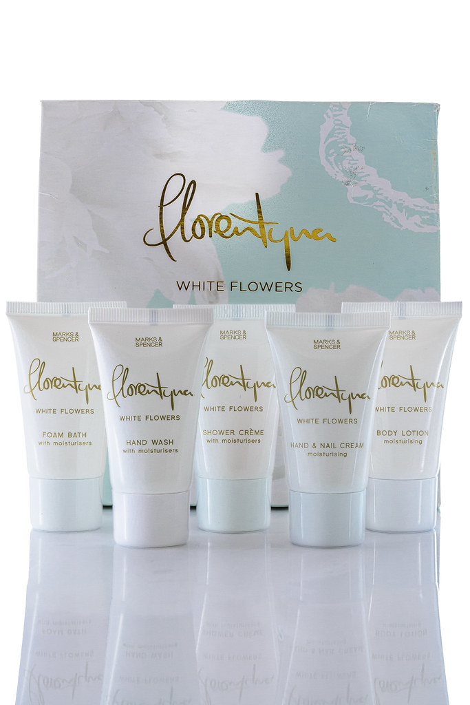
Got a sheet of black and white perspex a while ago and my wife is away for the day with my wee boy so the living room got converted into studio mode so I could practice my product lighting more. The D700 shutter count is getting scary high so dug the d7000 back out for these and shot with 4 yongnuo flashes for lighting. Would love any advice/ideas on improving these for next time.
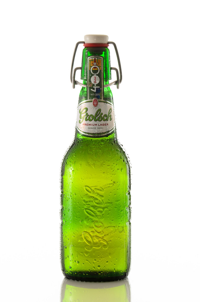
grolsch.png.jpeg


17092273725_64a31f52f6_b.jpg


17091585061_24971e881e_h.jpg


17066313586_dd094a9a2e_b.jpg


17091580251_0498565260_b.jpg


17091580901_b9709afc9f_b.jpg
 
Last edited:
Some products suit the white others the black.

Strangely the Grolsch looks the best in each case, to my eye.

Surely nothing to do with the product?
 
Hi Craig.
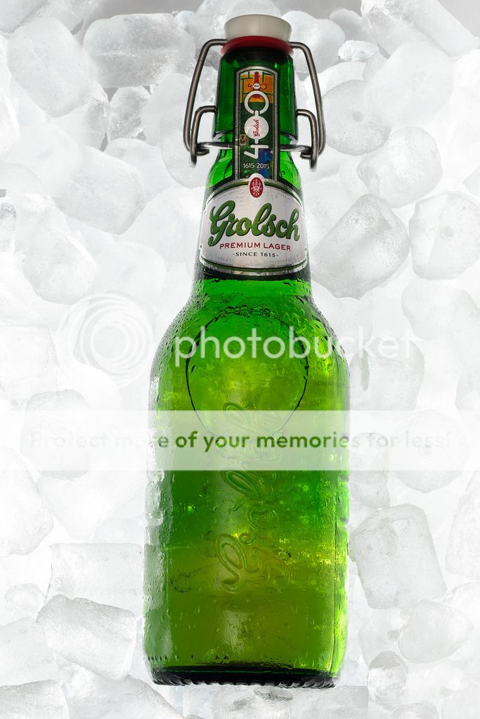
Sorry I can't offer any advice as i'm not up to this standard but agree as an image the Grolsch photos are most apealing. Like the ice in the first. Not sure how you achieved that but it works well.

Gaz
 
Nice work craig, the beer, body wash and florentyna products look quite professional to me but Im not expert in this field, sorry. Nice reflections in the images too.
 
Hi Craig.
Sorry I can't offer any advice as i'm not up to this standard but agree as an image the Grolsch photos are most apealing. Like the ice in the first. Not sure how you achieved that but it works well.

Gaz

Thanks Gaz, the ice one I got a clear Pyrex oven dish and sat it on a clear plastic box on top of the perspex to elevate it and poured a layer of ice in. I then placed three flashes around it resting on the table facing down so they bounced light from under and sides and had a gridded flash above to light label. The dish was an oval so I'd to cut and paste some of the ice in PS to fill the corners.

Nice work craig, the beer, body wash and florentyna products look quite professional to me but Im not expert in this field, sorry. Nice reflections in the images too.

Thanks Carl the perspex really helps with reflections and is much easier to get a clean surface compared to the mirror I used to use.
 
Last edited:
In the Grolsch ice bucket shot it's slightly slanted to the right, if that was the intention I'd probably have made it more obvious and the air bubble location is a bit distracting.

For the second shot the reflection over the top label mars it slightly and it could probably use some black cards to add contrast on the main part of the bottle.
 
Thanks Simon, yeah the air bubbles not ideal. Im not sure the best way to avoid that for this type if shoot. To create enough angle to get the air bubble to top would have caused the ice to spill out and to open and fill bottle would potentially have made it undrinkable at the end. Will try to straighten it out properly not done much post on these images was very crooked sooc as struggled to line camera up perfect on boomed tripod. I think the ice is verging on over lit as well so may need to try this one again.

Will try the black cards as well next time. Negative fill is something I need to be more aware of in general I think.
 
Excellent shots, did you need 4 flash or could you have got away with less? Always looking for home projects.
 
Excellent shots, did you need 4 flash or could you have got away with less? Always looking for home projects.

Thank you, you could definitely do it with less, probably two lights as minimum though. You would need to be careful lighting the background to keep it even with one light on it but for these its a fairly small area so doable. But yeah one light on back one light on side for key and then use silver and white card for fill reflectors you could get the same results. It'd be hard to pull off with one light source if you want a white background.
 
Thanks for the info on your set up and lighting. Jeez a lot goes into getting these images for sure. The lighting is so damn clever but oh so difficult to get your head round :-(

Great images.

Gaz
 
did a retouch of the Grolsch ice shot whilst I await a chance to reshoot which would be the correct option, how does this look?

Slight changes but the whole result is improved for it I think.

At full size the ice has a bit of a grainy look and I might be tempted to try darkening some points of the logo to help make it stand out more but I think you've done well based on the original.
 
Back
Top