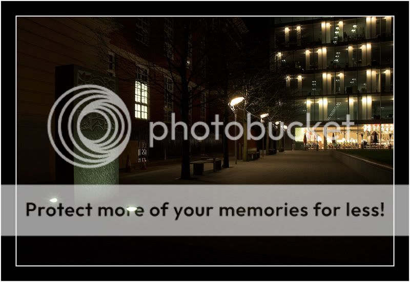
Quite like the single window on the left competing with what looks like a building of glass and light up ahead with a faintly lit path linking the two. Quite like it actually but not sure why
Composition, exposure, even the setting looks spot on, but it doesnt grab your attention instantly. However after sitting looking for s few minutes it does begin to draw you into looking at the details.
Maybe its the fact that its effectively monochrome - due to there being a narrow range of colours. Maybe try changing it to black and white to make it more utopian.
Despite the above comments I will say that the more I look at it the more I like it
I did toy with the idea of converting to B&W but as you said, it's more or less that anyway... I originally liked the idea of the different lighting temperature on the ground floor, and with the rest of it converted it looked a bit daft, IMO...
I agree, Dave, it was a bit dark. Thanks for adjusting the levels on the carving - looks loads better :thumb:
This site uses cookies to help personalise content, tailor your experience and to keep you logged in if you register.
By continuing to use this site, you are consenting to our use of cookies.


")
