- Messages
- 8,398
- Name
- Lynne
- Edit My Images
- Yes
Bloomin nora...just read your blogposts...ya don't do things by halves do ya 
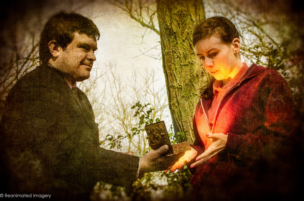
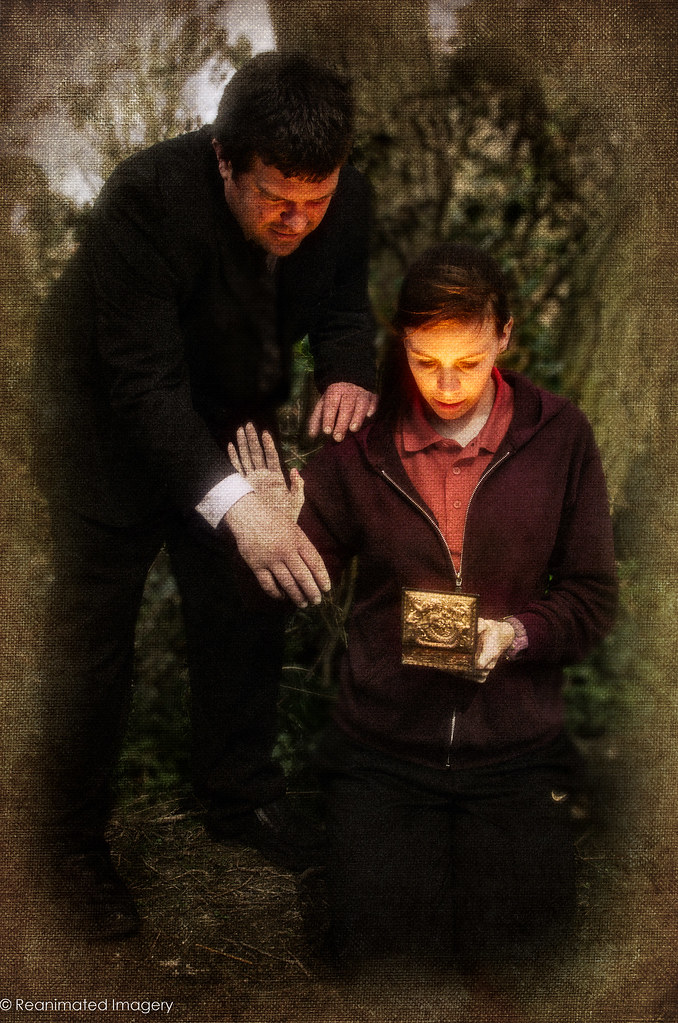
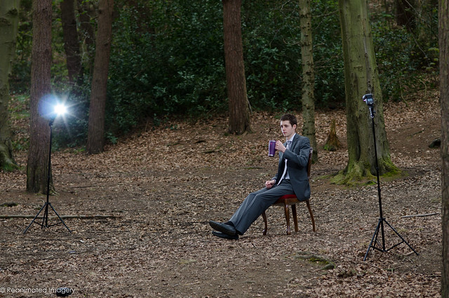
as an image to convey they theme it works really really well ( had to read the blog to find out what the bottom row of blobs was all about....people watching of course ! ) I've said beofre that I'm not really comfortable giving crit on your images but something is jumping out at me in this one & I'm not sure if it was intentional or not....there's a ghostly outline around the guy throwing the switch ?
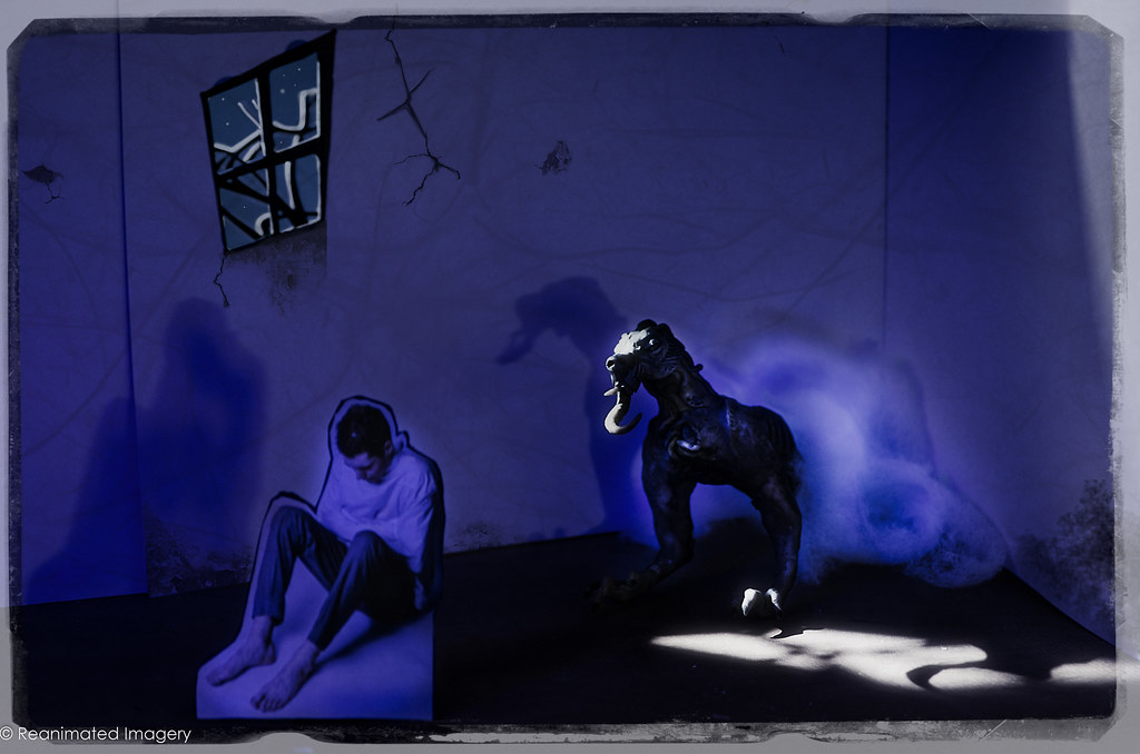
on a side note......how do you create the lighting effect ? I've had a try in pse usinig a tutorial but can't get a multi forked effect such as yours
as an image to convey they theme it works really really well ( had to read the blog to find out what the bottom row of blobs was all about....people watching of course ! ) I've said beofre that I'm not really comfortable giving crit on your images but something is jumping out at me in this one & I'm not sure if it was intentional or not....there's a ghostly outline around the guy throwing the switch ?
on a side note......how do you create the lighting effect ? I've had a try in pse usinig a tutorial but can't get a multi forked effect such as yours
")

 awesome shot