First of all - I think you'd probably get better critique if you'd posted fewer photo's - I usually reckon it takes me around 10 minutes per shot to give anything approaching worthwhite crit. so you're into 3 hours work here!
still - May as well have a go - not full crit. but maybe a few quickies...
Oh - and I've numbered them for the benefit of anyone who comes along later.
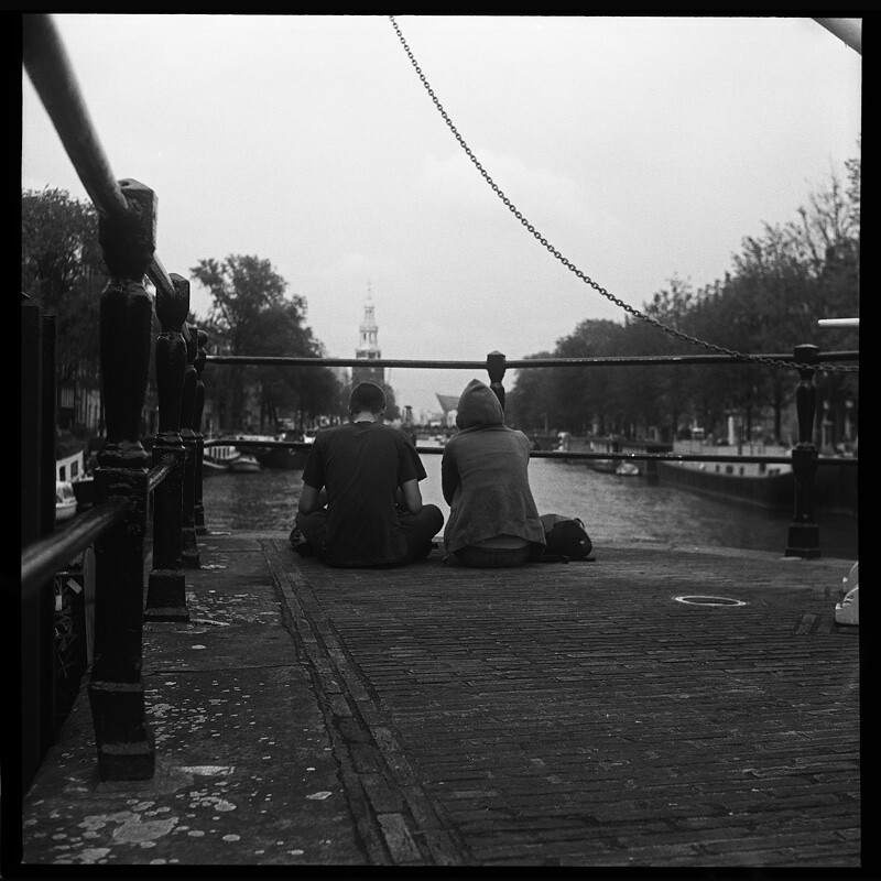
1) Like the leading lines from the railings - not too sure about the chain - it kind of cuts off the upper rhs. Also the bar/rail in the top rhs corner is a pain. It's a shame about the fencepost growing out of the hoodies shoulder, and it would have been nice if the church spire (?) had been between the 2 people rather than making a pointy hat for the other guy.
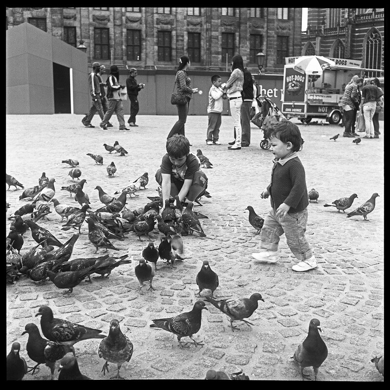
2) Again a visually interesting shot, but i'd have been tempted to have taken half a step left and put the crouching kid between the feet of the mid-distance adults - as opposed to having one stand on his shoulders. I'm noticing a bit of Keystone-distortion in the shot - it's a pain to keep the camera level with wlf's.
3) I think this is a very strong shot - again, slightly marred as it stands by a good chunk of keystone distortion - though nothing that couldn't be sorted at the printing stage by tilting the baseboard
")
4) Again, with the keystoneing sorted, this is a cracker of a shot.
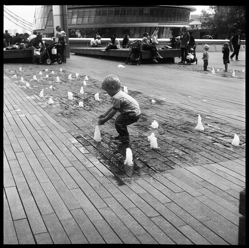
5) Personally I'd prefer this as a crop taking in just the lad playing in the street fountain - the rest of the background just distracts from the key element of the image to me... It's also a shame you've posted this shot in here and elsewhere, as it'd be a dead cert for this months POTY competition - "Gettin' Wet!"
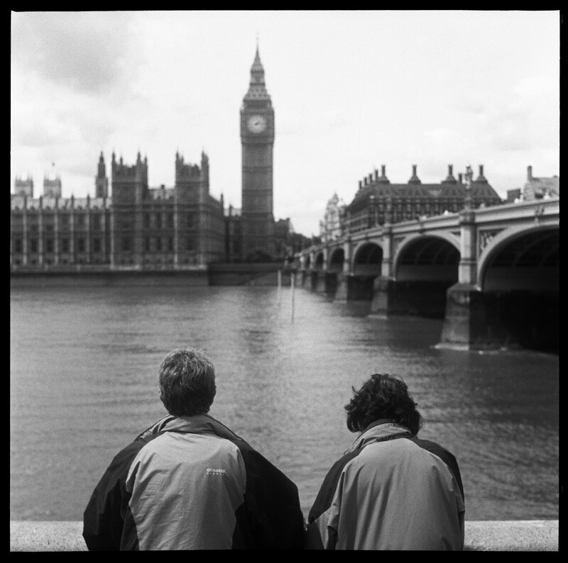
6) I'd have liked to see this taken from marginally lower position - moving the 2 people up in frame and showing a smaller expanse of water. Also, if the reflection of the tower had fallen between the 2 heads, it would have been perfect IMHO.
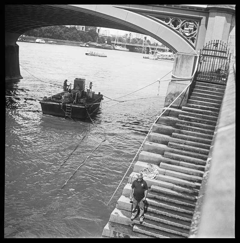
7) Not keen personally - I'm sure theres a good picture in this frame, but to my mind, this isn't it... Though this could be prejudiced by my dislike of non-abstract architectural shots that are on the wonk.
8) straighten the horizontals on this and it's another cracker
9) Chapeau ! - this is a absolute corker!
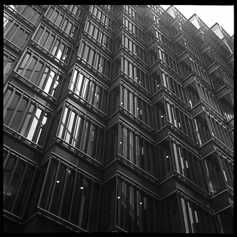
10) Nice architectural abstract(ish) shot - more about the repeating patterns than the actual building. This time the angle on the shot makes it work well.
11) As is stands, on my calibrated screen, I'm afraid the lower RHS building runs away to complete black, which spoils it a little for me. I wonder if there's still enough detail in the neg, to be able to dig a little more out with a good wet print and a whole raft of dodgeing and burning. Nice composition though, and I like the clouds reflected in the left hand building.
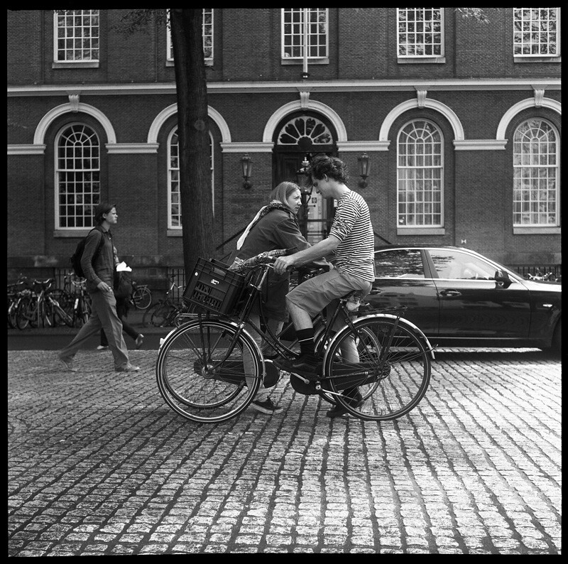
12) Like the basic composition, but it's just the details that let it down somewhat - the chap on the LHS with someone elses leg growing out of his knee - the wonkey horizontal on the building, the building door being open behind the main couple, and the back of the car being in shot. Can't see if it was parked or driving through - if driving through, it's a shame you weren't 1/2 second later pressing the shutter.
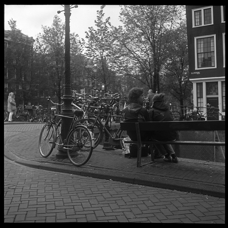
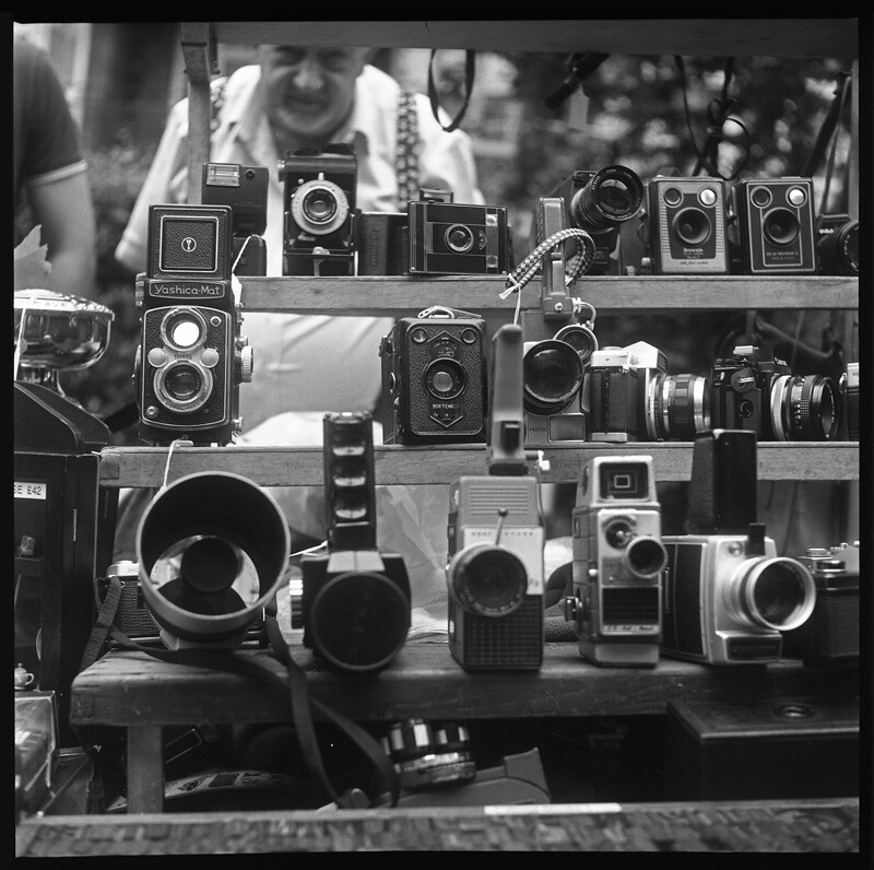
13) More Dutch bikes (I'm a sucker for bike shots!) and one of the essential shots from this location. Again, being ultra picky, but it's a shame that the other bike was chained up so close that it's back wheel is in shot.