
- Messages
- 777
- Name
- Amanda Herbert
- Edit My Images
- No
Hi all,
I've been eager to explore my photography with film for a second time.
Would love some CC on my skills (but not the model). I asked this teen to be a willing guinea pig via Instagram.
F100 + 100m macro. Porta 400 and Tri-X 400 BW.
#1 I often use this park and know this area has lovely light. I wanted to see how Porta created colours with the pink bricks.
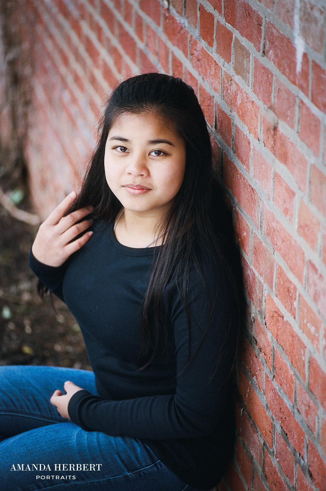 Amanda Herbert Photography by M@ndy, on Flickr
#2 Another favourite area. I've included this shot because I found a setting within Alien Skin to process the photos with less blues.
 Amanda Herbert Photography by M@ndy, on Flickr
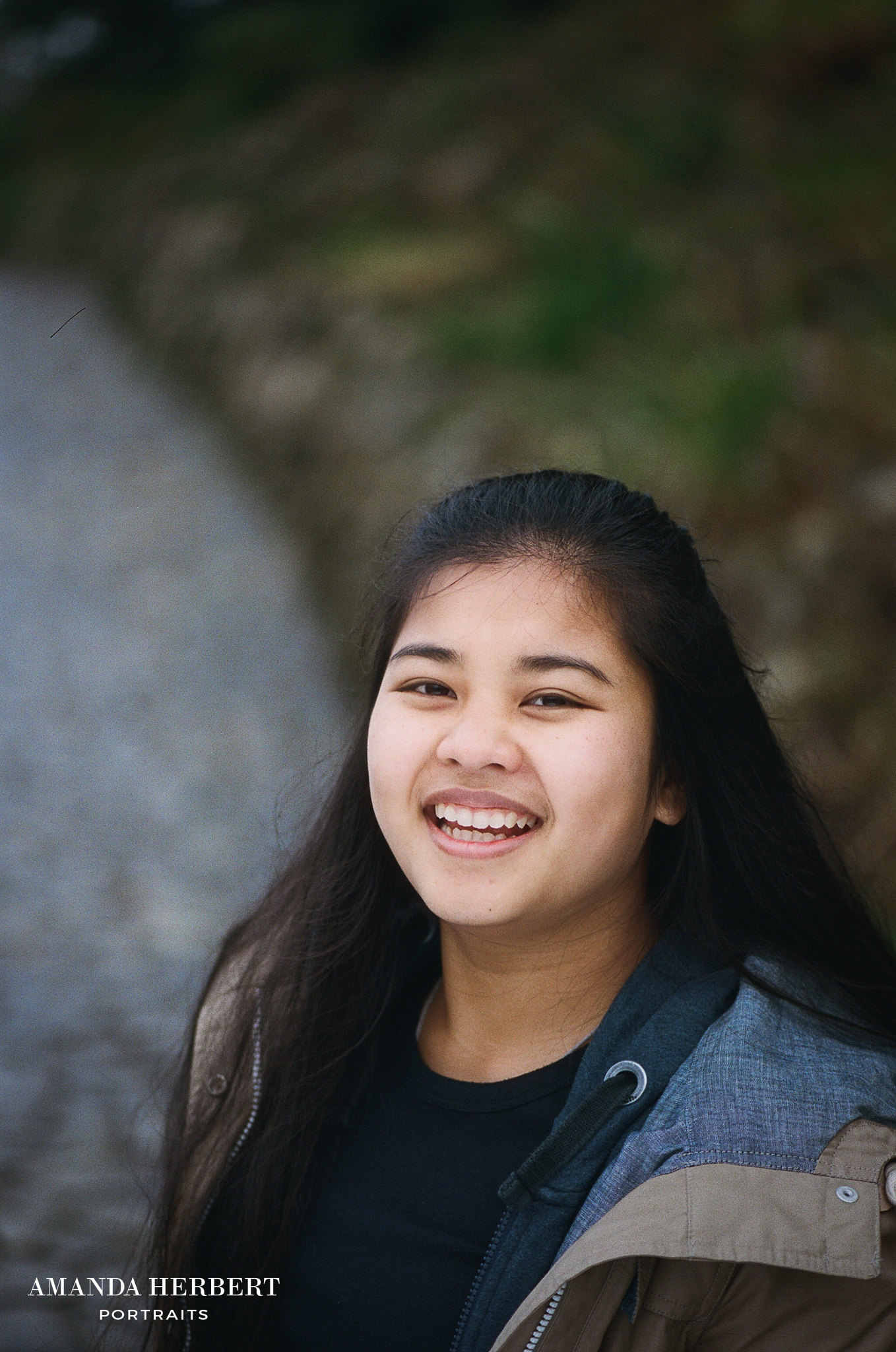
#3 Initially I thought I was more interested in colour film. Then I decide that I could convert colour into BW via LR. Infact, I've blogged nearly all BW film shots. I literally spent 20 minutes taking 36 frames and ran around the park with this teen.
I actually think this energy created more engaging photos.
 Amanda Herbert Photography by M@ndy, on Flickr
#4
 Amanda Herbert Photography by M@ndy, on Flickr
#5 I prefer other images, but the background gates were green and I was fascinated to know how the 'colours' would translate to BW film.
 Amanda Herbert Photography by M@ndy, on Flickr
Thanks Mandy
I've been eager to explore my photography with film for a second time.
Would love some CC on my skills (but not the model). I asked this teen to be a willing guinea pig via Instagram.
F100 + 100m macro. Porta 400 and Tri-X 400 BW.
#1 I often use this park and know this area has lovely light. I wanted to see how Porta created colours with the pink bricks.
Amanda Herbert Photography by M@ndy, on Flickr#2 Another favourite area. I've included this shot because I found a setting within Alien Skin to process the photos with less blues.
Amanda Herbert Photography by M@ndy, on Flickr#3 Initially I thought I was more interested in colour film. Then I decide that I could convert colour into BW via LR. Infact, I've blogged nearly all BW film shots. I literally spent 20 minutes taking 36 frames and ran around the park with this teen.
I actually think this energy created more engaging photos.
Amanda Herbert Photography by M@ndy, on Flickr#4
Amanda Herbert Photography by M@ndy, on Flickr#5 I prefer other images, but the background gates were green and I was fascinated to know how the 'colours' would translate to BW film.
Amanda Herbert Photography by M@ndy, on FlickrThanks Mandy
Last edited:

