
- Messages
- 53
- Name
- Darrell
- Edit My Images
- Yes
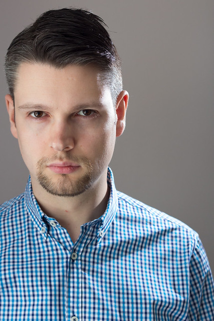
Here's a self portrait from last week. I'd rather not shoot myself but as I can't convince the other half, I'm my only model for the time being.
Any criticism is appreciated (although focused on my photography rather than modelling please!). Also I'm interested in any preferences over the B&W or colour.
Thanks!
Darrell
 Darrell Self Portrait Colour by Darrell Drew, on Flickr
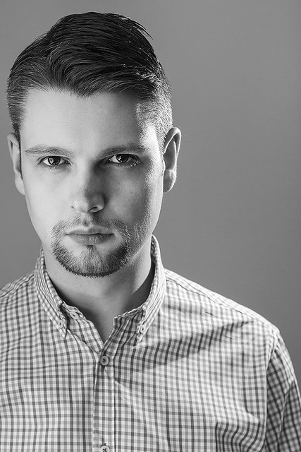 Darrell Self Portrait by Darrell Drew, on Flickr
Any criticism is appreciated (although focused on my photography rather than modelling please!). Also I'm interested in any preferences over the B&W or colour.
Thanks!
Darrell
Darrell Self Portrait Colour by Darrell Drew, on FlickrDarrell Self Portrait by Darrell Drew, on Flickr")
 Darrell Without PP