Beginner Should I change my book cover?

Should I use a photo or plain text on the front cover?

  • Photo

    Votes: 16 100.0%
  • Text

    Votes: 0 0.0%

  • Total voters
    16

Garry Edwards

Moderator
Messages
12,320
Name
Garry Edwards
Edit My Images
No
Following on from this thread https://www.talkphotography.co.uk/threads/free-e-book-about-photography-for-beginners.752112/ about my new e-book for beginners, one of the few people who has helped me to improve and develop this book is Satish, aka @Jungli .
Among his many helpful suggestions is a photo of someone using a camera, on the front cover. I can't reproduce that photo here for copyright reasons, but could easily produce something similar, if that's the best way forward. This photo is very similar https://www.amazon.co.uk/Beginners-...learn+photography+books&qid=1707389242&sr=8-4

But is it?

Looking at beginner books on Amazon, nearly all of my competitors use one or more photos on their front cover, here are some of them https://www.amazon.co.uk/learn-photography-books/s?k=learn+photography+books

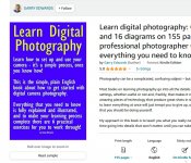
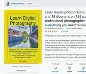
I decided to go with plain text instead, this is my book https://www.amazon.co.uk/Learn-digital-photography-professional-photographer-ebook/dp/B0CFB2TX6R and this is the cover
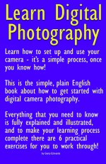
cover_1.jpg

The reason I went for plain text was to show people that my book is different - it deals with the basics that people need to learn, so many of the others are basically just showing pretty pictures and telling people that they can produce pretty pictures too . . .

But have I got it wrong? Should I copy my competitors and have a photo on the front instead?

I'd appreciate your opinion on this, so will you please vote on it? And any comments, posted as a reply, would also help.
 
I've voted for photo, but in truth I think a mix is ideal - you have enough space to use a photo in the upper third/half and some catchy text in the rest
 
I've voted for photo, but in truth I think a mix is ideal - you have enough space to use a photo in the upper third/half and some catchy text in the rest
This.

Unless the typography is very good photos catch the eye much better.

FWIW I'd reduce the text to bullet points:

How to set up and use your digital camera - SIMPLY!

A plain English guide to starting Digital Photography.

Everything you need to know fully explained and illustrated.

6 practical exercises to work through for success.​
 
My feeling too is that the text alone is too bold (as if you're shouting instructions) & too austere - to draw people in something more visual is needed. I see the value of the text, though - just halve its size.
 
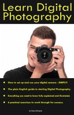
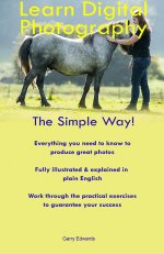
Many thanks for the responses so far. This is my latest effort, all comments very welcome


cover_2.jpg
 
I think this is much more appealing than text alone. Personally I would slightly increase the size of the bulleted text to give it more of a balance.
 
Don't know how to say it without risking it being taken the wrong way !

The photo to me is wrong, it needs a photo that the target audience would like to take, be that a beach scene, city scene, sports scene or similar. (the photo may look better without the black and yellow though)

It's not a road sign, so the black and yellow looks harsh and unappealing, softer colours and maybe a border (with rounded corners) instead of the solid black areas, and a paragraph of description not bullet points.

It doesn't need the "by" before your name.

If there were 20 books on the same topic on a shelf, and you only had time to look at 5 of them, would it be one of the 5?
Presentation is everything at that stage.
 
I'd lose the bullets, centralise the text and drop the full stops.
I'd change the font colour & keep it uniform.
I'd also drop the word "digital" from the title to give you a bit more creative space. For a beginner, all photography is digital.
I'd find another font and mess around with the typography. Lots of tutorial videos on typography on YouTube. It can have as much depth as taking a photo.

I'm assuming the photo is a placeholder? If not, I don't think it works against the black book cover.

It's loads better than the initial post though. This was the front cover for my course handouts and it took me longer to do that than it did to write the notes despite the fact it looks like it took 5 minutes to make!
Screenshot 2024-02-08 161146.png
I tried text + photo + text and it looked awful. Ended up searching for a good photo that was the right size for the cover and allowed the text to sit on it & still stand out.
Sometimes just messing with the spaces between letters is enough to make something stand out a bit more. I know this is obviously a very different design to what you need, but it's just highlighting how it can take a while (and a lot of messing about & learning new skills) to make something look good.
 
Last edited:
Very quick effort (using your words), busy cooking :)

gecs.jpg
 
I'd lose the bullets, centralise the text and drop the full stops.
I'd change the font colour & keep it uniform.
I'd also drop the word "digital" from the title to give you a bit more creative space. For a beginner, all photography is digital.
I'd find another font and mess around with the typography. Lots of tutorial videos on typography on YouTube. It can have as much depth as taking a photo.

I'm assuming the photo is a placeholder? If not, I don't think it works against the black book cover.

It's loads better than the initial post though. This was the front cover for my course handouts and it took me longer to do that than it did to write the notes despite the fact it looks like it took 5 minutes to make!
View attachment 414208
I tried text + photo + text and it looked awful. Ended up searching for a good photo that was the right size for the cover and allowed the text to sit on it & still stand out.
Sometimes just messing with the spaces between letters is enough to make something stand out a bit more. I know this is obviously a very different design to what you need, but it's just highlighting how it can take a while (and a lot of messing about & learning new skills) to make something look good.


That's good, it makes you want to pick it up :)
 
I'm not a graphic designer, so feel free to ignore everything I say!

Assuming that the sole outlet for this book is Amazon it has to be borne in mind that it will appear like this:

2024-02-08_164051.jpg

Probably smaller on phones etc. Essentially you're creating an advert. When I started my business I went on a (pretty crappy) course but one piece of advice I was given was that when it comes to advertising you are buying space. Leave room for the copy to breathe and be seen.

Don't cram too much on the cover, and certainly not detail that can be put in the description. Title, light and airy photo and colours, and a couple of salient points. As Ian says, choice of font, font style, and letter spacing can make a big difference. Bolder fonts like his example are more eye catching and 'friendly' looking, as a lighter colours and softer shades.

Think of how newspaper articles are constructed - bold headline and striking picture followed by precis of story, then the detail. That's one way to approach it.

But like I said, I'm not an expert, and there are many ways to skin cats.
 
I'm not a graphic designer, so feel free to ignore everything I say!

Assuming that the sole outlet for this book is Amazon it has to be borne in mind that it will appear like this:

View attachment 414212

Probably smaller on phones etc. Essentially you're creating an advert. When I started my business I went on a (pretty crappy) course but one piece of advice I was given was that when it comes to advertising you are buying space. Leave room for the copy to breathe and be seen.

Don't cram too much on the cover, and certainly not detail that can be put in the description. Title, light and airy photo and colours, and a couple of salient points. As Ian says, choice of font, font style, and letter spacing can make a big difference. Bolder fonts like his example are more eye catching and 'friendly' looking, as a lighter colours and softer shades.

Think of how newspaper articles are constructed - bold headline and striking picture followed by precis of story, then the detail. That's one way to approach it.

But like I said, I'm not an expert, and there are many ways to skin cats.
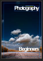
I see what you are saying, personally I still think it has to be more pictorial, and as a simple comparison (not saying my effort is any where near perfect, but just to compare graphically)

gecas.jpg
 
personally I still think it has to be more pictorial,
That was what I was getting at. ;) Along with the idea that the appearance of the text is just as important.

The trouble is if you go for a landscape picture it might deter people who want to shoot portraits, and so on. Which is possibly why a lot of the examples in Garry's links have multiple photos in different genres. His smiley person with a camera sends the right kind of message.(y)

A subtitle might help. Something along the lines of Learn Digital Photography: Simple Steps for Success. Again, don't take that as gospel. Just kinda thinking out loud.
 
I'm not a graphic designer, so feel free to ignore everything I say!

Assuming that the sole outlet for this book is Amazon it has to be borne in mind that it will appear like this:

View attachment 414212

Probably smaller on phones etc. Essentially you're creating an advert. When I started my business I went on a (pretty crappy) course but one piece of advice I was given was that when it comes to advertising you are buying space. Leave room for the copy to breathe and be seen.

Don't cram too much on the cover, and certainly not detail that can be put in the description. Title, light and airy photo and colours, and a couple of salient points. As Ian says, choice of font, font style, and letter spacing can make a big difference. Bolder fonts like his example are more eye catching and 'friendly' looking, as a lighter colours and softer shades.

Think of how newspaper articles are constructed - bold headline and striking picture followed by precis of story, then the detail. That's one way to approach it.

But like I said, I'm not an expert, and there are many ways to skin cats.
I see what you are saying, personally I still think it has to be more pictorial, and as a simple comparison (not saying my effort is any where near perfect, but just to compare graphically)
 
That was what I was getting at. ;) Along with the idea that the appearance of the text is just as important.

The trouble is if you go for a landscape picture it might deter people who want to shoot portraits, and so on. Which is possibly why a lot of the examples in Garry's links have multiple photos in different genres. His smiley person with a camera sends the right kind of message.(y)

A subtitle might help. Something along the lines of Learn Digital Photography: Simple Steps for Success. Again, don't take that as gospel. Just kinda thinking out loud.
Agreed, I just found a photo of mine that no-one would say I was using without permission. Was just supposed to show the concept

I think that some genres appear pleasant to most people, but some don't :) I think portraits don't, too many variables and personal tastes, but that is just my feeling
 
Many thanks for all the further replies, greatly appreciated.
Don't know how to say it without risking it being taken the wrong way !

The photo to me is wrong, it needs a photo that the target audience would like to take, be that a beach scene, city scene, sports scene or similar. (the photo may look better without the black and yellow though)

It's not a road sign, so the black and yellow looks harsh and unappealing, softer colours and maybe a border (with rounded corners) instead of the solid black areas, and a paragraph of description not bullet points.

It doesn't need the "by" before your name.

If there were 20 books on the same topic on a shelf, and you only had time to look at 5 of them, would it be one of the 5?
Presentation is everything at that stage.
Good points.
I agree about portraits, I don't do landscapes but I do have a photo of a horse, which is also inside the book. I think that most people like animals. Also, all of the sales proceeds go to a horse rescue charity.
I'm not a graphic designer, so feel free to ignore everything I say!

Assuming that the sole outlet for this book is Amazon it has to be borne in mind that it will appear like this:

View attachment 414212

Probably smaller on phones etc. Essentially you're creating an advert. When I started my business I went on a (pretty crappy) course but one piece of advice I was given was that when it comes to advertising you are buying space. Leave room for the copy to breathe and be seen.

Don't cram too much on the cover, and certainly not detail that can be put in the description. Title, light and airy photo and colours, and a couple of salient points. As Ian says, choice of font, font style, and letter spacing can make a big difference. Bolder fonts like his example are more eye catching and 'friendly' looking, as a lighter colours and softer shades.

Think of how newspaper articles are constructed - bold headline and striking picture followed by precis of story, then the detail. That's one way to approach it.

But like I said, I'm not an expert, and there are many ways to skin cats.
Agreed, too busy
I'd lose the bullets, centralise the text and drop the full stops.
I'd change the font colour & keep it uniform.
I'd also drop the word "digital" from the title to give you a bit more creative space. For a beginner, all photography is digital.
I'd find another font and mess around with the typography. Lots of tutorial videos on typography on YouTube. It can have as much depth as taking a photo.

I'm assuming the photo is a placeholder? If not, I don't think it works against the black book cover.

It's loads better than the initial post though. This was the front cover for my course handouts and it took me longer to do that than it did to write the notes despite the fact it looks like it took 5 minutes to make!
View attachment 414208
I tried text + photo + text and it looked awful. Ended up searching for a good photo that was the right size for the cover and allowed the text to sit on it & still stand out.
Sometimes just messing with the spaces between letters is enough to make something stand out a bit more. I know this is obviously a very different design to what you need, but it's just highlighting how it can take a while (and a lot of messing about & learning new skills) to make something look good.
Also very good points. You're right, all beginners think that all photography is digital, so I've dropped the repetitions - but for now at least have left "Digital" in the title, mainly because I'm finding it difficult to make the text look OK without it.

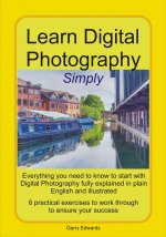
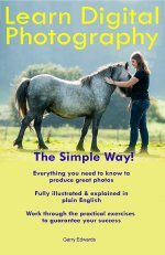
This is my latest effort
cover_3.jpg

I now realise that I have zero ability in terms of typefaces and graphics, so I need to find a volunteer . . . any offers gratefully accepted, but if necessary I'll hire someone to do it.
 
This is my latest effort
View attachment 414215

I now realise that I have zero ability in terms of typefaces and graphics, so I need to find a volunteer . . . any offers gratefully accepted, but if necessary I'll hire someone to do it.

I think you're getting there.

If you can extend the sky upwards in that photo so the text doesn't cover the faces and the bottom of the shot drops down, it would be a good basis IMO. (y)
 
Getting there Garry!

I now realise that I have zero ability in terms of typefaces and graphics, so I need to find a volunteer . . . any offers gratefully accepted, but if necessary I'll hire someone to do it.
Ask around to see if any friends have an interest in graphic design. Try young ones to begin with :) Maybe there are kids (or grandkids) that know someone who can help you out for the price of a bottle of pop. Art & Design is a popular choice for students these days.

A friend of mine is a graphic designer by trade. If you're completely stuck, she might do you mates rates if she's not too busy. PM me if you want me to ask her.
 
I think you're getting there.

If you can extend the sky upwards in that photo so the text doesn't cover the faces and the bottom of the shot drops down, it would be a good basis IMO. (y)
Is this any better?
cover_3.jpg
 

Attachments

  • cover_3.jpg
    cover_3.jpg
    97.4 KB · Views: 19
Last edited:
Again, my thanks to everyone for their comments, suggestions and votes.

It's obvious that my approach was wrong, and I think I've gone as far as my very limited graphics ability will take me, so I'm now going to ask my youngest daughter, who does all the promotional work for our charity really well, to knock it into shape.
Getting there Garry!


Ask around to see if any friends have an interest in graphic design. Try young ones to begin with :) Maybe there are kids (or grandkids) that know someone who can help you out for the price of a bottle of pop. Art & Design is a popular choice for students these days.

A friend of mine is a graphic designer by trade. If you're completely stuck, she might do you mates rates if she's not too busy. PM me if you want me to ask her.
Thanks for the offer, but at the risk of sounding like the people who ask for advice and then say that they can't afford to follow it, the profit from each sale is only 65p (Amazon takes the rest) so I think that I need to go for the compromise of my free amateur graphic designer:)
 
Last edited:
On post number 7 a pretty girl on the front cover with a camera would attract more people to your book. I would let you use my wife for such a photo, I can guarantee you won't sell one copy. ;):naughty::exit:
 
...the profit from each sale is only 65p (Amazon takes the rest) ...
Just checked for it on Amazon - They're giving it away free with Kindle Unlimitied (do you get anything for such a 'sale'?), and charge £4.99 for the normal Kindle edition - that you (or the charity) get just 65p from that is shocking.
It's also quite a way down the page (11th) despite being the first one to actually match my search.
 
We get a few pence from Kindle readership, sometimes amounting to more than £1 per month.

65p per £4.99 sale is poor, but Amazon is now the only available sales outlet, so there's zero choice. I never buy anything from them on principle but can't avoid them when selling my books.
 
Personally I'd go with a picture, as someone said above (Lindsay?) people are lazy and wont read much but a pic will catch their attention.
 
Minor suggestions:

Do you give your credentials on the rear cover, flysheet, somewhere else?

Can you guarantee success?

Do not like abbreviations- & rather than and.

Good luck with the book.
 
Can you guarantee success?
That's an interesting one, I doubt anyone would come back on that. But supposing they were not successful and were minded to make a claim, they would have to prove that they worked through all practical exercises and it didn't work, no?
 
A little refining as suggested, and that would be very usable, paying for someone to do it for you may well not bring you anything you like better.
I assume you have permission from the person in the photo?
Not yet, but she's my daughter and I expect her to be OK with it, especially as we've used the same photo for some of the charity promotional stuff.
Minor suggestions:

Do you give your credentials on the rear cover, flysheet, somewhere else?

Can you guarantee success?

Do not like abbreviations- & rather than and.

Good luck with the book.
Fair point, and no, I cannot guarantee success, and all success is relative anyway. My thinking is that anyone who works through the practical exercises cannot fail to get a basic understanding of the process, which amounts to success.

I don't think that credentials matter, I have a very old degree in photography and a lifetime of professional experience, but that doesn't even impress me :) so probably won't impress anyone else either, all that I think matters is my communication skills, which I can't prove.

I'll post the finished version of the cover here, once it's done. Again, many thanks to everyone.
 
I'll agree that credentials don't mean much to ME but they do to some people so are probably worth including. Lets face it, any extra sales they might attract earn the charity a few extra pence (and even I am not put off buying something because it DOES include [relevant] credentials!)
 
Can I make another suggestion, put a few testimonials in the book after the front cover and use them to help customers feel that its a good purchase (it is already) but validation adds real value.
 
Can I make another suggestion, put a few testimonials in the book after the front cover and use them to help customers feel that its a good purchase (it is already) but validation adds real value.
Good idea! I will also re-write the blurb that's visible before people look inside the book.

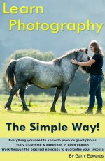
I had a re-think about who is best to improve the graphics, and remembered a talented young man who worked for me for a few years, before moving on to a better job:(
I emailed it to him yesterday and am very happy with the result, which came through a few minutes ago. He managed to lose the word "Digital" too, without making the text look unbalanced.
cover_4_red.jpg
 
Back
Top