Signature stamp.....Which one? (PART 2) pictures added

Messages
3,962
Edit My Images
Yes
Right got it down to these...all have small differences so curious to which is most appealing and professional looking etc to the rest of the world.

Any tip welcome again before I save it.

Was going to be a poll but its obviously not available lol

Untitled-6.jpg


Untitled-5.jpg


Untitled-4.jpg


Untitled-3-3.jpg


Untitled-2-10.jpg
 
Last edited:
The fifth is the cleanest, and will work well at all sizes (and in white as well).

If you wanted to keep the copyright symbol in there, then it could be placed in the upper left corner to use some of the dead space on the angle of the 'A'. It doesn't have to be huge, just enough to be seen.
 
thanks for the reply...will give the copyright a move see how it looks.

just trying to keep things simple but effecting while not looking amateurish.
 
thanks for the reply...will give the copyright a move see how it looks.

just trying to keep things simple but effecting while not looking amateurish.

The last one is clean, clear, and concise. It doesn't look like it was created using WordArt and conveys exactly what you want/need it to.

Job well done in short.
 
yeah i think the last one, its the easyest to read, most direct and would work on anything, now the question of will it have a shadow or a blur around it and what colour will it be, think we need to see it on an image...

I think the colour will depend on the image its being used on.... I will post up a couple with the last stamp on with the 'C' in the top left too.
 
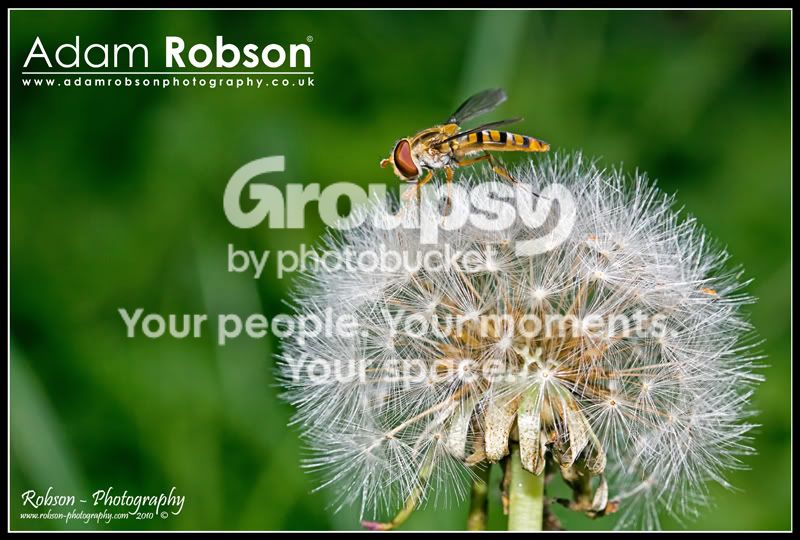
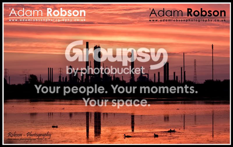
Right...two pics, ignore the other sig thats on there lol

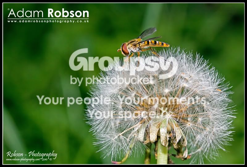
EDIT also one with the 'c' at the end

asasas.jpg


dsfs.jpg


tests.jpg
 
Last edited:
i like it in white, makes it easier to see and because it isnt too bigger text it doesnt detract from the image...

...however...

i really like the bottom left one...

lol the bottom left is the one I am getting rid of, got a new www. site hence the new name etc.

Started to go off that siggy too....now you confuse everything! :bonk:
 
This one (top left).

No misinterpretation of the name, no scrolls or kerning to detract form the image itself, and will work at just about any size.

How about the 'c' at the front or the back?

hmmm...

asasas.jpg


tests.jpg
 
Last edited:
At the front, definitely.

It 'squares off' the stamp, negates the dead space leading in, and also reads correctly ('Copyright Adam Robson').

you make a good point there.....Well its now saved in my brush tools! :thumbs:

Cheers for the help, and BandyQuill.

just hope no one comes along and disagrees :lol:

tbh I am happy with it now :thumbs:

Now to try to get the site working lol
 
you make a good point there.....Well its now saved in my brush tools! :thumbs:

Cheers for the help, and BandyQuill.

just hope no one comes along and disagrees :lol:

tbh I am happy with it now :thumbs:

Now to try to get the site working lol

No problem, glad to be of help.
 
Are you always going to go that big or will it depend on the pic?
I much prefer the new style and with the "c" at the front FWIW
 
Are you always going to go that big or will it depend on the pic?
I much prefer the new style and with the "c" at the front FWIW

No no that was just for the purpose of the post so you could see the signature better lol

my sigs normally depend on the picture its self and colours etc etc
 
coolio
has reminded me I must get a stamp sorted for my own pics.
 
This one (top left).

No misinterpretation of the name, no scrolls or kerning to detract form the image itself, and will work at just about any size.

I agree :thumbs:
 
I like the 3rd and 5th ones but any of them will do really.
 
Back
Top