Smoke on Stoney Middleton

Messages
7,523
Name
Nige
Edit My Images
No
I took this back in 2018 and spotted it while looking through my Lightroom catalogue the other day. I'm not sure I like the processing - or rather I'm in two minds about it. I like the lower half, but the warm tones in the sky not so much. I tried cooling it down, but it didn't seem to look right that way either.
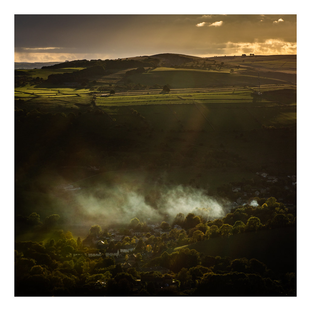

Smoke on Stoney Middleton
by fishyfish_arcade, on Flickr
 
It’s a fantastic image. Inthink the processing is fine. I like the top and the bottom (amazing light!) but the dark area inbetween removes continuity between the fore and the background. It’s almost two separate photos. I’d be tempted to crop the top out - the smoke and trees at the bottom are really powerful. But then again, the fields at the back look great too...
 
It is the kind of image I very much like but I can see what you mean. I'm not sure what to suggest, crop out most of the sky? For me the middle could possibly benefit from slightly lifting the shadows (but could be my monitor).
 
It’s a fantastic image. Inthink the processing is fine. I like the top and the bottom (amazing light!) but the dark area inbetween removes continuity between the fore and the background. It’s almost two separate photos. I’d be tempted to crop the top out - the smoke and trees at the bottom are really powerful. But then again, the fields at the back look great too...

Yeah, know what you mean. I kinda like the dark area in the middle (although maybe some lifting of the shadows would help). It reminds me a little of those cutaway illustrations where you see the surface AND the underground (not that Stoney Middleton is buried! :) ).

It is the kind of image I very much like but I can see what you mean. I'm not sure what to suggest, crop out most of the sky? For me the middle could possibly benefit from slightly lifting the shadows (but could be my monitor).

I did try cropping the sky, but it didn't work (to mye eye, at least). I also tried keeping the original aspect ration and having more sky, but the clouds are uneven at the top of the frame, with one side much brighter than the other, which is why I went for the 1:1 ratio. I might try lightening the middle a little to see how that looks though.

This feels like two images in one (rather than multiple subjects) - I like it

Thanks Ben.
 
"Cracking" shot, nuff said.

George.
 
Back
Top