Thank you folks
")
The 1st two are masterful and demonstrate the importance of light in the landscape.
The first image is the best image ever taken on Skye. There is no better, there probably will be no better. It's definitive, it's landmark. It's right hand cramp time. It's unfaultable. I'm jealous of it.
The second is a very nice example of the Quairing. I can imagine exposing that would not be easy and your effort is strong. What I notice though is the top of the ridge is darkened down a lot presumably due to using a grad. I might suggest some selective shadow recovery. It's a pretty minor issue.
Neist point. It's a lot better than mine. I think I prefer the high view or right down at the light house but I know why you had to take that image and the dedication you and nick give on your workshop.
4 I like but it's not my bag but there's nothing wrong with it or anything I could suggest to improve what's there.
5. Fair play for staying up late. I like my bed.
6. Great views like this need light and reflections..lol
I don't agree on your first quote, but I knew it was right up your street as I've already said.
Regarding the darkened ridgeline, it looks a lot darker on the smaller image, but it isn't from grads, it's just shadow.
Neist Point was a grab shot from where I had my clients, as you know
6, I totally agree with you, but we can't control the weather, and when it's either a boat trip in or an 8 mile hike, that's life lol!
1st is stunning and I love the light on the second.
Neist point, I also think the lighthouse is leaning right and I'm also drawn to the little building on the top of the shot away from the lighthouse which I find distracting.
You're correct, it is leaning right, I should have checked it when I levelled the horizon, thanks
I'm going to make myself unpopular here - not for the first time i imagine. None of these images REALLY grab me.
I often agree with ST4 but in the case of No 1 I think his praise is way over the top. Steve - there ARE better images to be taken here. You might be the one to do it!
As for Neist Point lighthouse I don't think the image works well at all. The lighthouse IS leaning quite badly and the hut with its barbed wire fence is an unpleasant distraction. To use this as a focal point in a landscape is a strange choice in my opinion. The light is not particularly interesting and there are some strange colour bands in the sky. If it were mine i would have binned it.
Isle of Ornsay - The Lighthouse is great in conjunction with the rainbow but it is a shame there wasn't better light on the Lighthouse itself. I might have composed it slightly differently myself but that's a personal thing. As it is a square crop might improve it..
Northern Lights - Yes, a good image and the sky is just luminous. I can see why you have included the cottage but the telegraph pole in the foreground and the village lights on the R.H.S. make it look a bit scrappy, though. I'd love to have had the chance to take pictures there myself.
Loch Coruisk is just about OK in my opinion. Nothing more.
I await a good kicking.
I won't kick you, everyone's entitled to their opinions, and those are yours.
I agree on the first image not being the best image taken on Skye, as I've taken a lot better elsewhere on the island, but the conditions warranted the shot. Not the best light, but I had clients to worry about before my own work. Thanks for the input.


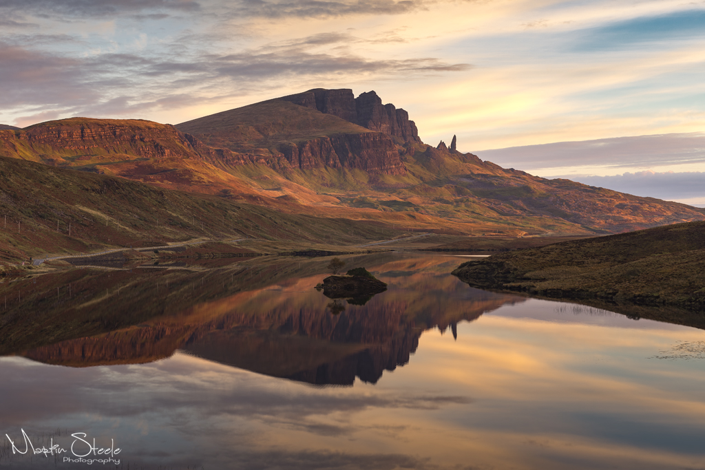 Old Man of Storr and Loch Fada by Martin Steele, on Flickr
 An autumn sunrise on Skye by Martin Steele, on Flickr
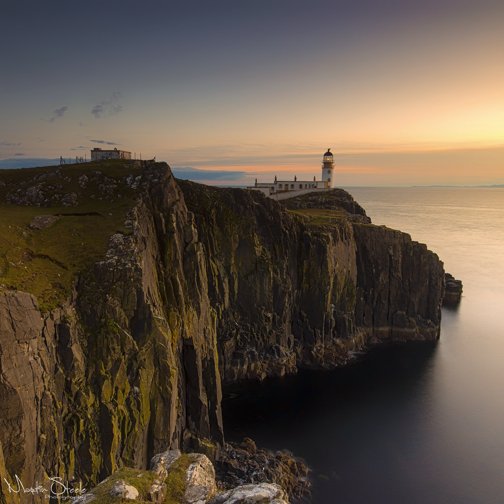 Neist Point by Martin Steele, on Flickr
 Isle Ornsay by Martin Steele, on Flickr
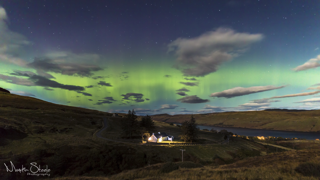 Skye Aurora by Martin Steele, on Flickr
 Loch Coruisk by Martin Steele, on Flickr

