Some old pillars

Messages
35
Edit My Images
Yes
Pillars-web.jpg


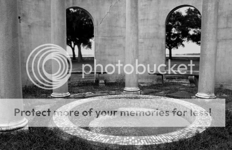
I took this the other day at an old abandoned mansion down the road a bit. The house is very old and now sits empty and in disrepair. The work done:

  • Sized to 11x17 inch (sized for web at the end for the forums)
  • Converted to b&w via Channel Mixer
  • Slight Levels adjustment
  • Some modification to the far background (darkened and added slight blur with graduated layer mask)
  • Unsharp Mask

Overall I'm pretty happy with it; the print turned out more or less how I had visualized. Still, I sure wouldn't mind some additional comment/criticism. Thanks for looking!

-monkey
 
I'm no fan of mono so I'll leave any comment on tones etc. to those that appreciate it.

The only thing that looks wrong to me is the lack of symmetry. It looks like it should be the same both sides but the shot is off center.

I like the sense of depth in the shot.
 
I always get nostalgic when viewing shots of sad old buildings, you have captured the feel of the place, I really like the trees through the arches too, as for symetry, not sure if it would just make the image look like a face, maybe symetry and a lower angle of shot?
 
Thanks for the comments. So far, the lack of symmetry has been the one comment that keeps coming up (I've posted the picture in another forum as well).

I had tried cropping the left pillar out, bringing everything symmetrical. Like Marianne said, all I could think about is the fact that it looked like a face. It just wasn't working for me. I can understand why people don't like the lack of symmetry, but for some reason this particular composition just works in my mind. Chalk it up to one of those pesky subjective things.

Again, thanks for commenting. I always appreciate another point of view.

-monkey
 
Like the shot, like the composition, like what you've done to the OOF background, like the contrasting textures.

Don't crop it - the pillars, as they are, frame the pool nicely.

My only suggestion would be that it may have been nice to see some more of what's going on vertically in this image.
 
i like the left pillar, i think it helps to frame the image, perhaps an inch off the right may help buy making the right pillar frme the other side as the left one does, and bringing the pool more onto the right third. on the other hand, it looks good as it is :)
 
Thank you all for the input.

Hoodi: I have a couple of different shots that show the whole gazebo, but I haven't really worked on them at all. You're right, though, perhaps more of the structure would have been nice.

Noah: That's an interesting idea (cropping a bit from the right). I'm slightly embarrased to say that I hadn't tried that particular crop, but it doesn't look half-bad.

-monkey
 
its the pillar on the left that is making it not right for me, unbalances it a little. otherwise, pretty good shot
 
Back
Top