Welcome to the world of small things Sandrine. Some thoughts.
I don't know if you are into post processing, but often some quite simple adjustments can make a big difference. As to whether to do any of these things (there are lots of possibilities), and if so how much, is very much a matter of personal taste. It takes time to experiment with various things, listen to other people's suggestions, discover your own preferences and slowly develop your own "style". It's the same with capturing photos IMO; I think it's a good idea to try different angles, distances, camera settings etc for a particular scene, once again searching for some combination that pleases your eye. I very often take multiple shots of a scene in this way and only find out when I come to select and process them which one(s), if any, I like.
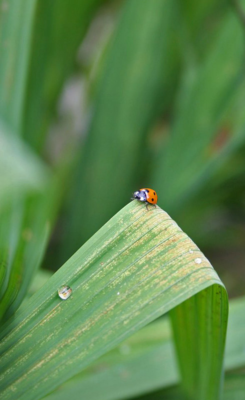
With my particular tastes (and yours may well differ), one thing I would be inclined to do with the first three is to reduce the highlights. Here on the right you can see the effect of doing that for the first one. I have done this for the other examples shown below. (I've also sharpened them all slightly.)

NOT MY IMAGE 1 - gtcas1976 ladybird 1 - Highlight reduction by
gardenersassistant, on Flickr
Bryn has made some suggestions about cropping. That is another thing which can have a big impact on an image. There are some rules of thumb about cropping - you may want to look up "Rule of Thirds". I would take notice of these - they are often helpful. But not always. Sometimes it pays to do something that goes against one or other of these rules of thumb because there are other considerations that have a stronger impact on the image.
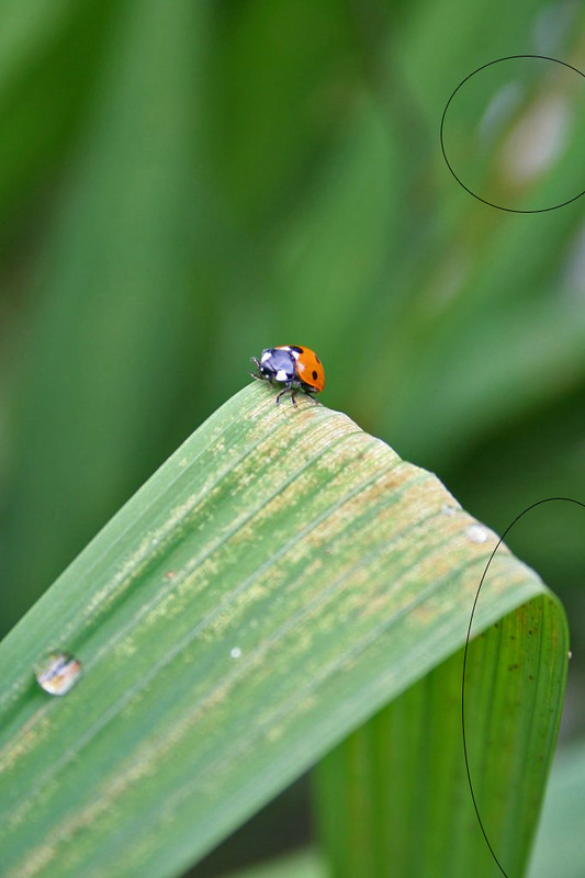
Let's look at the second image. Here it is, uncropped.

NOT MY IMAGE 3a - gtcas1976 ladybird 2 - uncropped by
gardenersassistant, on Flickr
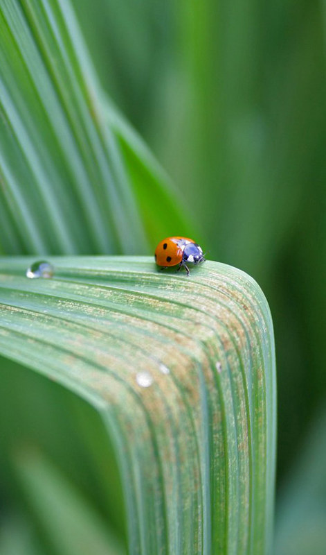
One of the rules of thumb, with animals, is that it is often best not to have the subject right in the middle of the frame, as is the case here. It can look better to have the subject looking, and/or moving "into the frame", which in this case would mean having it more towards the right, like this perhaps,

NOT MY IMAGE 3 - gtcas1976 ladybird 2 - Crop2 by
gardenersassistant, on Flickr
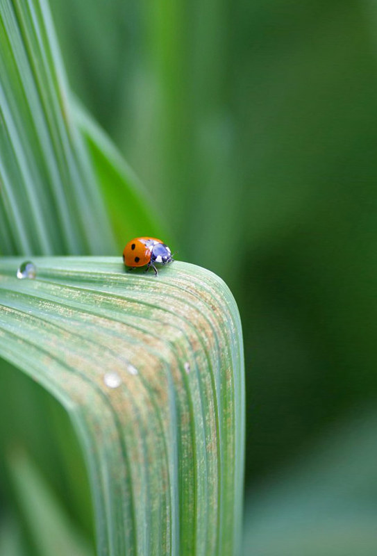
or this,
NOT MY IMAGE 4 - gtcas1976 ladybird 2 - Crop3 by
gardenersassistant, on Flickr
I tend to look carefully at the backgrounds when deciding how to crop. In this case I really like the backgrounds and so I don't want to remove too much of them. As an example of how differently people can view images (and you really can't please all the people all the time), Bryn sees the top of the images as negative space, of which there is too much, whereas I see it as positively contributing shapes that to my eye enhance the image, which is why I've gone for a taller, thinner crop in the second version above. In fact, I like the backgrounds so much that in this case I'm very comfortable with the original, despite the central placement of the subject. That doesn't trouble me in this case, because I get a real feeling of the ladybird being there, out in the open, with a big environment all around it,
Bryn mentioned rotating the third one. A good point. The problem is that if you rotate the image you have to crop it to get rid of empty areas in the corners, and you end up with something like this,
NOT MY IMAGE 5 - gtcas1976 ladybird 3 - Rotate2 by
gardenersassistant, on Flickr
Here the subject is (just) "on the wrong side", as it is "looking out of the picture" rather than looking in. Perhaps what one might prefer is something like this,
NOT MY IMAGE 6 - gtcas1976 ladybird 3 - Rotate, Stretch 3 by
gardenersassistant, on Flickr
but to get that (without cheating like I have here
")
) you would need to have captured the image with an eye to the the composition. FWIW, I often (when the subject lets me) capture different compositions to have some options to play with when selecting and processing the images.
For the first image, I couldn't find any alternative crops that I liked the look of any better than the original. This has to do with not wanting to truncate the shape in the top right or to cut off the edge of the leaf at the bottom right. As always, this is personal taste, and yours is as valid as mine or anyone else's. We all quite literally see things differently.
NOT MY IMAGE 2a - gtcas1976 ladybird 1 - Not wanting to crop by
gardenersassistant, on Flickr
As to the flower, it too is very central. That can work fine with flowers, but for my taste if the full emphasis is going to fall on the flower, like it does here with it so central and big in the frame (rather than having it a bit smaller with an environment that sets if off nicely), then I'd prefer to see more of it in focus, which would mean a smaller aperture (and a longer exposure and/or higher ISO). Depending on the conditions (breeze, light level, and whether shooting hand-held or with a monopod, tripod or similar), that might or might not be practical. And in any case it might not be to
your taste, which is what matters here. (And a lot of people generally prefer a narrow depth of field, where only a relatively thin "slice" of the picture is in focus.)

