South Wales Coast (Update 05/03/11)

Messages
2,162
Edit My Images
Yes
1
5351721292_49d020c523_b.jpg

2
img596c.jpg

3
img597c.jpg

4
img598c.jpg


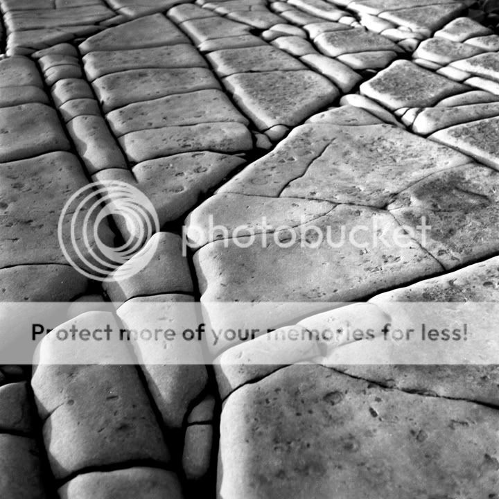
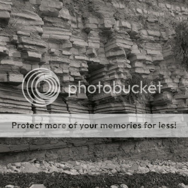
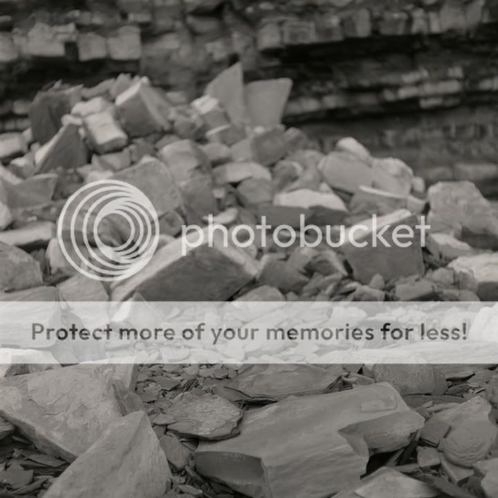
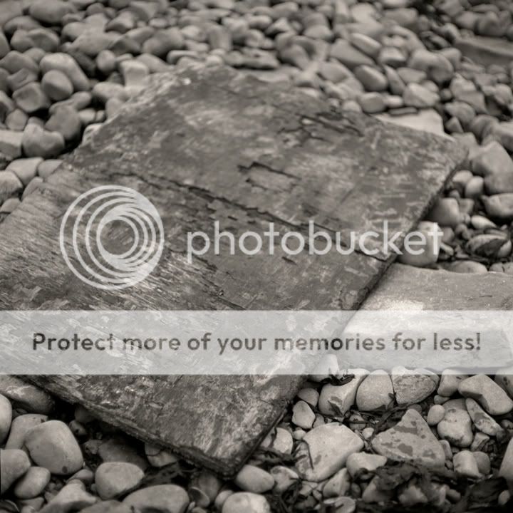
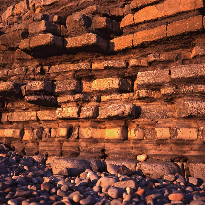
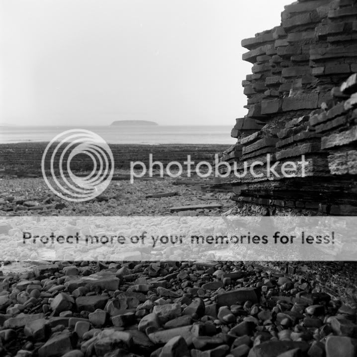
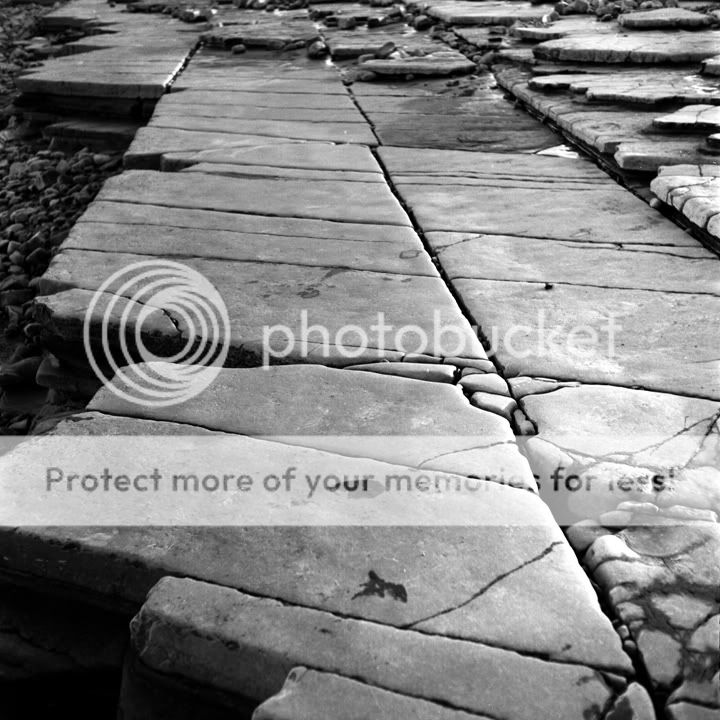
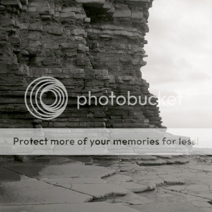
Mamiya c330 / panf 50

I have found a decent bit of coastline close to Cardiff so I am going to start a small project on photographing the area. The idea is to go use a variety of formats as I am thinking of making a pinhole camera (maybe 5x4)

Love to know what you think so any crit appreciated.
 
Last edited:
Cheers Adrian, well its on the same coastline just a bit further down. I might try a similar image when its high tide to show how it differs.
 
I'll be honest with you, only the last one does anything for me. I can imagine it printed onto square canvas and stuck on the wall of some trendy restaurant. Highlights in the top-right are a bit harsh though.

The first one is too low contrast for me. The lack of contrast comes across to me as less atmospheric and more boring.

The second and third ones are also boring to me. Much better tonality than the first, especially the third one, but I think neither of them really has much in the way of focus (not technically speaking of course) as in, I'm not sure what is supposed to be getting my attention. That's the beauty of the last one actually, it works as a whole without needing any distinct subject - a feeling not found in the third one.

Looks like an area with plenty of potential though, I'm sure that once you've scouted it out and taken many more photos, you'll have some good stuff. I still look forward to seeing some results from your project.
 
The first two seem to be your style to a T. Minimalist composition and very smoooooth textures and shades. I like them, although they seem a little bit too bright on my monitor.

The bottom too are also very nice, something a bit different, but nice studies of what looks like a great spot. Should make a good project. Will you be adding more to this thread as you progress, or is this going to be a mainly darkroom-wet-print project?
 
I'll be honest with you, only the last one does anything for me. I can imagine it printed onto square canvas and stuck on the wall of some trendy restaurant. Highlights in the top-right are a bit harsh though.

The first one is too low contrast for me. The lack of contrast comes across to me as less atmospheric and more boring.

The second and third ones are also boring to me. Much better tonality than the first, especially the third one, but I think neither of them really has much in the way of focus (not technically speaking of course) as in, I'm not sure what is supposed to be getting my attention. That's the beauty of the last one actually, it works as a whole without needing any distinct subject - a feeling not found in the third one.

Looks like an area with plenty of potential though, I'm sure that once you've scouted it out and taken many more photos, you'll have some good stuff. I still look forward to seeing some results from your project.

Thanks for taking the time to crit, the last one was the image I was most excited about but it doesn't look near as good as I imagined. This is one of the problems I am having in b&w, its soooo much harder than colour but I love a challenge.

The first one is my fave but that because I love less, the sun had set which had probably caused the lack of contrast. I will probably have another go form the same position but when there is some light.


The first two seem to be your style to a T. Minimalist composition and very smoooooth textures and shades. I like them, although they seem a little bit too bright on my monitor.

The bottom too are also very nice, something a bit different, but nice studies of what looks like a great spot. Should make a good project. Will you be adding more to this thread as you progress, or is this going to be a mainly darkroom-wet-print project?

Thanks for the crit, I find the second one a bit to busy :D 
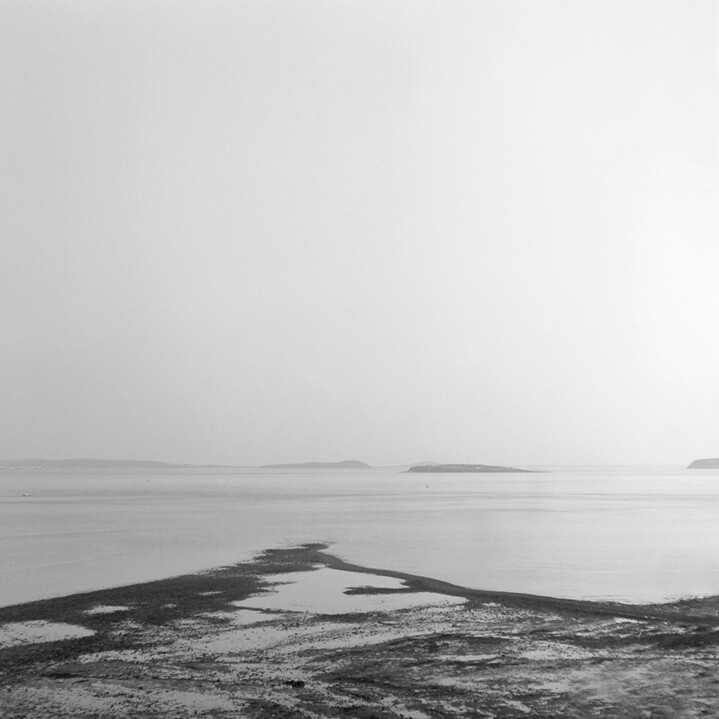
But I feel this view has some potential, I just love the islands in the distance gives you something to find when looking at the image.

I will might add to this thread as it will be interesting to see if I can improve my b&w. I will be making some prints but they will probably by chucked in a cupboard never to be seen again :(

I want to try and use a variety of formats as I have become a bit of a fan of pinhole images, so we will see....
 
I like the minimalistic style of the first image, its the 2nd one that does nothing for me I find it lacks interest.

3rd and 4th are good, like the texture and lines in the stones you also have some nice tones there as well.

I tired Pan F on some architecture and portraits a while ago but I find its to black,white graphic for my taste. I am going to try Kodak Tri-X.

On the note of minimal landscapes have you seen Micheal Kennas work from Japan?
You find it intesting if your sooting around the South Wales coast.
 
Thanks for the crit Nick, I agree with you on panf as it doesn't really do grey. I am going to now shoot tmax which I believe is similar to tri-x.

(Off to view Micheal Kennas work....
 
Love the last two, not had chance to play with PanF but have some ordered.
1st one is a little to minimal for me and the second lacks some interest, but what do I know.

Mart
 
I'm another +1 for the first one, nice minimalist feel to it, though I'd probably have treid to hold some more tone in the top right hand of the frame - as it stands, that's the lightest part of the shot and it draws the eye out of frame.

Second one, like the tones of the rocks, though I'd try and dodge the uppermost rock strata a little, and perhaps i'd have shot with a slightly narrower strip of rock at the RHS of frame, enough to frame the shot, but not enough to overpower.

The third and fourth are all about lines and tones, and I really like them. Again, I'd try and burn just a little overall tone into the (apparently) slightly blown highlights on the edges of the slabs bottom right in #3 and top right in #4, but after that if they were mine, they'd be printed. BIG!.
 
5
img607.jpg

6
img610c.jpg

7
img611.jpg

8
img612.jpg

9
img616.jpg

10
img617.jpg


mamiya c330
Kodak tmax 100
Tmax developer (24' 6 mins)

Some from last week, I am defiantly going to be shooting tmax more often! I took my time over developing and the negatives came out really well so I am happy.

Any c&c appreciated
 
Last edited:
That's a nice bit of coast you've found there Liam. Should keep you busy for a while exploiting its potential. I really like the close-up shots in the second batch, they engage me more as a viewer and draw me into the image.
 
Cheers guys, its an awesome bit of coast. There is an island a bit further on (sully island) which is suppose to be even better but can only be reached at low tide.


Canon AE-1 / t-max 100

I will hopefully get out more this month....
 
Last edited:
3 & 4 stand out for me, with 4 being better as it excludes the pebbles on the left of 3. One thing that strikes me generally about the 2 sets of photos is that many of them look as though the might benefit from an increase in contrast, but that's a personal thing and may not be what you were looking for. As I'm assuming they've been scanned, perhaps worth playing with the contrast and seeing what you think? The other thing is that number 4 is a gift for a rainy day when there will be all sorts of light reflections from the wet stone, so maybe keep that in mind.
 
13

f5.6 1/125th

14

f11 1/125th

15

f8 1/125th


I just got a colour roll of film back from peak, perfect even though the its from 97! Fuji Provia 100 on a mamiya c330, I really need to bring my 5x4 up here....
 
LOVE the bicycle one, that's a fine art print if I saw one
#13 has great colours too!
 
Always gotta be B&W for me if its film!
Love the shots,
Like the first posts the best, similar to some I got from greece.
Like the minimalism. Try them in a set all next to each other, they would all support each other :)
 
Back
Top