

- Messages
- 1,502
- Name
- Ian
- Edit My Images
- Yes
Decided to go with my friend for a trip along the Suffolk coast to do some photography. Ended up in Southwold around sunset time and we both realized out mistake of being somewhere east facing meant no good sunset to capture. But came away with a few shots I have processed. Open to critique to help me improve my photos
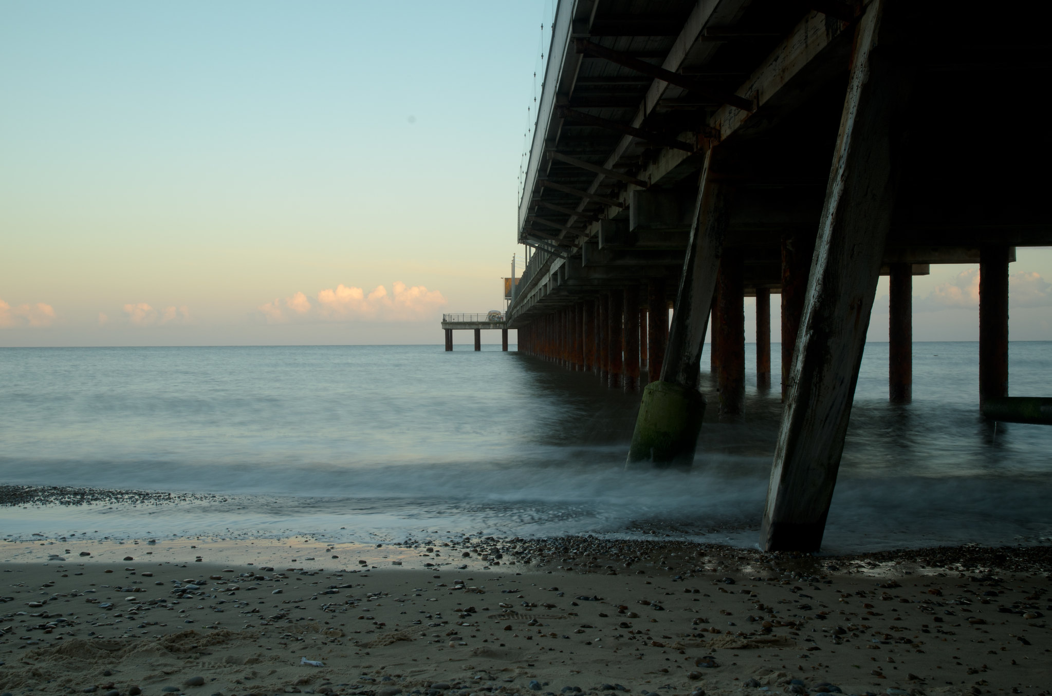 Southwold pier2 by Ian Diplock, on Flickr
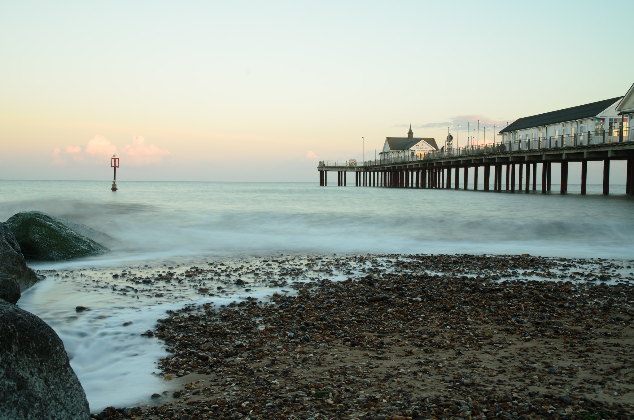 Southwold pier by Ian Diplock, on Flickr
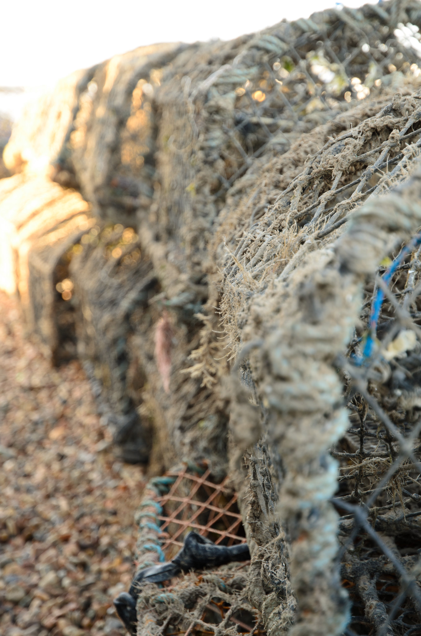 Lobster nets by Ian Diplock, on Flickr
Southwold pier2 by Ian Diplock, on FlickrSouthwold pier by Ian Diplock, on FlickrLobster nets by Ian Diplock, on Flickr") The colours look nice in this picture and I like the stones that frame the image from the left, nice balanced composition. On the other hand the same colours don't work very well in the first image, the dark structure on the right side dominates the frame. I think it would probably work better in B&W, the composition with the pier lines pointing towards the frame's centre looks already fine.
The colours look nice in this picture and I like the stones that frame the image from the left, nice balanced composition. On the other hand the same colours don't work very well in the first image, the dark structure on the right side dominates the frame. I think it would probably work better in B&W, the composition with the pier lines pointing towards the frame's centre looks already fine.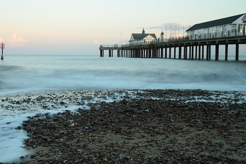 Southwold pier3