Stop the fight - it's all over. *Warning - BLOOD on show*

Messages
3,238
Edit My Images
Yes
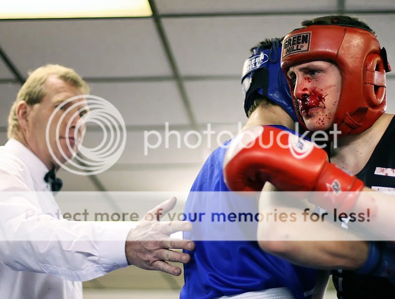
Last few seconds from a fight I covered. Poor chap. They cleaned him up and he went back for more but the ref called time on what was a broken nose, according to the doctor on site.

Ignore the WB - long story. See other boxing thread dated 1/2/2007.

UNi_PT_Boxing0040.jpg


UNi_PT_Boxing0047.jpg


UNi_PT_Boxing0042.jpg


UNi_PT_Boxing0041.jpg


UNi_PT_Boxing0046.jpg


UNi_PT_Boxing0043.jpg


UNi_PT_Boxing0044.jpg


UNi_PT_Boxing0045.jpg
 
superb shots, but brutal , hope you didn't get any blood on your camera...OMG that blood looks like its from an artery, that poor guy obviously isnt enjoying his hobby.
 
He looks a bit of a mess in that last one but the main thing I see is disappointment on his face.

More great pictures :)
 
Agree with Robert, I guess the red guy was taking a beating - and it shows in more than just his wounds, great set
 
1 and 3 are the strongest Diego, good set but not sure about #2, it looks like it's all OOF but I see what you were doing.
 
Ouch!! Great shots.
 
A cracking set there - lovely sequence. Nice to see a bit of Dewhurst for a change (a well-known chain of Family Butchers in the UK to all those non-UK members).

Yes, it's a Sport, you wimps. No-one's forcing them to be in that ring. Better there than doing crack in a stair-well somewhere and robbing people's camera kit to pay for the habit.

These are crying out for a very contrasty B&W treatment.
 
As a ex boxer i felt theses pics
great set
 
good set, monotone it man!
 
Hi, have you tried a B&W conversion on them yet? Would give them more of a feel to them. Would be interesting comparison.

cheers
Iain
 
Here you are then. These have been archived now as not that bothered about them to be honest. Neither here nor there, the two sets of lights were giving my WB nightmares and the celing looks pants.

That said the club in question are delighted with what they got and I welcome to shoot every event for my new project.

Here are some black and white -

UNi_PT_Boxing0044.jpg


UNi_PT_Boxing0040.jpg


UNi_PT_Boxing0042.jpg


UNi_PT_Boxing0041.jpg


UNi_PT_Boxing0043.jpg


UNi_PT_Boxing0045.jpg


UNi_PT_Boxing0046.jpg


UNi_PT_Boxing0047.jpg
 
They look great either way,but in colour it captures how brutal boxing can be.
 
Now see I think they are better B&W, gives them more 'punch' :D
Take no1 in colour and its equivilent in B&W, you notice the boxers face and eyes, his expresssion more than when its in colour. You don't need to see the red of the blood to see the brutallity in the photo.

cheers
 
Great shots Pete and definately better in colour.(y)
 
Back
Top