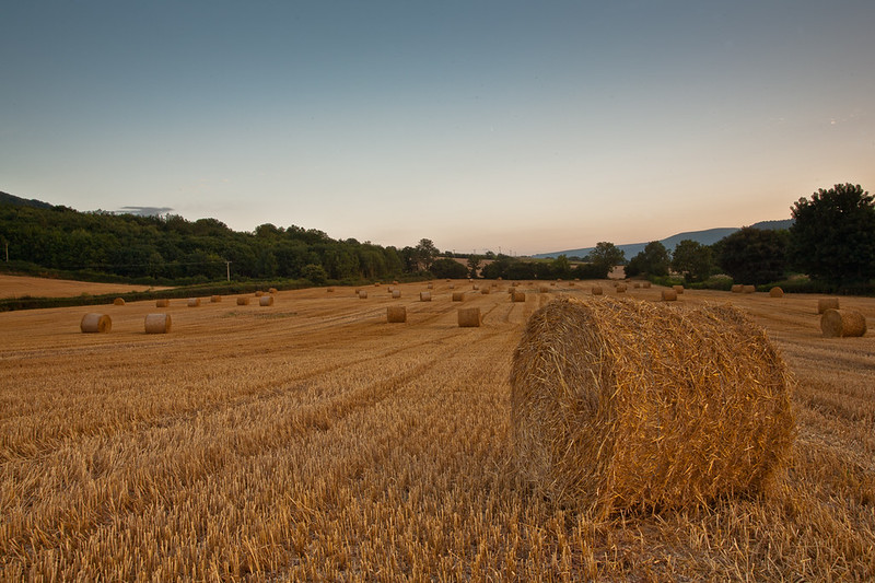
Assuming that the subject is the straw bales, then they are rather lost in a scene of low contrast and almost uniform colour. The outline of the large bale merges in far too much at the bottom, especially on the left hand edge. Increasing the contrast allows the "tramlines" in the stubble to become clearer, and act as more of a unifying feature.
I think that the composition is stronger without the two bales on the extreme right hand side, and the telegraph pole just included on the extreme left.
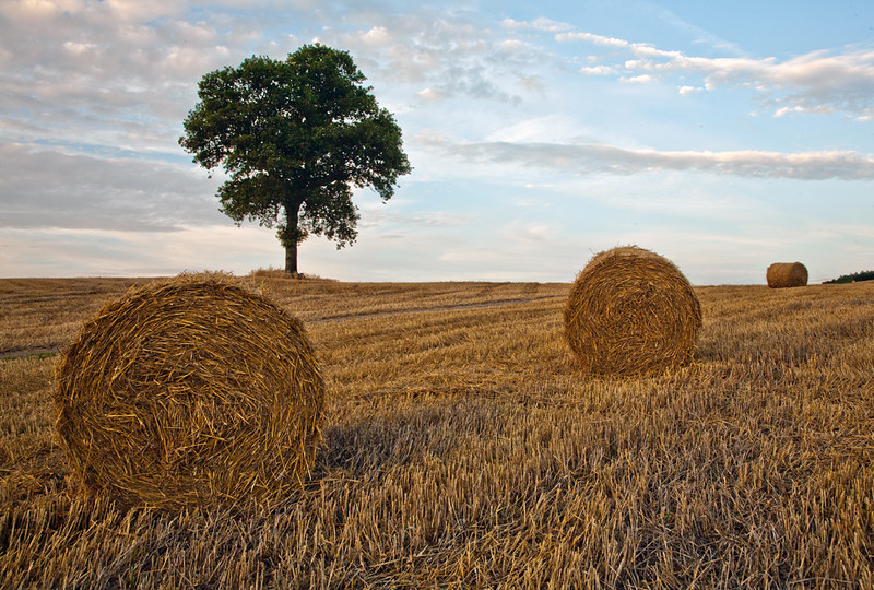
The sky as it stands suggests a coming storm, and the bales (save the one in the foreground, that seems to be off line to the rest) all seem to be scooting away for shelter.
If you feel that the sky doesn't add anything, you can always just crop it out.