You say stale and predictable, I say clean and consistent. No concerns about ultimate IQ or suitability for publication but a couple of nitpicky crit points:
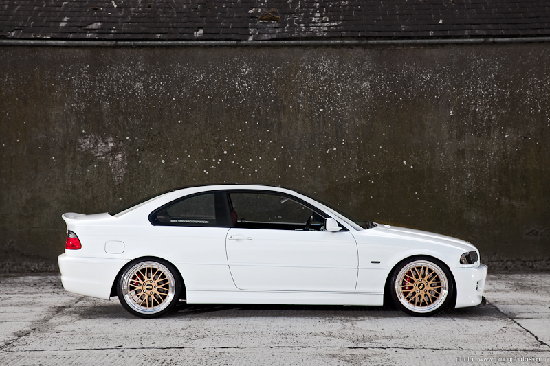
1) I'd expect to be able to read the text on the side window. Maybe it's a web resize/ sharpness issue or maybe the sticker itself is not that clear?
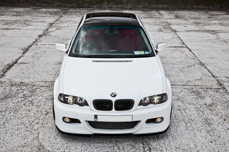
2) Permits in the windscreen. Also, not sure you got the most from your polariser on the glass.
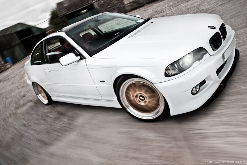
3) Like the setting but the presentation makes it look like the car's dropped in - I'm putting it down to the lighting/ lack of shadows on/ around the O/S/R wheel. The white window frame bothered me at first glance but it's all good now.
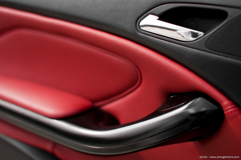
4) Interesting abstract, I always have trouble comping details like this but you've set up a nice shot. Wants a little more DoF though, even at this size.
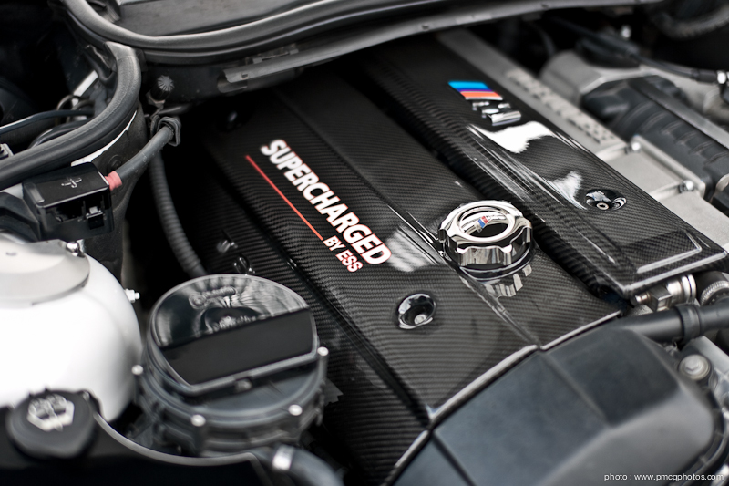
5) As above really, definitely needs more DoF - this car is lots about its engine, right? Think image size is losing some of the detail here, but there's nowt wrong with the light. Maybe a small black shroud handheld above the engine could have given you better clarity on the oil filler cap (I carry a black polystyrene pizza base to help eliminate unwanted reflections on shots like this).
6) Ground toning through car windows? Headlights look neutral coloured in this shot compared to slight tungsten yellow in #2. Loving the limited motion that's retained the detail in the setting.
Started off thinking you might have exposure blended these but not so sure now.

")
