Dangermouse
Squeaky Clean
- Messages
- 9,968
- Edit My Images
- No
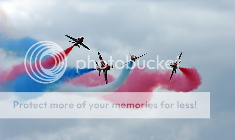
Still playing with some Red Arrows shots......any good, anything constructive appreciated")
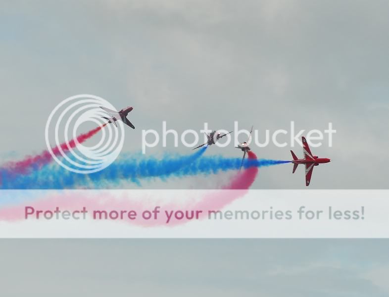

Too much dead space around the aircraft for my tastes, but you got the exposure correct.. nothing worse than seeing pics of the arrows badly exposed then the saturation and shadow highlight tool gone mad ruining the whole picture
must say I dont understand Viper saying
think it would look much better if you had caught the colour on all the hawks, not just the one on the right
am I missing some basic point??
cheers Chris
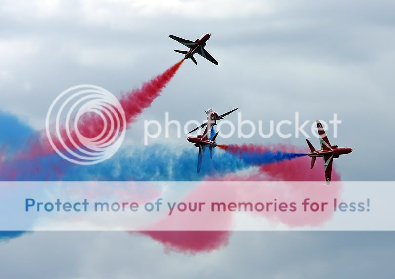
I assume he was talking about the fact that the Hawk on the right is bright red whereas the other 3 are a faded red due to the angle of the aircraft.must say I dont understand Viper saying
think it would look much better if you had caught the colour on all the hawks, not just the one on the right
am I missing some basic point??
cheers Chris
As Rob said, that is what i was referring to.
Peter, i just wish i was able to suggest how to improve it
