Critique Three from Acros SOOC...

Messages
2,820
Name
Mark
Edit My Images
Yes
Hi Mark

#2 for me , as a person who really doesn't understand film , is a corker...plenty of detail & none of the graininess I associate with film shots .Exposure looks really good , I know how difficult the light was in that room :clap:

Like wise #3....super detail in those posts & goof DOF (y)

#1 looks rather sinister to me but I like the way it forces you to follow the path in to the distance (y)
 
'Ello, of the three it's #1 for me. I like #2, nice detail and an interesting photograph. There seems to be some flare coming in centre right ?

The detail in the FG wood in #3 is really nice.

I like contrast between the outside if the oath and the inside. I like how the light seems to shimmer on some of the leaves on the floor and how you've composed it so the end of the path has been pushed right up into the top TRH corner.

Cheers.
 
Thanks everyone. Yes I agree the Beamish path is a little different, which is what I wanted!

Kevin you're right, the office shot does have low contrast, probably correctable if I understood reciprocity failure, zones, developing for greater contrast, etc etc etc, but actually I quite like it that way. I think it enhances the tranquil feel a little. Of course I could fix it in Lightroom, but wanted these ones to be SOOC.

Andy, yes there is a little flare, from a very bright window to the right.
 
I'm trying to improve my critique (and as a consequence, my appreciation and understanding of what makes a "good" photo IMO) so please feel free to critique my critique or ignore it as you wish, I don't mean any offence by any of it :)

#1 is a little dark for me, there's a lack of context to where the trees stand. The dark area leads the eye to the path in the distance but I'd have preferred to have a hint that the path was there, otherwise you only see it when you look further into the image and for me that was on the second viewing as my first impression was to scroll past it. That might well have been exactly what you were intending, of course. I like the contrast to the light grass in the background and the image might not be as dark were I to view it on a decent monitor instead of this one at work, the constant bugbear of digital presentation which somewhat negates the desire to show the images SOOC. That could lead to a discussion on whether you could ever have a film image SOOC given that different developers have different impacts on the negative but that's a subject for elsewhere.

#2 is a very strong image, low grain, great detail and I like the flare from the right as it shows a window spilling light into the room, further enhanced by the shadow area over the books being where the edge of the window funnels the light. Tranquil, as you say above, and rather timeless. Pick of the set for me.

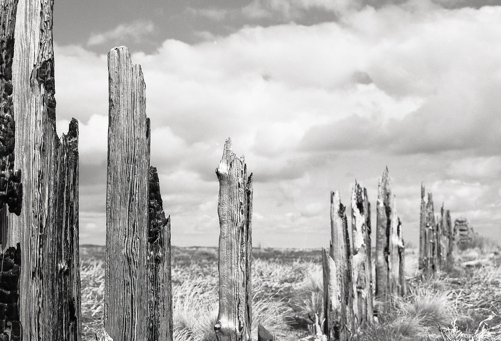
#3 is a good image with a couple of flaws; the positioning of the posts doesn't form a line leading the eye rather than a wall blocking access to the landscape beyond. Admittedly, that landscape does appear rather flat and lifeless but the later posts don't have sufficient detail to compensate for that. Expanding on that note, the zone of in-focus (must be a better name for that which I don't know) appears to end in the gap between the third post on the left and the next post along. I find that a little jarring, I'd have preferred to have the post after the gap in focus or the one before just going out of focus to provide a smoother transition.
 
I pretty much agree with Dean. The first one is way too dark for my taste, and the transition to the lighter areas is too rapid, so it suffers from no greys. The composition is nice, but it might be good to have something the eye is led towards?

Second is the pick of the bunch for me. Nothing much to say, except that there are some problems with verticals, I would probably have tried to make that middle edge vertical and accept some leaning on the one to the right. But then they wouldn't have been soos (s for scanner)...

The last one, there is a problem for my eye in that it is inexorably led by the composition to the taller post on the right, and that's out of focus. The are a few elements in the cloud that tend to lead me back around, but I keep sliding back there. That said, as others have noted those left hand posts are corkers.

Altogether this is a very nice set.
 
It's the high contrast and unusual composition of the first one that makes it for me. Tension and release - the claustrophobic feeling under the trees, and the release of the sunlight outside. With a less dramatic boundary between light and shade, and a more conventional framing, you'd "just" have a nice shot of some trees.
 
Thanks, especially for the detailed feedback :)

Number one is my fav of the three. I know it's Marmite, and unconventional, and that there are elements there that could have been brought out, but I wanted a graphic image; to me it's not an image of trees, or a path, it's just a nice shape on the "paper". I think more mid tones would ruin that.

Number two I almost rejected, but I'm really pleased with it. Yes it does need a straighten, and the flair can be seen as a good or a bad thing, but it does capture the feelings I got from the place.

Number three does have all the issues mentioned, but again it's the tones I like; it's got a silver feel to it (from the orange filter). I've got a few quite heavily processed digital shots of these posts that I lilke too, but I'm yet to find a really satisfying composition. The surrounding landscape is beautiful, but featureless.
 
Last edited:
PS, number one really shows film off to me. I know it's missing detail in the shadows (though that does depend on your monitor), but with digital I'm sure it'd have been either black in the shadows, or blown out in the highlights, or both. This version was stopped down two stops, yet still does have shadow detail if I chose to bring it out.

Film is truly wonderful!
 
Last edited:
Back
Top