Trotternish Ridhe circa 2013

Messages
489
Name
Julian Elliott
Edit My Images
No
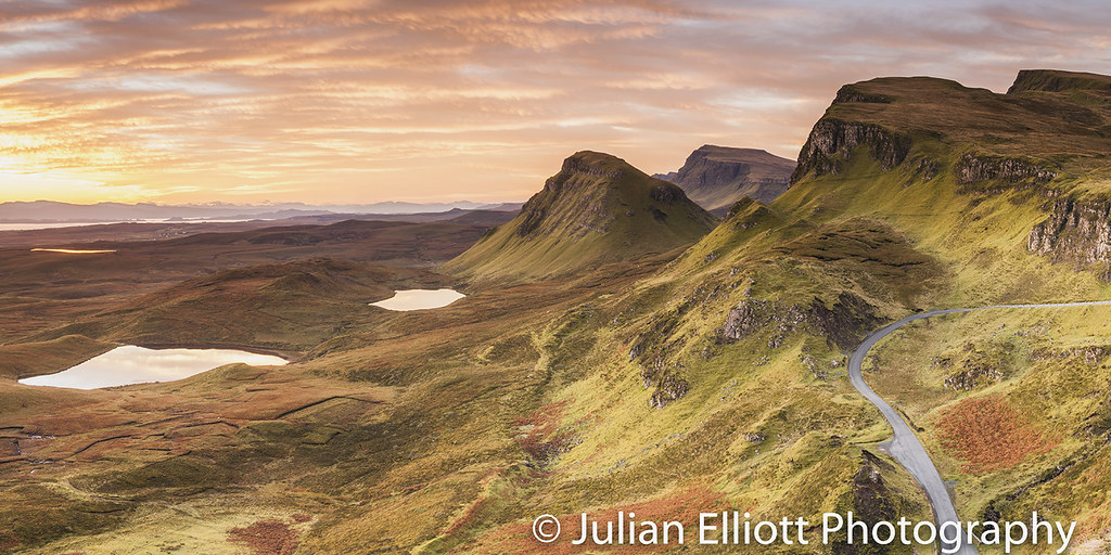
Was up on the Isle of Skye back in 2013 with my father-in-law in tow. Our first day started well ;)

15493799_721433131356909_3762112342239766077_o.jpg
 
Looks good conditions and composition wise but the processing is quite severe here. I would also note that using grads are great but the top of the ridge is very heavily darkened due to using them. The light just wouldn't have fallen like this.

I've seen your site, you've got some good work on there but this isn't upto the standard you present on your persona/commercial site.
 
Fair enough. All down to how I feel at the time processing wise.

I wouldn't say the processing is sever at all! It's mainly just a typical s-curve that has been applied. And the grads I'm not sure I agree on. This was October so the top of the ridge would have been in shadow as the sun isn't falling on it.
 
Looks good conditions and composition wise but the processing is quite severe here. I would also note that using grads are great but the top of the ridge is very heavily darkened due to using them. The light just wouldn't have fallen like this.

I've seen your site, you've got some good work on there but this isn't upto the standard you present on your persona/commercial site.

Overall it is a nice scene and a nice sunrise, but I have to agree with Steve. The trouble is there is quite obvious overexposure on the left in the sky, and this had a knock down effect while editing on the rest of the image. Its a case where you would do multiple exposure blending, since pretty much no grad filters will be enough (except in case of underexposure). You could probably sort out the problem area with all sorts of photoshop trickery recreating the sky.

I can see more flaws on the right, as the top of the ridge is darkened very heavily. In contrast the bottom of the frame is arguable too bright. This is what you would expect from a typical heavy ND grad filter. You could sort this out doing selective burning and dodging. Or you might just join the blending camp. I got fed up fixing photos from filters and replacing those things.

Probably the easiest thing to do is to crop some from the left.
 
There is not much you do about the overexposure. I was once told by a certain well known landscape photographer that at times it can be best to just it to go paper white.

I think if it was done with multiple exposures then it would run the risk of looking too much.

Probably another image to divide opinion.

Edit:

This might be more to people's taste.

31537507142_4dfd50f625_b.jpg
 
Last edited:
Yep, definitely like that 2nd one! Very nice! :)
 
Yep, definitely like that 2nd one! Very nice! :)

Thanks! Crop is tighter so as to remove the burst of light to the left. Ever so slightly brushed the right hand corner people found distracting so it looks more even.

You know what annoys me though? That road!
 
Looks good conditions and composition wise but the processing is quite severe here. I would also note that using grads are great but the top of the ridge is very heavily darkened due to using them. The light just wouldn't have fallen like this.

I've seen your site, you've got some good work on there but this isn't upto the standard you present on your persona/commercial site.

:plus1:
 
Justin it is a really nice scene. You have obviously progressed a lot since it was taken. Processing wise it is so easy to fix that second edit (which is the best one). @SFTPhotography and @LongLensPhotography do have a point IMO, you may not accept it but try this on your computer and see what you think?

Firstly, colour correct the shadows. Open a levels adjustment layer and hold alt down and drag the black point up to identify where the clipping begins. Reset to zero and zoom in to the point, which are the rocks on the right hand side top of frame. With your info palette open repeat the black point slider with alt trick to identify the darkest pixel in that area. Again reset it, but remember where it is and click on the back point dropper and hover over it. On the small JPEG there is one that reads 10, 5, 0 (R,G,B). Click on this and it will pull the colour channels down to black evenly. This reduces the predominantly red cast to the shadows and makes the image more pleasing, the reds of the highlights then contrast with the more neutral shadows then. If you want to push the midpoint over to the left about 1.05 so the image is not darkened you can do.

Next, and this is Steve's point I believe. Create a curves adjustment layer, click on the curve about 3/4 up, so 191 and drag it down so you can see the effect. Then click on the mask and click 'g' for the gradient tool and whilst holding shift so it is level with white on top in the tool palette drag upwards to create a medium hard edged grad just beneath the middle of the image. Tweak to suit. Then open up the curves box again and play around with the adjustment point. Or if already heavy then fade the opacity of the layer.

I'm sure you know how to use photoshop so I may have been rushing those points, I'd show you but you have edit my images set to 'no'. If you have any questions feel free to ask. There is a really good image in there :)
 
Justin? Why is it people always get me confused with the Justin's of the World? ;)

Thanks for that Craig!

Progression. You would hope that any photographer worth his/ her salt would progress in three years. Everyone is learning all the time. But something that is more difficult for me as a pro is finding the time to sit down and just S T O P! There are a number of things on my "to do" list but normal workloads get in the way. Even the last two months I haven't been travelling all I've done is sit down and plough through some work that had to be pulled out of one image library to go into another.

Photoshop. Do I know it? Not inside out but right now I know what I need to. Like all things it's something that I like tinkering with but to me as soon as it starts getting as you described above then it's just too much. Which leads me into workloads as travel photographer.

I would love to have the time to sit and tinker but if you take this year as an example it just is not possible. When I go somewhere for a week or so I invariably come back with at least 150 images that should be saleable. I have to get those images worked on ASAP and off to the image libraries as my next time away is usually schedule for 3 to 4 weeks afterwards. If time lapse sequences are in there too it makes my time dwindle to nothingness.

Given current workloads I think the next time I just might be able to schedule sitting down for myself would probably be 2019 ;)
 
PS Steve. Just taking a moment to read some of PS stuff. Don't you use the Threshold to see your blacks and whites? That's my preferred method. And if you're really going for it using a solid layer + threshold to find the midtone?

If I was colour correcting to 5% black where the blackest black is set to to 12/ 12/ 12 and white at 95% this is how I do it.
 
Julian, it just looks unreal to me - and not in a good way. The second version may be slightly better to my eyes, but even there, where are the shadows?

Photoshop trickery is all well and good but an image needs to have more of its roots in reality than either of these do as far as i'm concerned. Sorry.

There may be a good image in that RAW file somewhere but I wouldn't know where to find it.
 
Jerry. Are there not times when you've been out and the sky has been unreal?

A week ago I was stood on a bridge in Paris and the sky was just unreal. Totally red. So red that you could see on your hands the reflection of the red from the sky.

Is the image reality? Yes and I think it's one of those times when you just have to be there. One thing I do constantly is set my white balance to Daylight. Why? Because for a while I used Fuji Velvia a lot which produces exactly the same as above. How do I know? Well I would also take a digital image too and compare.

using normal colour correction techniques of correctly black to 5%; white to 95% and then ensuring the greys are 50% this is how it comes out.

I also need to look at how my work does at Getty and are people buying my images. Every month I sell in excess of 60 images so I must be doing something right.

31582142791_46190f45c6_b.jpg
 
A quick - 0.5 or so grad filter from the right bottom corner in Lightroom will do the trick.

Pretty much. Its all it needs. I would have loved a sky like that when i went. and I like the road, its a great lead in. You can walk (a fair bit) further round and hide it better, or go for "the tree" shot which IMHO is good one.
 
I think we're just going to have to agree to disagree.

The grad in Lightroom makes no difference at all. The road isn't, for me, a lead in line but from the position I was it's unavoidable.

I don't believe the land is that bridge relative to the time of day. The sun is already up and hitting the landscape therefore the land will not be in shadow but as I have captured it.
 
PS Steve. Just taking a moment to read some of PS stuff. Don't you use the Threshold to see your blacks and whites? That's my preferred method. And if you're really going for it using a solid layer + threshold to find the midtone?

If I was colour correcting to 5% black where the blackest black is set to to 12/ 12/ 12 and white at 95% this is how I do it.

I'm not on my computer so can't check if the final edit is any different but in the first 2 you have not colour corrected the blacks.You have simply set a threshold level, but when there is a colour cast to the image setting a threshold level will not fix it. The advantage of using the black point dropper (or the long winded method of pulling the black points in individually on the seperate colour channels one at a time) is that it pulls each colour channel back to black by the necessary amount. This makes the blacks neutral and the cast to the darker shadows is gradually improved too. I don't mind your image being red in the highlights but personally I think it is more accurate and more pleasing if the red cast is not there in the blacks and deep shadows. Colour separation is important, it allows the red highlights to stand out more with less saturation required because relatively to the darks they look redder if the blacks are neutral...

Julian, it just looks unreal to me - and not in a good way. The second version may be slightly better to my eyes, but even there, where are the shadows?

Photoshop trickery is all well and good but an image needs to have more of its roots in reality than either of these do as far as i'm concerned. Sorry.

There may be a good image in that RAW file somewhere but I wouldn't know where to find it.

It is not photoshop trickery Jerry, it is using a dark grad on the lower part of the image to correct the over gradation of it in capture. If you wanted more roots in reality then don't use the grads so strongly in the field then you would not need the additional PP work.

A quick - 0.5 or so grad filter from the right bottom corner in Lightroom will do the trick.

This is the short version of what I was trying to say reference the curves layer!

I think we're just going to have to agree to disagree.

The grad in Lightroom makes no difference at all. The road isn't, for me, a lead in line but from the position I was it's unavoidable.

I don't believe the land is that bridge relative to the time of day. The sun is already up and hitting the landscape therefore the land will not be in shadow but as I have captured it.

The grad in post makes a objective difference in making the image more accurate, it also makes a subjective improvement for me in making a fuller image with colour depth and contrast of tones.

It's not that the land is bright compared to the sky, it is that the 'shaded' side of the land in the bottom part of the frame is brighter than the 'shaded' side of the land in the top of the frame.

Is the image reality? Yes and I think it's one of those times when you just have to be there. One thing I do constantly is set my white balance to Daylight.

I also need to look at how my work does at Getty and are people buying my images. Every month I sell in excess of 60 images so I must be doing something right.

Totally agree with your point about having to be there. I have seen some ridiculous skies and people look at them and say 'really?!' and you think well if you got out of bed earlier there is a better show on earth some mornings than you will ever see on the tv!

You are obviously doing something right to be a working full time photographer. Advice on the internet from others is tricky, they are a good bunch here on TP and nothing is said with any malice, it is just people trying to offer the help they know they would appreciate receiving themselves if needed. I want people to critique and other alternatives to my photos, I will then try the ideas out to see if they fit. Sometimes I don't appreciate the validity of the advice until some time later to be fair. And as this is the internet sometimes the people offering advice are incorrect, but I encourage you to be open minded.

Cheers Craig.
 
Last edited:
Hi Craig 85

You are absolutely correct in that the first two were not colour corrected. As mentioned before, if I had the time then everything would be colour corrected but it just doesn't work that way when you have to work to do as well as trying to fit in a family as well. My afternoon has been spent keywording images so this gives me a break.

Grads. They do what they say on the tin. They are there to balance the foreground light against the background light. Some of us use them and some don't. I prefer to use them to create an image that I see in front of me "in camera" because coming home and spending an hour or so in PP is not a good use of my time.

A number of years ago I showed a young friend of mine a photo shot on Velvia. He saw the actual slide and his exact words were "Wow, it looks like Photoshop!"

The bottom corner. Still don't see an issue myself but it's subjective. Looking back on Photographer's Ephemeris that bottom corner would have seen the light before the land at the top. Without going back in time there is just no way of arguing this.

Getting up. I think this is the one thing that frustrates me at times when people will verbatim say "you photoshopped that sky in." Just the other day there was an amazing sky here where I am in France. Could I go and get it? Nope but the kids getting to school on time was more important. When I used to live in Salisbury and stand by the Water Meadows on a gorgeous morning the amount of people that pay no attention at all to the spectacle that is produced by nature would be unbelievable.

Lastly. I am very open minded and I also respect others opinion. But it has to work both ways and at times people have to respect the wishes of the photographer. I've recently come across an Italian photographer's work. Very nicely done etc but I just find his images a little on the dark side. But that is his choice and not mine. By the sounds of it he is doing well so obviously he is doing something right. Everyone has their own style and ways of processing and creating an image as to how they saw it.

As you say, I am full-time and this is my only way of working right now. Getty Images take nearly all that I do and have sold the images and time lapse in 40 countries and counting. That for me is the final judgement. If I can please the editing team and then the sales team are out there selling my work that is what matters to me.

I know forums are always going to be one of those melting pots and I did um and ah about joining. I don't regret it all though! Being a British born photographer who is based in France can be quite frustrating at times as for a lot of the time I am working on my own. At times I need somewhere like here just to keep my sanity otherwise I'm going to start talking to the walls!!!
 
Last edited:
I have to agree, the ground looks way too bright for that time of day. I have a shot of this same place, seemingly taken in similar conditions and at the same time of day, and it certainly doesn't offer the same brightness.
Its a lovely scene mind you, and the conditions look great, but personally, I'd prefer a bit more of the mood to show through in this rendition.
 
It is not photoshop trickery Jerry, it is using a dark grad on the lower part of the image to correct the over gradation of it in capture. If you wanted more roots in reality then don't use the grads so strongly in the field then you would not need the additional PP work.

Maybe trickery was not the best word to use here. I don't use PS myself , preferring Lightroom, but isn't there a saying about silk purses and pig's ears?

I don't believe the land is that bridge relative to the time of day. The sun is already up and hitting the landscape therefore the land will not be in shadow but as I have captured it.

The sun is indeed up and is shining intensely at a low angle from the half left. You really would expect it to be casting quite strong shadows.

You're obviously doing well to be able to sell plenty of work. From the couple of images you've posted recently it must be a "look" that people like but it's not for me.
 
The sun looks to be up but there is a possibility it was hidden by the cloud and hadn't given the shadows yet.

I have another pano taken 10 minutes later whereby the sun has cleared any cloud and the shadows are strongly etched on the landscape.

As far as the look. i'm not the worst I can you that. I have a friend who has been doing stock since the days when he was £20K a year TAX! And the way he does his images is definitely not for me as they look too processed. But he sells too via Getty and does well.

Doing well? Through hard work and graft yes. Not oodles of money but definitely a good wage. Don't let anyone tell you it's easy as it's not and especially so where demand for images is being outstripped by supply.
 
Back
Top