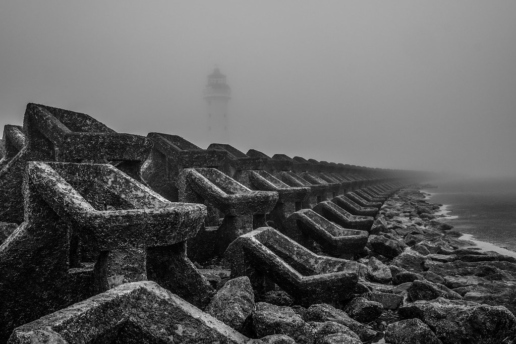
So in both images,
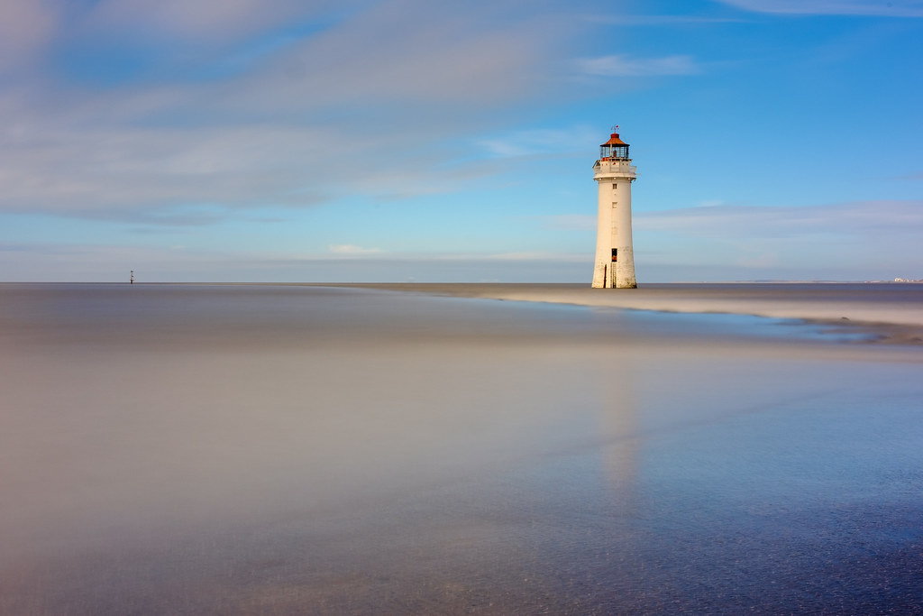
for me, the subject is the lighthouse.
And if that's the case, it's lost in the frame. I quite liked the people in this image, and when I clicked through to Flickr I saw the birds. And I think that makes a good composition that is balanced, and still has the subject in an important part of the frame. Green thing bottom left needs not to be there though.
View attachment 303629
As for the 1st image, I see so many landscapers that throw rocks at the foreground that it just turns me off. I don't think it's interesting or inventive, however there are a ton of YouTube channels out there telling you that's what you need. And I'm no more right than the next person because it's all subjective. It's like making a cake. If you follow the recipe you get the same as everyone else following that recipe (see the quote in my sig). But that's not your vision.
My advice would be to do exactly what you're doing. Take some time to ask yourself
why you're taking a picture of your subject. Once you know why, that might help with the composition. Perhaps it's the imposing nature of the lighthouse. In which case, it needs to be imposing in the frame and not lost in rocks or green things. If your subject is rocks or green things, then make them your subject and don't distract with a lighthouse...
Don't get me wrong. I've seen a billion photos of "that" lighthouse at the end of "that" path in Wales that all look lovely. And you may want that exact photo so that you can say "I was there. I took that". But I'm guessing your OP isn't about that, it's about finding your own vision. And for me, that begins with asking myself why am I taking the pic, and what is it about the scene that interests me? Once I know that, I can work with the rest.
The wildlife stuff on your Flickr btw has that I think. Maybe take the telephoto out with you to do landscape? Rockwell said that anything wider than 50mm means the photographer doesn't know what their subject is. Controversial, but it still made me smile. Longer focal lengths can give you more compositional options.


")