Critique Welcomed!
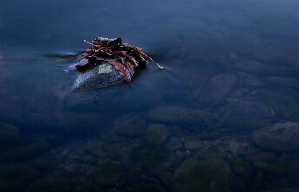
sirch Lu-Tze Admin Messages 104,485 Name The other Chris Edit My Images Yes 18 Nov 2018 #2 I really like the concept but for me it could do with a bit more vibrancy in the leaf colour.
ancient_mariner Messages 23,532 Name Toni Edit My Images No 18 Nov 2018 #3 Looks good to me, muted maroon/red against the blue of the water, nicely minimal with a centre of attention.
Looks good to me, muted maroon/red against the blue of the water, nicely minimal with a centre of attention.
OP hyakuhei Messages 1,732 Name Robert Edit My Images Yes 19 Nov 2018 #4 Thank you for the feedback, I'll revisit the PP and see how the leaves look being boosted a bit further
Thank you for the feedback, I'll revisit the PP and see how the leaves look being boosted a bit further
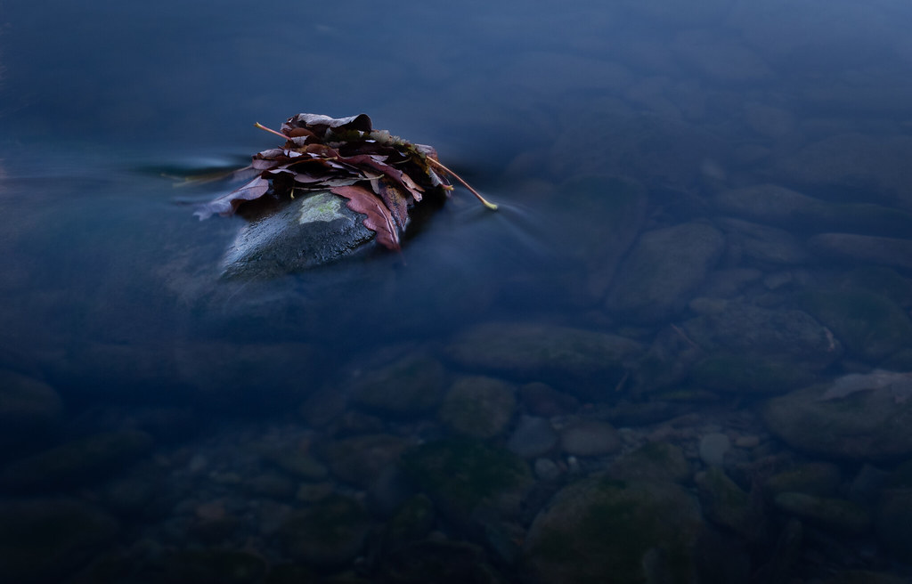
OP hyakuhei Messages 1,732 Name Robert Edit My Images Yes 19 Nov 2018 #5 Slight boost to the leaves exposure, saturation, deselection of the mossy dry patch on the rock and bottom edge which was getting overly bright
Slight boost to the leaves exposure, saturation, deselection of the mossy dry patch on the rock and bottom edge which was getting overly bright