website - shoot it down in flames..

Messages
30,364
Name
Neil
Edit My Images
No
after a general opinion on site layout please..

our website has always been a bit of a hash job as it was written about 24 hours before our first event lol

attempting to build version 3 now, which im hoping may last for a bit and was after a few opinions on rough layout.

things im aware of/going to change:

1) main logo - background colours dont match
2) "slideshow 1" etc - will be titled more appropriately
3) the right edge of the slideshow doesnt quite line up - open to suggestions on this, the iframe doesnt quite load right to the edge?
4) no SEO'ing present yet
5) the other pages linked off of the front pages arent setup, havent redone any of these yet other than litterally squashing them to the same width
6) the big empty grey space on the left is where the welcome speech/latest news is going..

otherwise as a rough idea of layout, what do you think? im thinking of restricting the page height as well as the width, good/bad idea?

LINKY

:help:
 
I like the header and menu bar part, very simple but I like that.:thumbs:

I would put the text that is next to the slideshow above it instead and make it bolder.
Then I would move the latest galleries down to just above the copyright info and make the slideshow bigger so that it fills the gap inbetween, as that should be the main focus of your page.

That's my unprofessional opinion, but just looking as a potential client.
 
First impressions are good, Neil.

One thing that stands out - and this is really for the non-savvy web user - is that your email link doesn't look like a link. To me it's obvious to run the cursor over it, but to casual users it might not be.
 
First impressions are good, Neil.

One thing that stands out - and this is really for the non-savvy web user - is that your email link doesn't look like a link. To me it's obvious to run the cursor over it, but to casual users it might not be.

okey doke.. that makes sense. i might replace it with a contact us page/form?
 
I like the clean simple look of the site.
Layout is easy on the eye.
The only criticism I have is that gallery area could be improved in terms of navigation. IMHO there are too many clicks required to get to the images. Maybe a simplified gallery home / index page?
 
As I see it you're using HTML frames to include major items of content such as the menu, however I think that would be better implemented as a server side include using PHP. Because browsers will render frame and framesets differently but if you re-implement it using a SSI all the work is done on the server and the client only gets one HTML page instead of a several.

For example instead of using:
<frame src="main.html" name="mainFrame" id="mainFrame" title="mainFrame" />

You could use in PHP:
include('menu.html');

The overall design and site layout looks good however so keep at it! Hope that helps :)
 
Looks very tidy. I would label the slideshows more clearly. i.e. rather than Slideshow 1, Slideshow 2, Slideshow 3 change them to "motorsports slideshow, equestrian slideshow, action sports slideshow"

That way your prospective clients will be able to view the slideshow most relevant to them.

Perhaps you could break the front page down that way as you've got three distinct customer groups. You could have the appropriate 'latest galleries', slideshow and link to purchase images taking customers directly to where they want to go.

It also takes a number of steps to get to the galleries, perhaps making those links a little more direct would help.
 
I like the clean simple look of the site.
Layout is easy on the eye.
The only criticism I have is that gallery area could be improved in terms of navigation. IMHO there are too many clicks required to get to the images. Maybe a simplified gallery home / index page?

it is an option in photocart to add a "latest gallery" section to the gallery screen, i took it out originally as it was screwing up a previous generation of the site. i'll have a look at putting it back in..

As I see it you're using HTML frames to include major items of content such as the menu, however I think that would be better implemented as a server side include using PHP. Because browsers will render frame and framesets differently but if you re-implement it using a SSI all the work is done on the server and the client only gets one HTML page instead of a several.

For example instead of using:


You could use in PHP:


The overall design and site layout looks good however so keep at it! Hope that helps :)

interesting, i never thought of that to be an option to be honest but i'll give it a whirl :thumbs:

Looks very tidy. I would label the slideshows more clearly. i.e. rather than Slideshow 1, Slideshow 2, Slideshow 3 change them to "motorsports slideshow, equestrian slideshow, action sports slideshow"

That way your prospective clients will be able to view the slideshow most relevant to them.

Perhaps you could break the front page down that way as you've got three distinct customer groups. You could have the appropriate 'latest galleries', slideshow and link to purchase images taking customers directly to where they want to go.

It also takes a number of steps to get to the galleries, perhaps making those links a little more direct would help.

interesting thought about having 3 front pages in effect.. i'll give it some thought.

thanks for the suggestions so far, all useful :)
 
Hmmmm..... could just be the lunchtime crawl on the net but loading times seem a bit excessive (45-50 secs for page to load) with eth slideshow taking another 10 secs or so after that.

With regards to the logo, the bold text is too close and almost bleeding together in places. Maybe a fraction more spacing between the charachters is required. Also the finer text is taking on usual colour swirls. Could be this works monitor, but it usually defines fine lines great for my cad drawings.

The menu bar line is too narrow. The bottom of the text characters are being cut off. the 'g' on blog for example looks like a long tailed 'a' with no curl, could it be a fixed height cell or even a set of images to fix the text heights?

Do you need as many levels in the structure of your galleries? I have just navigated down the motorsport route to find (IMO) a pointless 'Events' level in the menu. Maybe in future this will have more in it, but a menu option with only one choice isn't great.

What is the point in the line:

This gallery was added on 8 August 2009 expires on 14 July 2099
On galleries? Do you need to display the expires bit?

Is it possible for the user to change the number of thumbnails displayed in your galleries? or a 'display all'??? I personally don't like lots and lots of pages and prefer it all on one (or as few as possible). OK, so that's a personal pref, but still a comment :)

When navigating the galleries, can a thumbnail be shown as well as the text. If it was a random from within the subgalleries, then even better, but a picture as well as words would be much nicer and friendly. Text is cold and hard in this context.

Add your homepage link to your logo as a quick 'Return to home' just like this forum. It makes navigation easier.

As for the images & (C) info, can I suggest putting it vertical on images in a slightly more transparent nature (say 80-90% opaque) just to take the edge off it. I noticed on your ordering page (and others with smaller image) the text is cramped and looks harsh and pixellated. I understand you are protecting your work, but if rotated 90° then it could all be a uniform size (most of the time) and if the odd occasion occurs where it needs to be horizontal then make it so. The mild ghosting effect will help reduce the harshness and (noticeability of the) pixellation also ;)

Again, on your ordering page, you have an email addess for contacting you, but it is not an hyperlink. I suggest to make it one. It doesn't have to be underlined like days of old, but it's just nicer to see an email and know that if I wanted to, one click and you're there rather than open email, then retype or copy & paste.

On most pages you have a smaller image on the right side of the page, but not on the gallery. If you added an image and moved the 'continue to the gallery' link under it, it would sit better with your other pages. I would suggest instead of a photo, a graphical image to depict the gallery or an rrow 'This way to...' or maybe a billboard type image possibly (sorry, thinking out loud again....)

Umm.... I'll give it a rest for now, but I hope this was brutal enough for you :| Keep up the good work :)


PS One more thing, add copyright logo and year(s) to your footer text

K
 
Hi. I'm looking at the site in Browzar - the menu links are part obscured, some of the images on the rhs on pages look odd - sort of squeezed. Copyright bit in footer seems to end up with an odd line break.
Otherwise, with others comments, a pretty nice site.
 
Hmmmm..... could just be the lunchtime crawl on the net but loading times seem a bit excessive (45-50 secs for page to load) with eth slideshow taking another 10 secs or so after that.

could be peak usage, normally it loads in a second or two.. might also be that we had an event yesterday so people are checking if the photos are up?

With regards to the logo, the bold text is too close and almost bleeding together in places. Maybe a fraction more spacing between the charachters is required. Also the finer text is taking on usual colour swirls. Could be this works monitor, but it usually defines fine lines great for my cad drawings.

interesting.. what res are you browsing at?

The menu bar line is too narrow. The bottom of the text characters are being cut off. the 'g' on blog for example looks like a long tailed 'a' with no curl, could it be a fixed height cell or even a set of images to fix the text heights?

again interesting.. what browser are you running?

Do you need as many levels in the structure of your galleries? I have just navigated down the motorsport route to find (IMO) a pointless 'Events' level in the menu. Maybe in future this will have more in it, but a menu option with only one choice isn't great.

yes i did pre-empt some categories.. the others, equestrian for example, i think it needs separating out a bit as there are a lot of events for different venues, different organisers etc.

What is the point in the line:


On galleries? Do you need to display the expires bit?

agreed.. as of yet i cant find an option to turn that off.

Is it possible for the user to change the number of thumbnails displayed in your galleries? or a 'display all'??? I personally don't like lots and lots of pages and prefer it all on one (or as few as possible). OK, so that's a personal pref, but still a comment :)

not that im aware of. would you want for example 1300 images i think is our largest gallery off the top of my head all loading on one page?

When navigating the galleries, can a thumbnail be shown as well as the text. If it was a random from within the subgalleries, then even better, but a picture as well as words would be much nicer and friendly. Text is cold and hard in this context.

agreed, its on the to-do list :)

Add your homepage link to your logo as a quick 'Return to home' just like this forum. It makes navigation easier.

added to the to-do list :)

As for the images & (C) info, can I suggest putting it vertical on images in a slightly more transparent nature (say 80-90% opaque) just to take the edge off it. I noticed on your ordering page (and others with smaller image) the text is cramped and looks harsh and pixellated. I understand you are protecting your work, but if rotated 90° then it could all be a uniform size (most of the time) and if the odd occasion occurs where it needs to be horizontal then make it so. The mild ghosting effect will help reduce the harshness and (noticeability of the) pixellation also ;)

Again, on your ordering page, you have an email addess for contacting you, but it is not an hyperlink. I suggest to make it one. It doesn't have to be underlined like days of old, but it's just nicer to see an email and know that if I wanted to, one click and you're there rather than open email, then retype or copy & paste.

On most pages you have a smaller image on the right side of the page, but not on the gallery. If you added an image and moved the 'continue to the gallery' link under it, it would sit better with your other pages. I would suggest instead of a photo, a graphical image to depict the gallery or an rrow 'This way to...' or maybe a billboard type image possibly (sorry, thinking out loud again....)

yup, as said i havent touched the other pages apart from squashing the widths.

taken onboard about the email address, might bin it in favour of a contact form..

Umm.... I'll give it a rest for now, but I hope this was brutal enough for you :| Keep up the good work :)

nope not brutal, constructive crit appriciated :)
 
Hi. I'm looking at the site in Browzar - the menu links are part obscured, some of the images on the rhs on pages look odd - sort of squeezed. Copyright bit in footer seems to end up with an odd line break.
Otherwise, with others comments, a pretty nice site.

browzwho??! lol

okay, i havent tested in anything other than IE and FF so far but i'll take a look at further compatibility :)
 
Hi,

Nice looking site, couple of things that I have noticed (have skimmed over the comments so sorry if I raise something that somebody else has already mentioned).

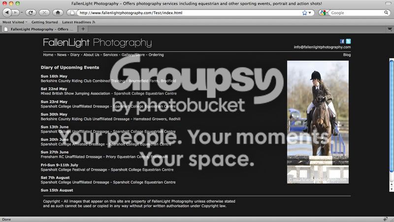
Whenever the scrollbar is showing for the iframe it pushes the page content left so nothing lines up. You should really avoid using iframes as they are really poor for for SEO (all pages will appear under the one link). You also end up with the scrollbars showing as in the image above. You should be able to use an include to add the code for the header and footer.

I am not a massive fan of the diary page, think it needs something to make it stand out a bit. See attached, have bolded up the dates and changed the heading to a h3

Screenshot.jpg


Thanks

Adam
 
yeah ive noticed it all goes to skew when scrollbars come in, im going to look at PHP as above..

yeah as i mentioned i havent touched any of the other pages apart from the front page as yet so all of the other "diary/news/about" pages are looking all over the shop.
 
could be peak usage, normally it loads in a second or two.. might also be that we had an event yesterday so people are checking if the photos are up?

More than likely the usage here of 700+ people on lunch saturating our bandwidth tbh

interesting.. what res are you browsing at?

Screen Res is 1280 x 1024

again interesting.. what browser are you running?

IE 7.0 is the company setup

yes i did pre-empt some categories.. the others, equestrian for example, i think it needs separating out a bit as there are a lot of events for different venues, different organisers etc.

May I suggest until there are further categories removing the redundant level??

agreed.. as of yet i cant find an option to turn that off.

I guess it's a case is simply snipping out a bit of code, without looking harder (from home) then I can't suggest exactly what.

not that im aware of. would you want for example 1300 images i think is our largest gallery off the top of my head all loading on one page?
Maybe not 1300, but I wouldn't mind options of 200 at least and maybe 500 per page. Maybe I'm just strange like that.


taken onboard about the email address, might bin it in favour of a contact form..

I have a personal dislike of contact forms. Basically, they hide your email address, postal address and phone numbers etc. That bugs me on websites and at that point I normally close the page and go look elsewhere.

nope not brutal, constructive crit appriciated :)

Glad it's appreciated, half the time in all fairness it's my opinion which usually accounts for nothing, but I know what I like and can at least offer comments on that perspective

K
 
More than likely the usage here of 700+ people on lunch saturating our bandwidth tbh

good point, more people viewing rather than commenting..

Screen Res is 1280 x 1024

IE 7.0 is the company setup

okay i'll check out those display issues you mentioned

May I suggest until there are further categories removing the redundant level??

on the to-do list :)

I guess it's a case is simply snipping out a bit of code, without looking harder (from home) then I can't suggest exactly what.

its going to be within photocart, i'll ask them if it can be turned off..

I have a personal dislike of contact forms. Basically, they hide your email address, postal address and phone numbers etc. That bugs me on websites and at that point I normally close the page and go look elsewhere.

hmm, okay i'll have a ponder..

appriciated taking the time to comment in depth :thumbs:
 
browzwho??! lol

okay, i havent tested in anything other than IE and FF so far but i'll take a look at further compatibility :)

It runs on ie but has no history - just to nip on to the forum when at work ...
 
Your website breaks my right mouse button for no reason.

If I can't right click a link to "Open in new tab", I'm outta there tbh.
 
Back
Top