

- Messages
- 8,261
- Name
- Carl
- Edit My Images
- Yes
I've literally just finished copying the images over, picking only a few from the set to see if Im finally getting on the right track. The set will be full of images like this, I really worked my socks off tonight. I've introduced a new curve action that I have been fiddling with for the last couple of days too, inspired by so many other vintage looking images the only clue I had on how to replicate that "look", was curves adjustments.
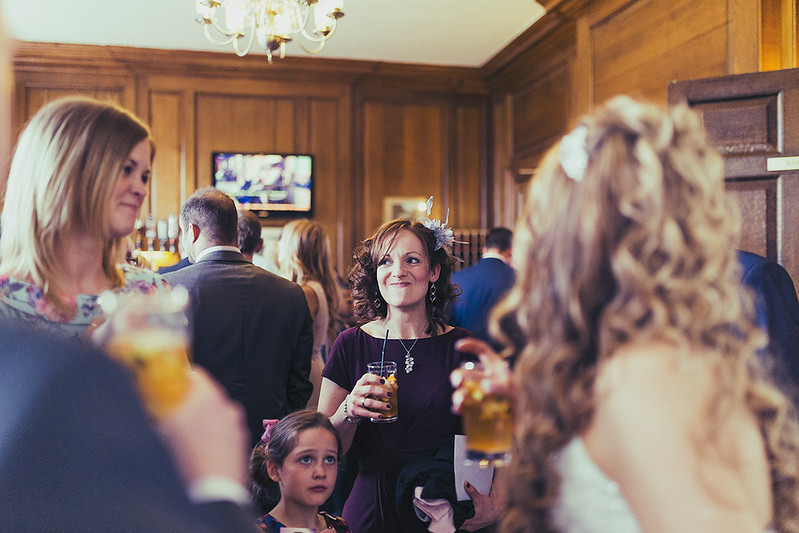
1..
 _MG_1737 by Carl@CDHPIX, on Flickr
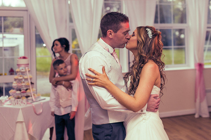
2..
 _MG_0853 by Carl@CDHPIX, on Flickr
3..
 _MG_0811 by Carl@CDHPIX, on Flickr
4..
 _MG_0741 by Carl@CDHPIX, on Flickr
Thanks for popping in
1..
_MG_1737 by Carl@CDHPIX, on Flickr2..
_MG_0853 by Carl@CDHPIX, on Flickr3..
_MG_0811 by Carl@CDHPIX, on Flickr4..
_MG_0741 by Carl@CDHPIX, on FlickrThanks for popping in
") if you get me ... Vertical right!
if you get me ... Vertical right!
 _MG_1758
 _MG_1737
 _MG_0378
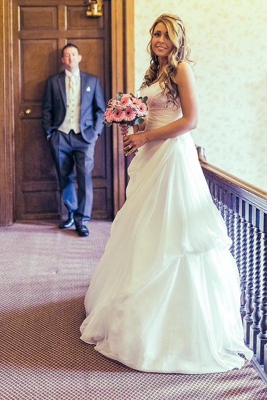 _MG_0814
 _MG_0853basic
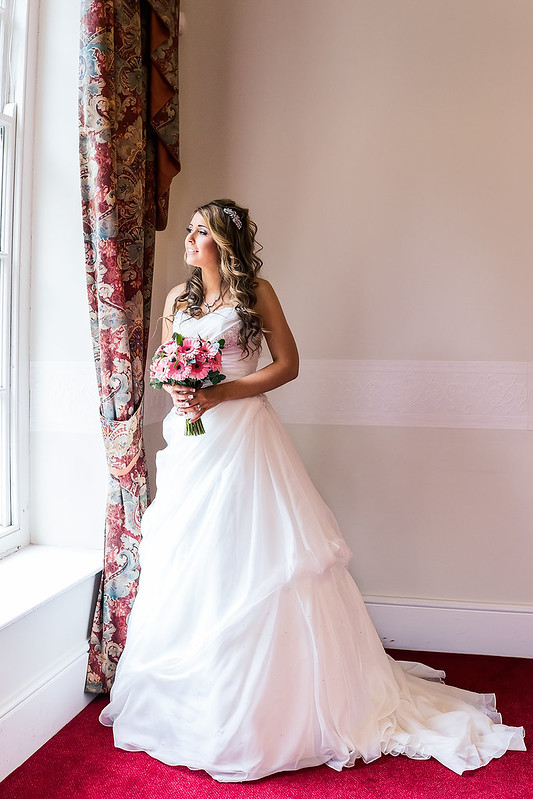 _MG_0853p4
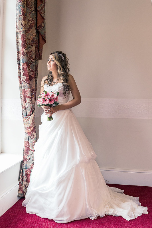 _MG_0853p5
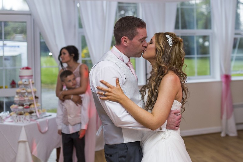 Rework