Week in Wales - Acros 100 now, Provia 100F asap

Messages
7,621
Name
Jonathan
Edit My Images
Yes
Hi Guys :)

So first, let me apologise for my "trickling" of photos to this thread. My aim, as usual, is to post only one image to flickr every day, and so I'll repost the same image to this thread. I have 4 photos on B&W (Acros 100) that I'm happy with from the week, possibly one more depending on whether my better half can convince me to post it up! I also have 5 photos taken on Provia 100F to send to Peak and I'll post them up asap.

Anyway, here is the first photograph. Thoughts always welcomed :)


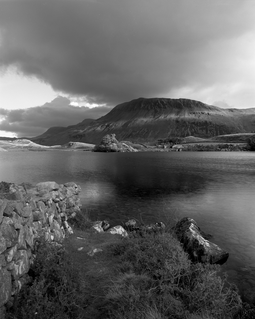
Llynnau Cregennen, Wales, Sunset
by Jonathan Woods Photography, on Flickr

Next one to come tonight :) - For details of the photograph, see the flickr link.
 
Last edited:
Watching too and looking forward to seeing some more especially if that one is anything to go by. lovely!
 
Well, not a bad way to start fella. Wonderful depth and tones, love it. Shame I couldn't make it, would have been nice to have a day togging with you lot.
 
Like that a lot, Jonathan, lovely tonal variation across the pice, and a composition that really works. The only surprise for me was the darkness of the reflection of the hill, which seems a lot darker than the hill itself! Looking forward to some more.

This is 4*5, yes?
 
Lovely image, I like the composition.... it looks even better with the larger version on flickr.
Look forward to seeing more...
 
Many thanks all :)

Chris, yes this is 4x5, shot on Acros with a yellow filter, exposed at box speed. Reflections will always be darker than the object itself - I'll go into the science if you so desire :D - and suffice to say, all those images out there where the reflection (off of water, mainly) is brighter than the object itself is usually the result of over or positionally incorrect grad'ing.
I didn't know that....
 
Jonathan I do like both of these. The first is very well composed in my view and the picture elements draw the viewer into the image. The simplicity of the second image is also very appealing. A lovely range of tones from this film too. I have never shot with Acros but really must give it a go.
 
Excellent work young fella, love the way the ferns are all leaning in toward the trees and the trees are all so similar.

Andy
 
Thanks again all :) I'm actually a little annoyed at myself now, I should have taken the second shot on colour really. Just goes to show that I really need to have some colour neg loaded at all times as well as slide.
 
Stop being such a tease @Woodsy!

Set's looking good so far dude, really liking #1 and #2 in colour would be an absolute peach. Loving the multitude of vanishing points in the forest, can get properly lost in the image.
 
wow....really beautiful. Very impressive work...am looking forward to seeing more.
 
That's looking a bit tasty, nicely composed and the tones are to die for.
 
Its the tones that really grab me too, I'm not one for woodland scenes but...
 
Many thanks all :)

I have to be honest, woodland scenes never normally work for me, but I'm pretty happy with these. Acros really sings with a yellow filter though, such a nice film to use.

The next two, I don't quite know what to make of. I go full circle from liking them to not and back again :/
 
Fabulous stuff mate.
 
@Woodsy mate, you're spoiling us...and if ever there was an argument for using the proper link back to flickr so they can be viewed at a larger size and on a black background this thread is it. If anyone hasn't already done so, I strongly urge you to do so straight away (F11 for full screen in firefox and get the full experience)

Beautiful shots, lovely tones out of the Acros (probably my all time favourite B&W film) - just bloody excellent!

138619099_96a7017ef7_o.gif
 
Frankly, the best B&W work in this thread is that gif! I could watch that all day :D

Seriously though, many thanks guys, really appreciate it!
 
Your last image is really very good....
And I agree with Mark..... they look even more impressive on Flickr....
 
There's some cracking work there Woodsy, the light in number 3 has an ethereal feel to it, very nice indeed.
 
Lovely shot and the best so far. A thread setting a very high monochrome bar!
 
Yes the 3rd one is definitely the bees knees. I really like it. It's deceptively simple but with masses of detail and a great light.
 
Thanks for the comments everyone :)

I'm sending off my slide frames tomorrow hopefully, so should have some scans up by the end of the week.
 
C**p. Totally forgot! Sorry guys :/ Will get the remaining (shoddy) ones up tonight. Slide should have arrived at peak today, ideally it'll be back on Friday.
 
Last edited:
Number 5 has to be viewed bigger to be appreciated, as it really is very good.... the gradual dark to light tones really make it an interesting image...
Not sure about number 4.
 
If anyone needs a reason to go large format look no further than here. Which almost sounds like an insult, as it suggests the camera is the reason for this quality, ignoring the reality that it requires a great degree of skill too. I'm speaking from experience as a new LF user whose miserable attempts to get even the basics right are an effrontery to good taste.

Seriously beautiful work.
 
I'm not sure about 4 either Lee. It's not 'bad, it's just that it's not amazing either. Ah well!

Many thanks Steve :) I know exactly what you mean regarding LF and thanks very much for the kind words :)
 
Many thanks Des :)

I've finally got my Provia shots back from peak, after they sent them to my old address :/. Will get some up tonight :)
 
Photograph number 3


img361
by Jonathan Woods Photography, on Flickr

My eye is immediately drawn to and distracted by the tree jutting into the left side of the frame, I think compositionally it would have been much cleaner had that been excluded (although I'm obscenely fussy about clean compositions so I'm probably talking nonsense by most people's standards). The tones and depth of the image are stunningly gorgeous though, utterly gorgeous.
 
My eye is immediately drawn to and distracted by the tree jutting into the left side of the frame, I think compositionally it would have been much cleaner had that been excluded (although I'm obscenely fussy about clean compositions so I'm probably talking nonsense by most people's standards). The tones and depth of the image are stunningly gorgeous though, utterly gorgeous.

I too noticed it when composing the photograph. I agree it is distracting, however it was impossible to remove. If I moved closer and used a wider lens the perspective changes to the detriment. If I moved sideways to the left the nearest tree obscured the line to trees leading into the frame. If I moved to the right the dead tree on the right didn't work and became in itself distracting. If I moved backwards it introduced a load of unattractive foreground elements which I'd have to clone. If I crop the image as it stands, the left most foreground tree becomes too far over in the frame and doesn't work. Talk about being between a rock and a hard place! This was essentially the only composition of the scene that worked :(

Appreciate the feedback though fella :)
 
Last edited:
Back
Top