What do you think of this 'look'?

Messages
140
Name
Rob
Edit My Images
No
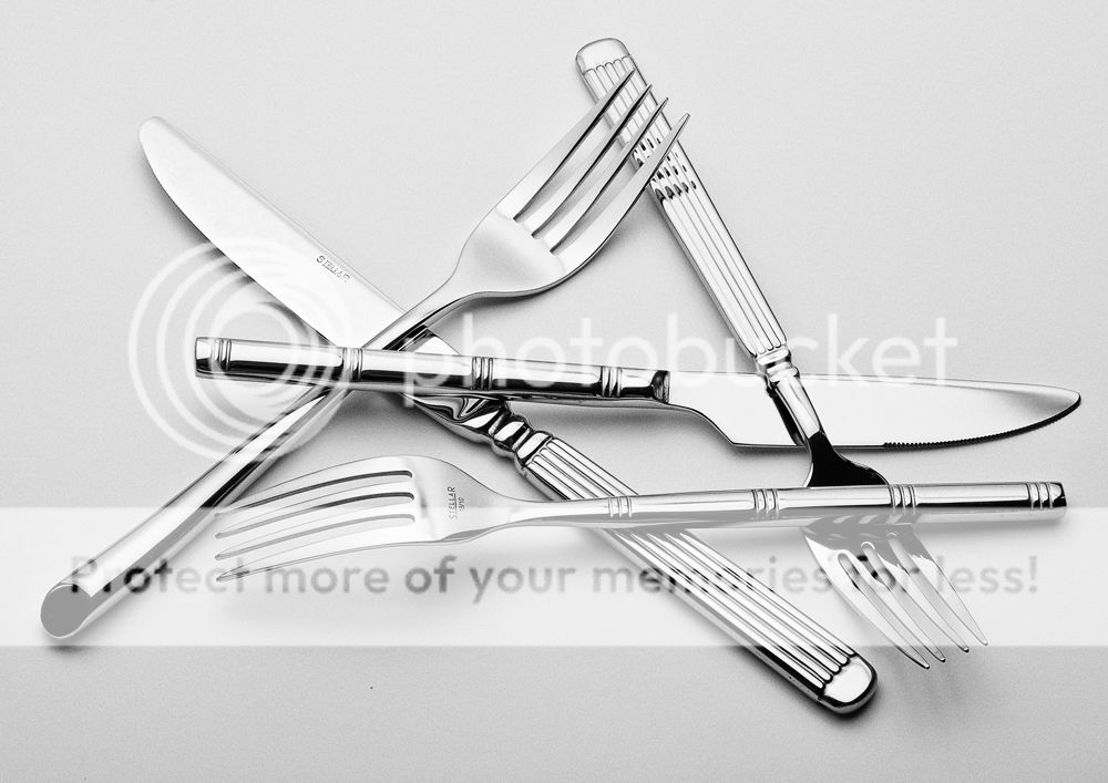
Any comments on the effect here? Is it too simple? Too plain? Is it's simplicity appealing?

CRISS-CROSS

crisscross1sil-XL.jpg
 
Last edited:
I like it a lot, although a knife has lost a bit of definition to it's outline.
 
Well IMHO, it's still a great picture and thePP is great .
 
Rob, I think the process is really great (y), the only issue i have is the layout, it does look as though the knives and forks have been placed purposly rather than just dropping them randomly, if that makes sence ?..
 
Rob, I think the process is really great (y), the only issue i have is the layout, it does look as though the knives and forks have been placed purposly rather than just dropping them randomly, if that makes sence ?..

Fair cop! I did actually place them very carefully because they scratch easily, or at least enough to show up on a macro shot, and I want to take some more shots with them.

Anyway, isn't 'chaos' meant to really be quite structured and ordered?:LOL:
 
Fair cop! I did actually place them very carefully because they scratch easily, or at least enough to show up on a macro shot, and I want to take some more shots with them.

Anyway, isn't 'chaos' meant to really be quite structured and ordered?:LOL:

(y):thumbsdown:(y):clap::LOL:
 
being picky.

When I do cutlery photography (sounds really sad but I really enjoy the solutions) I get right in and clone out the blemishes that always seem to be present. Suggest something similar.

Not sure what the PP effect is that you've applied but I would really like to see a blended image.

Like the shot though- don't mind placing them to ge tthe shot you want.
 
I like the gritty processing on the first image, but I do agree you need to have another whack at it so you can keep the knife definition.
I might have to have a go at cutlery!
 
I like it Rob the PP really works.

Simple yes! but simple is very effective, gets my (y) up
 
I really like this Rob, in fact I like both images. But I'm more drawn to the processing you've used in the first one. Defiantly works for me (y)
 
I like you're processing in the first image but the OCD in me prefers them all in a line ! Acutely,looking at it twice you have three forks which make a triangle and only two knives, may be worth adding a 3rd knife and see if you can come up with a similar pattern.
 
I like you're processing in the first image but the OCD in me prefers them all in a line ! Acutely,looking at it twice you have three forks which make a triangle and only two knives, may be worth adding a 3rd knife and see if you can come up with a similar pattern.

Those helicopter blades don't look quite straight to me...:LOL:

Seriously... I need to do this again and I need a better composition. I never noticed the uneven number of knives versus forks! I go around with my eyes closed.:eek:
 
I think that you've stolen my cutlery :bat: :LOL: I have those ones with the hoops on the handles (y) personally I think that the first is a little too heavily processed I can see what you were going for but I would dial it back a little :thinking:

Matt
MWHCVT
 
Rob

Been away for a while so sorry for delay in responding

I think the B&W conversion pre final processing is excellent- that's one I would go for but as with all art- it's whatever floats your boat not mine.
 
Back
Top