What makes a good B&W Photograph?

snipsnap

Suspended / Banned
Messages
348
Edit My Images
No
I know what I like when I see a great colour photograph and, luckily, it seems that I'm in agreement when I see others' remarks.

With black and white, I'm assuming one's looking for good composition, exposure, interest and so on but all this is true with colour.

SO:

What makes a good B&W picture?
 
Last edited:
Tones, contrast where appropriate, textures and many more

These things won't automatically make it a good photo, they have to all be used properly
 
I know what I like when I see a great colour photograph and, luckily, it seems that I'm in agreement when I see others' remarks.

With black and white, I'm assuming one's looking for good composition, exposure, interest and so on but all this is true with colour.

SO:

What makes a good B&W picture?

The only difference is that with a colour image, some elements gain prominence because of their colour (often red but other bright colours do it too) - so composition has a 3rd dimension, whereas with B&W there is only tone. So the important element has to have the right light - or conversely you can knock back a distracting item by removing colour from the equation.
 
Many thanks for these.

I suppose those thoughts are confirming my feelings but I wasn't able to write them down, if you see what I mean. Perhaps it's because we see so many colourful images these days that I've forgotten the "art" of B&W.

I'm processing a heap of piccies into B&W and had decided before I took the photos that I wanted B&W images so I wasn't looking for colour in the first place.

Interested (and interesting) to read what others think.
 
Last edited:
Some people say you should always set out to shoot a b&w photo (rather than simply remove colour) but i'm not so sure tbh....
 
I'm glad this came up, some time ago I saw some monochrome shots of some RCMP troopers and I was intrigued by the quality, possibly stunned even but I couldn't really put my finger on what I felt.

Earlier this afternoon I googled and I found the thread on POTN that contained one of these shots, I'd appreciate some views on the image please.
I'm now not really sure I like it but I'm not sure why!

http://photography-on-the.net/forum/showpost.php?p=11288943&postcount=1
 
I am head over heels for mono images
Most of what i shoot is now black and white. Or a single tone of some kind.
And while i shoot colour ORF files (you don't get a black and white raw file unless your lucky enough to own a leica monochrom)
I try to shoot mono in my head. Form tone, texture all play major roles for me and in keeping the colour channels available i have even more control over the tonal range than a greyscale image.
Once i am in potatoshop though i try and keep it old school with simple contrast adjustments and dodgeburn adjustments.
There is a certain clarity i find with mono that gets lost with colour, and we see colour every time we open our eyes so its nice to have a break
 
I had this conversation with a friend the other day. I was/am one of these people who would shoot in colour then change it in pse or dpp to monochrome in post processing by messing about trying out different techniques and if it looked good I would make a copy in black and white. But after we got taking he said to ask the question does it make it any better in black and white. If it doesn't make a feature of the picture or a detail more pronounced then it probably doesn't need to be in black and white and that colour obviously adds to the photo. He also said that if I wanted to make a picture black and white think about in the composition of the picture, how to add contrast and how exposure can affect the image. He also said about texture, the different textures can add another dimension and although the viewer a different insight into the photo other than if the textures were just flat on the page. He made me think about my photography a lot and I think in a way made it better. My new mantra is photography is art. I now try and think about my photograph I'm about to take rather than just necessarily snapping away - now all I need to do is learn when to use what settings where and how to change them when need be which is slowly getting there but my ratio to pictures that are ok to those that I love is still quite high in the ok section.
 
Last edited:
footman said:
I'm glad this came up, some time ago I saw some monochrome shots of some RCMP troopers and I was intrigued by the quality, possibly stunned even but I couldn't really put my finger on what I felt.

Earlier this afternoon I googled and I found the thread on POTN that contained one of these shots, I'd appreciate some views on the image please.
I'm now not really sure I like it but I'm not sure why!

http://photography-on-the.net/forum/showpost.php?p=11288943&postcount=1

I have to be honest and say i don't like that image.
It has a plastic feel to it that seems too tacky.
Maybe I've spent too much time push processing tri x but i much prefer a bit of grit lol
 
Last edited:
using B&W film :lol:


I know what I like when I see a great colour photograph and, luckily, it seems that I'm in agreement when I see others' remarks.

With black and white, I'm assuming one's looking for good composition, exposure, interest and so on but all this is true with colour.

SO:

What makes a good B&W picture?
 
I'm glad this came up, some time ago I saw some monochrome shots of some RCMP troopers and I was intrigued by the quality, possibly stunned even but I couldn't really put my finger on what I felt.

Earlier this afternoon I googled and I found the thread on POTN that contained one of these shots, I'd appreciate some views on the image please.
I'm now not really sure I like it but I'm not sure why!

http://photography-on-the.net/forum/showpost.php?p=11288943&postcount=1

I think it's the sort of image that so well fits the occasion and would be appreciated by the subject (well other than the stupid lip!) as it is 'factual' rather than artistic ... catches clear detail of the occasion as a record.
 
Thank you to all the other contributions as well!!!
 
Last edited:
using B&W film :lol:

Many a true word spoken in jest....

Having just started using film I have been amazed at how much detail I get compared to converting a digital image. Maybe it is my P/S skills are lacking but all the film pics are much punchier (if that is a real word!) than things done with my D90.

....I have also seen lots of conversions done because the original image was not exposed right and it seems you can "get away" with more by converting to B&W, sometimes it works and sometimes not.....

Heather
 
I had this conversation with a friend the other day...

If it doesn't make a feature of the picture or a detail more pronounced then it probably doesn't need to be in black and white and that colour obviously adds to the photo.
As Phil said earlier, B&W can be effective for the opposite reason - to make a (colour) detail less pronounced. I don't do many [digital] B&W (but I keep meaning to dabble) but when I have done, it has almost always been to knock colours back where their prominence has been a detraction (and, imho, where the tones/textures/contrast have held their own without colour).
 
there is somthing lacking from digital B&W


Many a true word spoken in jest....

Having just started using film I have been amazed at how much detail I get compared to converting a digital image. Maybe it is my P/S skills are lacking but all the film pics are much punchier (if that is a real word!) than things done with my D90.

....I have also seen lots of conversions done because the original image was not exposed right and it seems you can "get away" with more by converting to B&W, sometimes it works and sometimes not.....

Heather
 
I'm starting to do more b&w conversions
I like them, feel free to hate them, but I think less is more sometimes

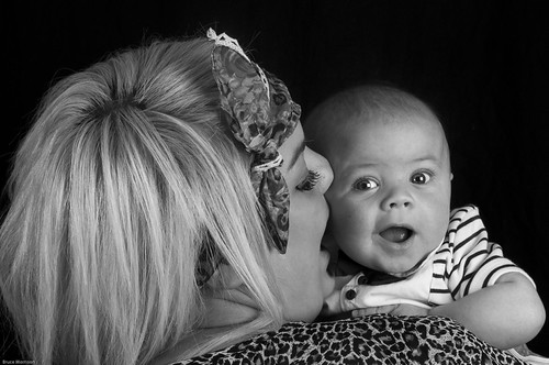
DSC_0071 by Bruce Mo, on Flickr


Taylor baby shoot-32 by Bruce Mo, on Flickr


Taylor baby shoot-47 by Bruce Mo, on Flickr


Taylor baby shoot-53 by Bruce Mo, on Flickr


Taylor baby shoot-69 by Bruce Mo, on Flickr

Still experimenting with it, but these are some of my early favorites taken mostly over the weekend
I've been considering a dedicated colour to b&w software purchase. Theses were just done in LR3, what does everyone use?
 
Shooting for B/W is an art.

Can't get away from how smooth and clean digital B/W is though, its so sterile, artificial looking.....synthetic, and with that it kinda loses a little bit of something..
 
All good stuff so far! I often shoot digitally with the intention of converting to black and white in post processing, as my subjects tend to suit monochrome. However, each photo is evauated to decide whether monochrome works or not, and if it doesn't, I leave it alone. And that's one of my biggest beefs with digital black and white, people seemingly converting on an arbitary basis when a colour image would work better.

The other thing with black and white is that like in the darkroom, an element of post procesing is nearly always needed to get the most out of the image. A straight conversion rarely works, an element of local and global adjustments will nearly always be beneficial.
 
During college a lecturer once told me that it's best to shoot in colour & convert to monochrome during post production as this'll retain the broadest variety of tones, which are essential in black & white work.

I think if anyones looking to create black & white work you need to consider elements such as tones & textures, depth of field can create interesting tones aswell. Conceptual photographs often look effective in black & white aswell.
 
Last edited:
It has nothing to do with film or digital. A good B&W needs to be just that. Not greyscale, not flat, not low contrast - it's got to be Black ... and white!! Good contrast, deep, true blacks, whites that are white with no grey, and creating a mood.
 
It has nothing to do with film or digital. A good B&W needs to be just that. Not greyscale, not flat, not low contrast - it's got to be Black ... and white!! Good contrast, deep, true blacks, whites that are white with no grey, and creating a mood.

:thinking::shrug:

If you're serious, then I think your post requires more explanation and maybe some examples.
 
Serious about which part?? I never said I was a master or anything. I love B&W, I just hate greyscale. Obviously there will be some grey in there, whether it's film or digital, I don't care what format. Images either work in B&W or not. They just need that 'pop' you don't get from a direct greyscale.

http://www.flickr.com/photos/cagey75/sets/72157623008663253/

Some of mine ^^

Now tear them apart and tell me they don't have true blacks or don't pop or whatever.
 
Last edited:
:thinking::shrug:

If you're serious, then I think your post requires more explanation and maybe some examples.

It has nothing to do with film or digital. A good B&W needs to be just that. Not greyscale, not flat, not low contrast - it's got to be Black ... and white!! Good contrast, deep, true blacks, whites that are white with no grey, and creating a mood.

It was the bit about no grey that I thought needed more explanation.

Serious about which part?? I never said I was a master or anything. I love B&W, I just hate greyscale. Obviously there will be some grey in there, whether it's film or digital, I don't care what format. Images either work in B&W or not. They just need that 'pop' you don't get from a direct greyscale.

http://www.flickr.com/photos/cagey75/sets/72157623008663253/

Some of mine ^^

Now tear them apart and tell me they don't have true blacks or don't pop or whatever.

Thanks ;)

If there are any pixels that are not solid black or solid white but somewhere inbetween - then it's greyscale.
 
Last edited:
Serious about which part?? I never said I was a master or anything. I love B&W, I just hate greyscale. Obviously there will be some grey in there, whether it's film or digital, I don't care what format. Images either work in B&W or not. They just need that 'pop' you don't get from a direct greyscale.

http://www.flickr.com/photos/cagey75/sets/72157623008663253/

Some of mine ^^

Now tear them apart and tell me they don't have true blacks or don't pop or whatever.

Some very good examples and I agree about greyness. I have problems when I have areas of grass or foliage in a shot as they sort of have to be grey don't they?

Nothing to tear apart but it is interesting that when clicking your link it is very obvious when a picture is 'just' greyscale such as second in from top left and 4 down and 4 across from top left. Based on your criteria, are these bad B+W?
 
It has nothing to do with film or digital. A good B&W needs to be just that. Not greyscale, not flat, not low contrast - it's got to be Black ... and white!! Good contrast, deep, true blacks, whites that are white with no grey, and creating a mood.

I think you've hit the nail on the head. Great photos by the way.
 
Cagey75 said:
It has nothing to do with film or digital. A good B&W needs to be just that. Not greyscale, not flat, not low contrast - it's got to be Black ... and white!! Good contrast, deep, true blacks, whites that are white with no grey, and creating a mood.

I don't agree with this at all. A mono conversion must suit the mood one is trying to convey. Some of my favourite shots of softer subjects such as brides and babies are low on contrast and only work because of it. To say it has to be black and white at the extremes limits you.
 
I don't agree with this at all. A mono conversion must suit the mood one is trying to convey. Some of my favourite shots of softer subjects such as brides and babies are low on contrast and only work because of it. To say it has to be black and white at the extremes limits you.

I don't agree with it either but then again nor does Cagey75 - he goes on to say "Obviously there will be some grey in there..."

Moreover, if you look at his B&W shots/their histograms (and I do like his pictures) - they don't agree either.

There are plenty of b&w photos that work because of the high degree of grey - look here for some examples. A black and white photo cannot be dismissed because it contains a certain amount of grey - it's a nonsense judgement that has no bearing on the merit of the photo. I think that tones and textures as well as contrasts play a part in b&w photography - and that the subtlety of mid-tones and soft edges can be as appropriate and effective in a b&w picture as can the opposite.
 
I suppose it is a bit like saying a colour photo has to contain red and green but I do know what cagey is getting at and I generally prefer photos that are more clearly black and white (but not always!)
 
I suppose it is a bit like saying a colour photo has to contain red and green but I do know what cagey is getting at and I generally prefer photos that are more clearly black and white (but not always!)

Precisely. What I mean is, don't just convert direct to greyscale. A lot of people do just that, and leave it at that. Often you see images where the 'blacks' are more like a charcoal grey. I like the blacks to be black, and have a little pop to them. Deep contrast, non-flat images. I have never converted an image using grey scale, I desaturate all colours individually in LR, in the H/S/L panel. Then use luminance on the individual colours to change tone, contrast. I then take the image to Cs5 and use selective colouring to reduce black levels in whites and neutral areas and give the blacks a little boost.


If any of my images look like a simple greyscale conversion, then I failed on that one :D But I'd like to think the blacks are deeper than you'd get from that method. Thanks for the compliments btw, as I said, I'm no expert. I love B&W, and I certainly don't feel like I've nailed it, but will continue to try. And I'm always open to trying other methods too. Just not direct greyscale ;)
 
Last edited:
One thing I will say is that anyone serious about mono should learn how to dodge and burn properly.
 
Is that a dig? :D or a general tip? I think I'm ok in that department ;)

I prefer to use the adjustment brush in LR, especially now they've improved it in LR4, rather than D&B in photoshop.
 
Last edited:
Just a general tip. My digs are less subtle!
 
“If I knew how to take a good photograph, I'd do it every time.” — Robert Doisneau.

I'm with Doisneau on this (and it applies to non-B&W too).
 
Just a general tip. My digs are less subtle!

That's ok then. Being Irish I'm born blunt. I don't do riddles ;)

I don't go by quotes. there's that one that says something about the first 10,000 shots you take being the worst ... well, I'm way passed that and still take crappy shots at times.
 
Back
Top