- Messages
- 49
- Name
- Alex
- Edit My Images
- No
yeah I printed it in b+w on luster paper and it looks great my printer the pro-10s has 3 shades of grey and blackYour 2nd image has more interest Alex, as there's an obvious subject for the viewer to look at. It would probably work in black and white too.
OK, this is intended to be helpful, rather than critical.
Image 1 - There's nothing in the image of interest, and the abstract pattern is not enough on its own to keep attention. Also nothing seems in focus, which is not always a problem for an 'art' shot, but in this case it does not help the viewer to find a subject that they can concentrate on. Colours are too saturated and colour balance too blue, making it look un-natural and odd.
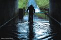
Image 2 - Much better in terms of having a subject - now we have a reason to photograph a big puddle! The silhouetting is good, but if he had been just a little further ahead or you had been lower then the rider would have better separated from the clutter at the sides. Colours still a bit too saturated, but colour balance is better. This image also lacks a sense of sharpness - have you added any sharpening or clarity in Lightroom?
thanks for your freed back!
I did add a little clarity in Lightroom, I didn't add any sharpening as it started looking grainy and I didn't know why I simply put it down to my lens being oily from lending it to a friend.
yeah, i shoot raw, and I think it was iso 300 but on an older camera like mine, the Canon Eos 700d iso 300 looks as clean as iso 1600 on a canon 5d mk3. so noise is difficult but should be manageable. you mentioned a lightroom and the detail slider. I've played and experimented with the slider. sharpness now looks better and the image looks way less noisy than before. my mate on facebook pointed out there's a purple spot on the image where the water ripples. I've since fixed that in Lightroom. I've also lowered the saturation. ill post the new image in 10 minutes.
A quick question if I can - do YOU prefer the adjusted image, or have you 'fixed' it because of what I suggested but really prefer the original version? A slightly difficult thing for photographers is that we end up creating images for other people instead of for ourselves, because we've been told is right or good. Sometimes you need to do things the way you LIKE it, even when it's technically wrong.
View attachment 117820View attachment 117821
Just a simple crop makes all the difference. Composition is equally as important as subject.