whats your opinion???

Messages
859
Name
michael
Edit My Images
Yes
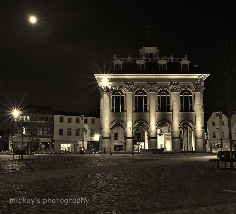
ok so last night i went out and took a few pictures of the recently refurbed town hall (Abingdon oxfordshire) i put this pic up on facebook everyone liked it but some said they wouldnt of included the kebab van my wife thinks it should be in the pic im on the fence also someone said they prefer it in sepia rather than colour

so any thoughts or opinion's???


1/


IMG_0134sepia (2) by steptoe1972, on Flickr


2/


IMG_0134sepia by steptoe1972, on Flickr


3/


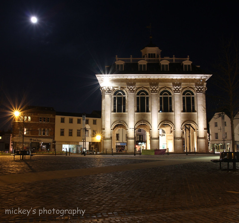
IMG_0134 colour by steptoe1972, on Flickr


4/ oh and just thought i would add this one just cause i like it


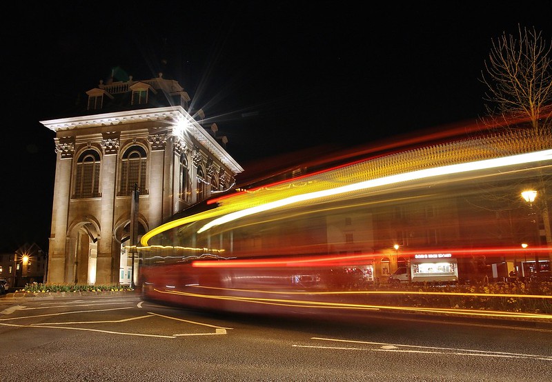
IMG_0165 by steptoe1972, on Flickr
 
Tat's a tough call but for what it is worth, comp #2 and #3 are best. Building is in the right place i.e. not in the middle as per #1 and the details of the building stand out. Like the colour version for the colours in the main building, but the sepia is better at handling the highlights, partic in the arches, and the sepia dilutes the impact of the banners at the front. I ould be tempted to crop some from the bottom to leave the smooth paving stones coming in from the bottom left.

Good angle and detail on the building on #4, but light trails spoil it for me. the picture does not seem to know what is its trying to portray
 
I would be tempted to go for option 2, but I would then crop more off the bottom right to bring the building more into the centre of the frame and try a perfectly square crop. It may also be worth correcting the verticals, it looks like its slightly rotated anti clockwise at the moment.
 
I would be tempted to go for option 2, but I would then crop more off the bottom right to bring the building more into the centre of the frame and try a perfectly square crop. It may also be worth correcting the verticals, it looks like its slightly rotated anti clockwise at the moment.

I have to agree with this to some extent, the square crop does nothing for what is a lovely lit shot imo and I would crop the bottom off for a more landscape shot.
 
Thankyou for looking and commenting

I also like #2 when i get home I will try cropping the bottom to see what it looks like

Thanks again
 
Sorry to put the cat amongst the pidgeons but it's #1 for me! The only criticism I would have is that it seems to be leaning to the right?

Thankyou Paul the wife will be pleased that you chose that one

Looks like ill have to do 2 copies one for her and one for me lol

I still like the idea of taking a little of the bottom as mentioned before whilst I'm at it ill try and straighten it

Thanks for looking and commenting
 
Sorry to put the cat amongst the pidgeons but it's #1 for me! The only criticism I would have is that it seems to be leaning to the right?

I prefer #1 as well, 2 and 3 both look unbalanced to me and the 'triangle' formed by the moon, the light on the building and the street light on the left edge of the frame keep pulling my eye away from the building itself. Personally I'd clone the moon out as I don't think it adds anything to the shot... just my opinion though.
 
1 and 4. 1 appears to have become victim to a slight tilt and some unfavourable perspective distortion by not being perfectly square on to the building ( I think, it's hard to tell it makes my eyes go weird!)

Number 4 needs a slight crop to and bottom to make panoramic or a heavier crop to the right hand side. All IMO of course.
 
Back
Top