

- Messages
- 298
- Edit My Images
- No
Thinking of entering a national comp. The theme is night time. Have 3 Canary Wharf skylines i like......
*Ignore the borders the final wont have one*
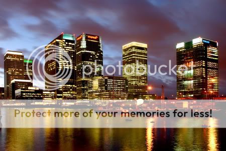
(1)
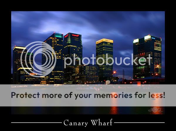
(2)
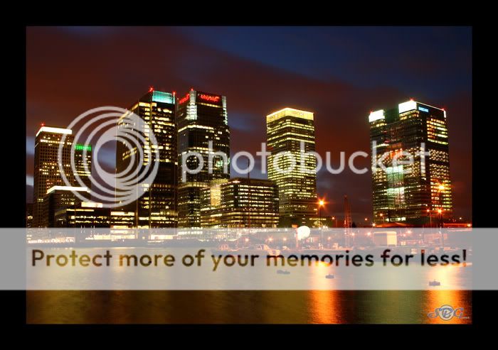
(3)
My personal favourite is number 1. It has the most detailed sky and the nicest reflections in the water. The only thing is can it be classed as a night time photograph. The sun had set but as you can see the sky is still quite light behind the clouds.
Number 2 has a really dramatic sky but the water is too dark for my liking.
And 3 i'm just not sure about.
Also can people tell me if the images i am posting are too dark. I am running dual monitors and there is quite a difference in how the images appear on each one.
*Ignore the borders the final wont have one*
(1)
(2)
(3)
My personal favourite is number 1. It has the most detailed sky and the nicest reflections in the water. The only thing is can it be classed as a night time photograph. The sun had set but as you can see the sky is still quite light behind the clouds.
Number 2 has a really dramatic sky but the water is too dark for my liking.
And 3 i'm just not sure about.
Also can people tell me if the images i am posting are too dark. I am running dual monitors and there is quite a difference in how the images appear on each one.
")