

- Messages
- 2,089
- Name
- Simon
- Edit My Images
- No
Three photographs from the past week from the north east coast.
1 Whitley Bay pre-dawn glow
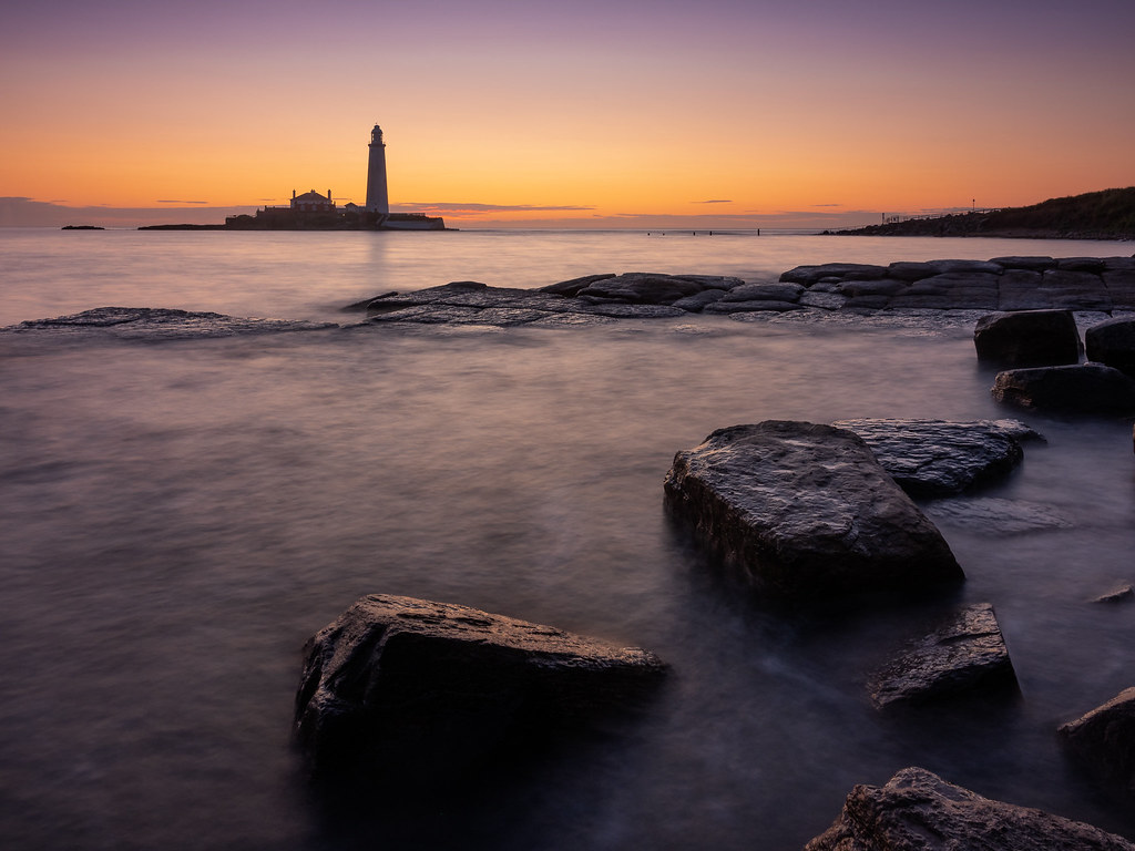 St Mary's Dawn by Simon Harrison, on Flickr
2 Gathering storm clouds
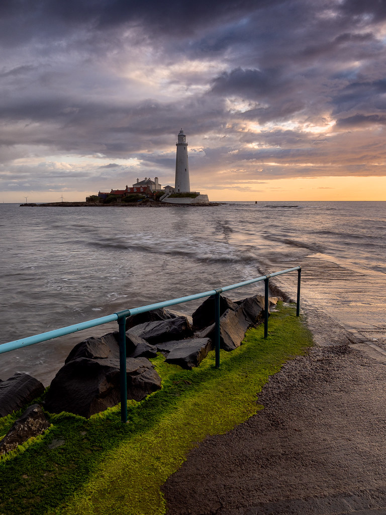 St Mary's Lighthouse by Simon Harrison, on Flickr
3 Saltburn Sunrise
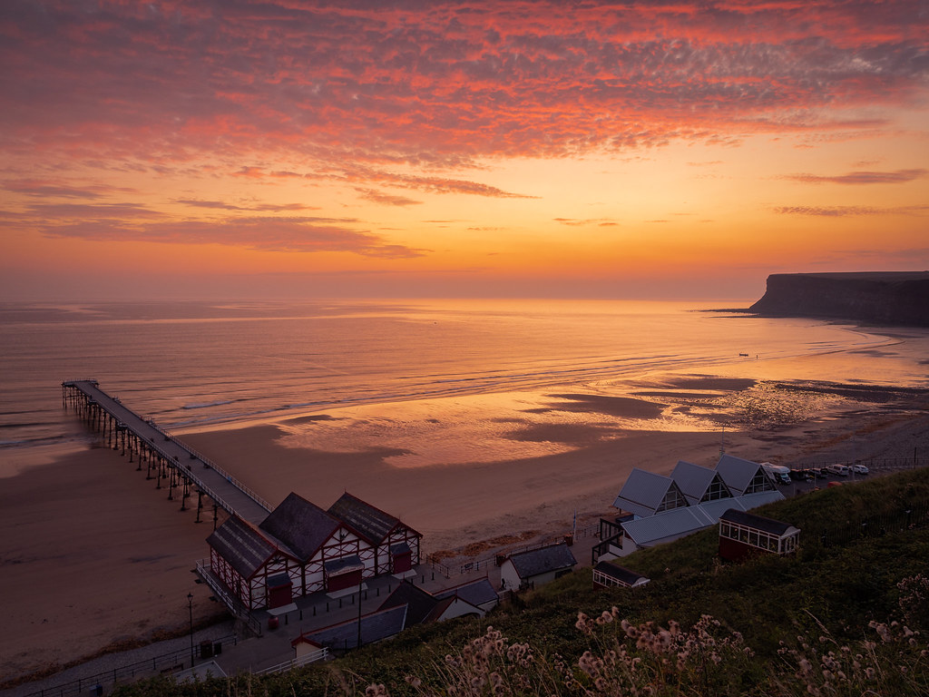 Saltburn Sunrise by Simon Harrison, on Flickr
Any feedback or critique gratefully received.
Cheers,
Simon.
1 Whitley Bay pre-dawn glow
St Mary's Dawn by Simon Harrison, on Flickr2 Gathering storm clouds
St Mary's Lighthouse by Simon Harrison, on Flickr3 Saltburn Sunrise
Saltburn Sunrise by Simon Harrison, on FlickrAny feedback or critique gratefully received.
Cheers,
Simon.
")
 good detail and nice colours, looks pretty darn good if you ask me.