
- Messages
- 205
- Edit My Images
- Yes
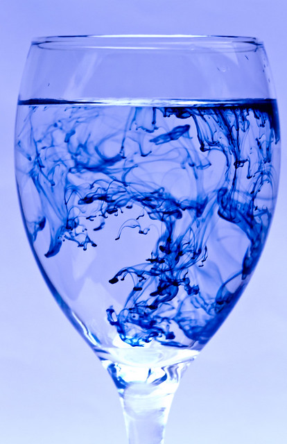
I've had the ink (calligraphy ink) for a few weeks but not had a decent vessel to hold the water and i dont drink wine so a wine glass only jumped out at me yesterday when i spotted one!
it seemed to work well")

Water and Ink by FightingFigure, on Flickr

Water and Ink by FightingFigure, on Flickr
Water and Ink by FightingFigure, on Flickr

Water and Ink by FightingFigure, on Flickr
The 1st little project i've done on my nice new shiny 7D
it seemed to work well
Water and Ink by FightingFigure, on Flickr
Water and Ink by FightingFigure, on Flickr
Water and Ink by FightingFigure, on Flickr
Water and Ink by FightingFigure, on Flickr
The 1st little project i've done on my nice new shiny 7D
 when your doing this type of think it's important to clean the glass then clean it again