Yashica Mat and a walk in the sun

Messages
16,290
Name
Andy Grant
Edit My Images
Yes
Well after my conversion to TLR cameras and succesful first roll through a Yashica A, I went mad and bought a Yashica Mat. And here are some from the first roll through that and a couple of colour shots from the A.


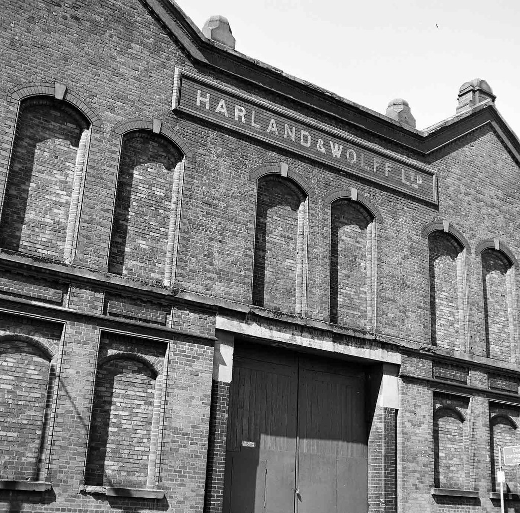
Harland-&-Wolff by andysnapper1, on Flickr

A 100% crop from the above shot

H-&-W-100% by andysnapper1, on Flickr


Statue-1 by andysnapper1, on Flickr


Statue-2 by andysnapper1, on Flickr

All the above shot on Adox CHS Art 50

And a couple on Kodak Ektar 100 through the Yashica A


To-the-sea by andysnapper1, on Flickr


The-Dunes by andysnapper1, on Flickr

So there you go, hopefully you will see from these why I love 6x6 negatives and twin lens reflex cameras.(y)

Cheers

Andy
 
I love the B&W's (y) they're so rich in tone that it just makes them really appealing (y) I'm not so sure about the colours :( they just seem a little flat though I guess that could be from the time of day :thinking:

Matt
MWHCVT
 
#1 - love the tones and the whole "big square neg." vibe that it's got going for it. Normally, I get all tetchy about uprights and horizontals and all that stuff, but this one is on enough of an angle to be a statement, rather than just looking "on the wonk" so my OCD's not complaining. There's also something in the actual "statement" of the shot - the bricked up windows and padlocked gates just really speak about the state of the industry I guess... It's also amazing the detail thats resolved when you look at the 100% crop. Very Nice indeed (y)

#2 - another rule breaker, and none the worse for it. Horizon splitting the frame - shouldn't work, but often does with square format. Figure on the LH third, but starting out to the short edge... opposite of normal guidelines, but again, just seems to work for me - partly because of the shadows, and partly because it seems to emphasize the sparseness of the scene behind the figure. Again, another good shot Andy.


#3 - I like everything about this shot apart from the pedestal being in shot - If it'd have been like the figure in #2, with the feet in the sand, it'd have worked better for me. Of course, it might have worked even better still, had the feet have been lapping around with water, but I can understand you not wanting to be stood waist deep in the water to get the image.


#4 - Nice subdued colours, and good use of leading lines, but they're just leading to such a small point of interest, that it's somehow lost. I think that this one might be an occasion where you crop into that lovely big negative and make a 2:1 panorama of the more interesting bits to be honest.

#5 - has a somehow timeless quality about it - as a "work of art" I don't exactly think it's there, but it's a shot that could have been taken anytime since I was a kid learning how to use a camera - only the clothes would have changed... and that's probably why I like it - it reminds me of occasional days by the seaside as a kid - usually the local Working Mens Club "Day Trip" where the entire village de-camped en-masse to some poor unfortunate seaside resort.
 
Thank you guys, very kind. And thank you Mark for usual astute comments.

Andy
 
no worries Andy - I'm trying, I'm really trying hard to get time to do a bit more critique on here, sadly - decent "non-flickr" type feedback takes a bit longer to come up with - especially for someone a slow as me :LOL:
 
Well its much appreciated mate. You nearly always get it right, the last image was one of those evocative views that took me right back to the early 70's, soon as I saw it I new it would look good. As you said not art but it works for me.

Andy
 
Back
Top