weekly Posiview's 2012 ....week 52 Busy added...finished!

Hi Andy

Art - the skulls are good ( I have had a look at your Skulls thread and think that you have a great idea going there). Tryptych #1 for me as i like the subtle colour and the differentiation between the shots.

Popart would be my choice though because I think that it is simply a brilliant piece of photography and PP. Very envious of your skill on this one. Top quality. (y)

EDIT: Also, I think that you have created artistic images with these shots, whereas I can only think of shooting someone else's art (altho not done yet).

Colour - another apparently simple idea brilliantly executed. Another fine image :clap:

Colour - A different take on the standard smoke shots. Seems to work as well

Reshoot -I certainly like this one. Looks nicely lit. I take it you emptied the bottle first :LOL:

My wife works for Mencap. I've asked her to pay you a visit!

Great shot though; can't fault it. I guess God gave you artistic ability in bucket loads to make up for everything else!!!

I guess God gave you artistic ability in bucket loads to make up for everything else!!!

Thanks, all.

Oi, Mark, there's no ';)'.....:bat:

Cheers.
 
My wife works for Mencap. I've asked her to pay you a visit!

Great shot though; can't fault it. I guess God gave you artistic ability in bucket loads to make up for everything else!!!

:LOL::LOL::LOL::LOL::LOL:....Mark , you're priceless :D

Andy....only you would glue leaves to a bottle....it has worked though , specular highlights aside ( whatever they maybe :thinking: ) So , apart from the leaves being natural what Is the connection to the theme ............ Like it mister...nice tones oin the leaves , great black BG...not keen on it being central for some reason....awkwidity I think :p
 
:LOL::LOL::LOL::LOL::LOL:....Mark , you're priceless :D

Hey, don't encourage him...:D

Andy....only you would glue leaves to a bottle....it has worked though , specular highlights aside ( whatever they maybe :thinking: ) So , apart from the leaves being natural what Is the connection to the theme ............ Like it mister...nice tones oin the leaves , great black BG...not keen on it being central for some reason....awkwidity I think :p

Cheers, I did try on the RH third but preferred this one.
 
Nice one Andy, I love your creativity on this.
You mentioned specular highlights, I take it this is lit with flash? Or was it light painting?
I think you are being too critical on yourself, there is no loss of detail and the lighting creates a more 3d feel.
It needs a little explanation to bring it on theme I feel as my first reaction was that it was a reshoot of art :D
That aside, its a very competent piece of creativity and lighting.
I admire your determination to try different ideas. Well done that man (y)
 
blakester said:
Nice one Andy, I love your creativity on this.
You mentioned specular highlights, I take it this is lit with flash? Or was it light painting?
I think you are being too critical on yourself, there is no loss of detail and the lighting creates a more 3d feel.
It needs a little explanation to bring it on theme I feel as my first reaction was that it was a reshoot of art :D
That aside, its a very competent piece of creativity and lighting.
I admire your determination to try different ideas. Well done that man (y)

Thanks, Iain, I actually thought of the idea and fitted it to a theme :)

The hightlights are from the flash and could be removed, possibly with some diffusion. I am very critical of my own work and appreciate feedback.

Cheers.
 
I think that is good Andy. Good definition of the heart shape and like the grainy nature which just fades into the 'shadows' to the left.

Not sure what that small darker circle to the left of the handle is? It is such a perfect circle that I am not sure if I am missing something.

PS need to alter title in thread - still says week 47
 
Last edited:
The right hand side of the pic is good nice grain and I can see that its a heart shape the circle is noticeable by the handle though my main crit is its too far to the right too much dead space on the left why place it there?
 
Lovely photo; I love the graininess of it :)

I'm not sure there is too much dead space, I just think it's not quite correctly distributed. I think it would work well at this crop, but with the subject shifted a little to the left, so that the point of the heart fell on the vertical third.

Also, you do definitely need to lose the dark circle :) Did you accidentally click with the brush when burning some areas?
 
I think that is good Andy. Good definition of the heart shape and like the grainy nature which just fades into the 'shadows' to the left.

Not sure what that small darker circle to the left of the handle is? It is such a perfect circle that I am not sure if I am missing something.

PS need to alter title in thread - still says week 47

Title changed (y)

Not my best by a long shot, but my first ideas didn't come off.

There is a circle on the plate which I forgot to remove :bonk:

The right hand side of the pic is good nice grain and I can see that its a heart shape the circle is noticeable by the handle though my main crit is its too far to the right too much dead space on the left why place it there?

Thanks, I did work towards a grainy feel. The negative space, I do use it a lot and am happy with the amount, perhaps the fact there's very little room to the right of the photograph exentuates (sp ?) the left of the photograph :thinking:

Feedback appreciated.

Cheers.
 
...exentuates (sp ?)...

"accentuates" :)

And yes, I think you're right; that was my point about getting the subject on the third :)
 
Hi Andy. Sorry missed a few weeks but here goes.

Pack – Good subject and model. Well exposed and like the way the blacks have been handled in the top. The shadow does not affect the overall image.
Art – Love skull pictures since I went to an exhibition by Lauren Baker. The first Triptych with the slight colour stands out, but maybe the middle and RH skull would look better reversed. Can’t fault Pop Art as these are great, but copied so many times since the original Warhol.
Colour – Shows good PP skills and something I must try one day.
Reshoot – Looks good to me and don’t think a reshoot needed.
Shadow – Shadows are so easy when you don’t want them! Nice use of subject but agree a bit close to the RH edge.
 
"accentuates" :)

And yes, I think you're right; that was my point about getting the subject on the third :)

(y) Can't work out the spell checker on iPad.

Hi Andy. Sorry missed a few weeks but here goes.

Pack – Good subject and model. Well exposed and like the way the blacks have been handled in the top. The shadow does not affect the overall image.
Art – Love skull pictures since I went to an exhibition by Lauren Baker. The first Triptych with the slight colour stands out, but maybe the middle and RH skull would look better reversed. Can’t fault Pop Art as these are great, but copied so many times since the original Warhol.
Colour – Shows good PP skills and something I must try one day.
Reshoot – Looks good to me and don’t think a reshoot needed.
Shadow – Shadows are so easy when you don’t want them! Nice use of subject but agree a bit close to the RH edge.

Appreciate the comments...I suspect I may have have missed a few of yours :thinking: Apologies! and I'll pop by.
 
The edit is spot on IMHO Andy.
I never commented on the first version but this one is much more balanced.
I like the processing on it, the shadow is very subtle a very accomplished piece.
I applaud your creativity in seeing this in what is a simple everyday object.
Good work Mister (as Lynne would say ;))
 
That's better Andy.

The edit is spot on IMHO Andy.
I never commented on the first version but this one is much more balanced.
I like the processing on it, the shadow is very subtle a very accomplished piece.
I applaud your creativity in seeing this in what is a simple everyday object.
Good work Mister (as Lynne would say ;))

Hi Andy

That edit looks v good to me and has addressed all of the issues raised.

Thanks all, this is why I'm here (y)
 
Eeekkkkk, just had a right :bat: from Jackie. She said, "what are my best Egyptian cotton pillow cases doing in that bag of mouldy leaves!!"

I thought better of saying, "it's for my art, darling!".

I'm now cowering in the toilet :exit:
 
Andy, edit is a great improvement. Can't help with you excuses though.
 
Evening, all (y)

Well, having used our best Egyptian :thinking: pillow cases as props and being caught by Jackie, I proceeded to wash them with a red top....eekkkk. Jackie hasn't seen it yet :bat:

Anyway, enough domestic bliss.

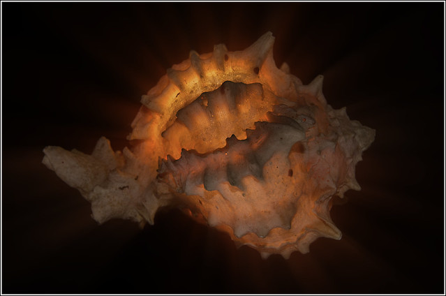
Glow attempt #1 failed so moved into #2. Flash under a shell.

Two different ones: one with minimal PP and one with minimal PP and a run through Tiffen.

Cheers all.


Week (Glow) 49 by andysheader (Posiview), on Flickr


Week 49 (Glow) 2 by andysheader (Posiview), on Flickr
 
Hi

Really like the shadow/heart. I have sen this before with rings on books but never with a mug handle. Well spotted methinks.

An interesting shot for glow. I prefer the first, perhaps the second is a bit too much for my liking.
 
I do like both of those Andy, great lighting and composition. Out of the 2 I prefer the first one, mainly for the lovely rich orange colour in there.

Hi

Really like the shadow/heart. I have sen this before with rings on books but never with a mug handle. Well spotted methinks.

An interesting shot for glow. I prefer the first, perhaps the second is a bit too much for my liking.

Thanks, guys.

Looking at it now on iPad it looks a tad dark :thinking:

I have a few other ideas and I've never been one to post one photograph....:cautious:

Cheers.
 
I like shadow, tis very clever, not too dark for me but very grainy

Egyptian cotton is just a kind of cotton - buy new ones and you'll be ok :)

now glow, the 1st one looks like inside the mouth of an alien, quite spooky, but for glow to work I think it has to be no.2 as you can see the glow 'radiating' more :clap:
 
Hi Andy.

I definitely prefer the second one for glow, but feel there's something missing. Somehow, despite the colour, it looks a bit cold to me; maybe it's the fact that the ends of he shell are in shadow?

Good shot though :)
 
Last edited:
sturisoma said:
I like shadow, tis very clever, not too dark for me but very grainy

Egyptian cotton is just a kind of cotton - buy new ones and you'll be ok :)

now glow, the 1st one looks like inside the mouth of an alien, quite spooky, but for glow to work I think it has to be no.2 as you can see the glow 'radiating' more :clap:

Thanks, looks like Jackie was winding me up!!
 
Southdowns said:
Hi Andy.

I definitely prefer the second one for glow, but feel there's something missing. Somehow, despite he colour, it looks a bit cold to me; maybe it's the fact that the ends of he she'll are in shadow?

Good shot though :)

Cheers, appreciate the crit, do you mean the tip?? I'm looking to have another go tonight and I'll take this on board.

Just seen yours but I'll view and comment when I'm on laptop.
 
Shadow - The edit is working better with the bigger gap on the rhS

Glow - Good idea and subject for glow. I'd probably go for #2 as the radiation gives a bit more interest.
 
Last edited:
Yes, the edit does the trick for me; it's a good'un!
 
I agree with Mark, the final edit really nails it Andy.
Lovely glow from the shell whilst still holding all the detail.
Minor crit but I would like to have seen a reflection or shadow onto the background/base just to ground the shell. (y)
 
Yes, the edit does the trick for me; it's a good'un!

I agree with Mark, the final edit really nails it Andy.
Lovely glow from the shell whilst still holding all the detail.
Minor crit but I would like to have seen a reflection or shadow onto the background/base just to ground the shell. (y)

Glow edit - good one for me Andy - rather like the detail in the shell - just seems to 'pulsate' more

Thanks all. Iain, funnily enough, I thought the same thing last night. It does seem to be floating in mid air.

I have an idea for round and hope to get it at tonight's TP meet :)

Cheers.
 
Back
Top