Mad Frankie's 52 - 2010 - Hello again!

Messages
431
Name
Gary
Edit My Images
Yes
Ok, starting a few weeks in so it's not so much of a 52 but a 42 and I'll catch up with old weeks when I can...

Themes

Week 1 - Curved - Post #9
Week 2 - Poem / Poetry - Post #3
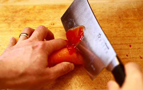
Week 3 - Chopped - Post #7
Week 4 - Street
Week 5 - Speed
Week 6 - Present
Week 7 - People
Week 8 - Mechanical
Week 9 - Play - Post #15
Week 10 - Chemistry - Post #4
Week 11 - Candid - Post #17
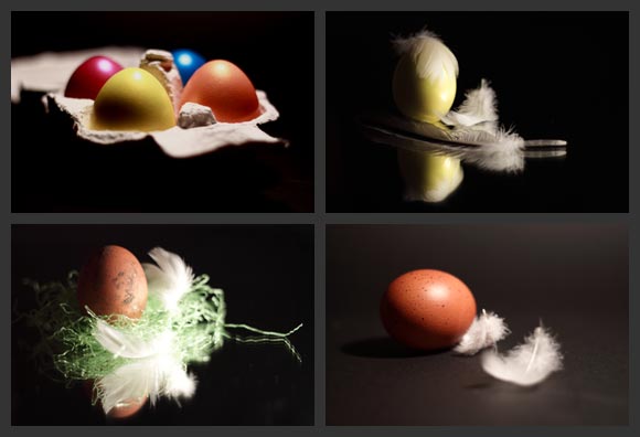
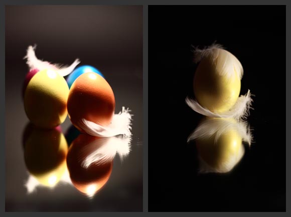
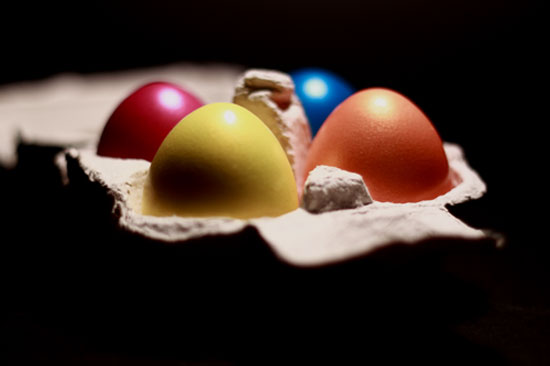
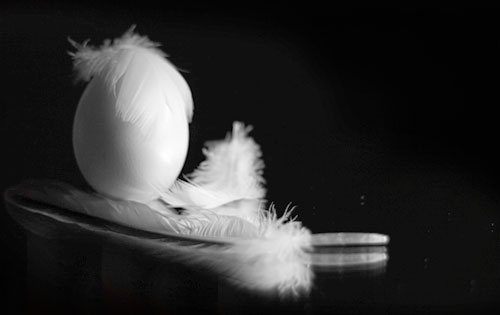
Week 12 - Produce - Post #31
Week 13 - Quad - Post #48
Week 14 - Shoot - Post #60
Week 15 - Single - Post #67
Week 16 - Stare - Post #76
Week 17 - Peace
Week 18 - Indulgence
Week 19 - Reshoot / Ingredients
Week 20 - Stop
Week 21 - Isolation
Week 22 - Quality
Week 23 - Post
Week 24 - Metal
Week 25 - Grunge
Week 26 - Beginnings
Week 27 - Art
Week 28 - Relaxation
Week 29 - Grace
Week 30 - Endings
Week 31 - Electric
Week 32 - Transform
Week 33 - Mobile
Week 34 - Surfaces
Week 35 - Light

Please be as critical as you wish to be, I won't take offence. I prefer open and honest critique of my pictures and if you can tell me what you would do to improve it, perfect. I want to learn, grow and develop as a photographer and honesty, (and this 52 hopefully), is the way I learn...

My rules:

1) New photos will be taken each week specifically for the theme, I may post a few images per theme but if I do I will choose my favourite before I start the next theme.
2) Where possible I will use the least amount of PP as possible. Standard b&w / contrast etc are ok but completely changing the image, unless required by the theme, are a no no. I want to make sure I take the best photo 'in camera' as possible.
3) I will share what I have learned that week and how I might approach it differently next time (or if I had more time)
4) I will limit myself to 1 JOKER during the year.
5) If I miss a week from illness / work / holiday etc I will catch up as soon as possible - I want a complete 52!
6) I will not look at other 52ers shots for the theme until I have posted my shot(s) so if my pictures are the same as someone elses it is purely coincidental
7) I will aim to post my opinions, and be honest, on as many other 52ers threads as possible, without ruining my marriage!

I've decided to also make general notes on what I learn as I learn them so at the end of the year, (or any time I'm feeling low), I can see how far, hopefully, I've come!

Things I've learnt

1) To keep my interest I need to move out my comfort zone and take different pictures
2) I've got a lot to learn about lighting!
3) With still life / posed photos, great shots rarely happen without a lot of preparation and effort
4) I can't wait for the summer and more light after work!
5) I need to really get into the theme, 'just doing' doesn't equal great photos
 
Last edited:
Good on ya Gary... Welcome aboard.
 
Kind of a catch up from the past weeks after a bit of inspiration:

I thought about poetry and obviously a poetry book, I happened to open the book on a love poem and the rest just came to me...

IMG_0325_opt.jpg


A second attempt with Dean's idea of a lit heart...

IMG_0521_opt2.jpg
 
Last edited:
I wasn't going to start this week as I only decided to join the 52 last night but an, ahem, 'action packed' Friday night, (and only Jonathon Ross on TV), got me thinking.

Taking a leaf from another idea of the coke and mentos I looked at doing one with a similar chemical reaction rather than driving around to find a refinery, (call me lazy!).

This one is vinegar and baking soda. I've put it in a shot glass sitting on a mirror. The idea behind it was to make it look a bit like a beer or Guiness.

Taking it one step deeper, I could wax on about the chemistry of making beer or the chemical effect beer has on us etc but I'd be lying if I said that's what I was thinking when I took the shot!

IMG_0308_opt.jpg


Just found this in my discarded pile, more like it?

IMG_0300_opt2.jpg
 
Last edited:
Gary, I love that poetry shot, mate. Really well executed. What would have made it awesome would be to have some warm light coming through the heart.
 
Woke up this morning and had a bit of a twisted idea for 'chopped'. It's self explanatory really, based on the usual scene of chopping a carrot, I've managed to chop my finger off.

I'm not 100% with it yet and I may do some selective PP in photoshop, maybe selective b&w but here it is to see what people think!

IMG_0334_opt.jpg
 
Gary, I love that poetry shot, mate. Really well executed. What would have made it awesome would be to have some warm light coming through the heart.


ooooooooh. Now that, Sir, is a great idea...

<goes off to play>
 
Another self explanatory pic. I was having a very poor day's photography in the New Forest when I saw this tree stump and it fitted perfectly into the curved theme...

Thinking about it, it could also fit into the chopped theme!

IMG_0374_opt.jpg
 
Last edited:
Some nice ideas in your catchup, but particularly the poetry shot. Was about to suggest some light through the heart, but Dean got there first so I'll just (y) the idea.

I'm not so keen on chemistry I'm afraid. It's a little difficult to tell from such a small image, but the subject looks very soft. Would also be tempted to have the full reflection included as it looks a little awkward cut off in the middle like that.
 
Thanks for the comment, I like the poetry idea and have just posted a second image with the heart lit while we wait for next weeks subject, comments welcome.

The chemistry shot was shart when I started pp so maybe I've fiddled a bit too much. I'll repost when I get a chance...
 
:wave: Welcome to the 52 Gary . . . and you've been really busy with your catch up!

This week's shot for chemistry is a great idea.
I love the colours and I love the black background. It's a shame that you couldn't have caught all of the reflection though. For me it would have worked better if you'd lost a bit off the top and left more space for the reflection at the bottom.

Poetry : My personal favourite out of the set so far - and it seems like it's got a lot of attention from everyone else too. I liked the original, but the one with the heart lit up is beautiful.

Chopped made me cringe :LOL: :LOL: :LOL:

Curved : A very nice abstract - simple but very appealing.

Looking forward to seeing more from you.
 
Thanks Sarah, good to be involved. I'm sure my early enthusiasm to catch up will be replaced by dread as time and themes go on...

I'm going to re-shoot the chemistry one I think, or maybe trawl through the other shots and see if I have a full reflection.

My wife saw the chopped picture on my laptop while I was wiping the ketchup off my hand and came in worried that I'd cut my finger! I suppose that's a good sign the photo works. :LOL:

Thanks for all your comments, it's actually the main reason I joined, to get some useful and honest c&c...
 
Ooh, just found a second chemistry shot...see post 4...
 
Last edited:
An image to help me catch up, I'm not sure it is dynamic enough but I'm working on the idea that this wooden rope swing is sitting there just waiting for someone to come along and play on it.

IMG_0484_opt2.jpg
 
A really good set of shots so far Gary... Good on you for catching up. Really liking Poem. Chemistry works and is on theme.. I think the second works a bit better, the top of the bubbles in the first look a bit odd to me.
 
Soft option, (and one day late), this week but excessive work, illness and really bad weather have meant no time for anything. This is probably the first week in a very long time I haven't been out with my camera. :thumbsdown:

However, it did make me think a bit differently and I came up with this solution. I set up my camera with a nifty on tripod and set it in the lounge in front of me. I then gave my wife the remote release and told her to snap away during the evening so I wouldn't know she was taking them, and so, candid.

This one was taken when I saw the West Ham v Arsenal score, (West Ham lost 2v0), and was the only one that I liked and showed a bit of emotion. It's not technically correct and I definitely didn't want my dismay captured on camera so I think it fits with candid...

*NOW cropped a bit as per comments below*

IMG_0546_opt2.jpg
 
Last edited:
Hi Gary, I've just been taking a look through your 52 - you're doing a great job of catching up - that's a very impressive output! (y) And welcome :wave:

The second Poetry shot is my favourite - and like all clever ideas, comparatively simple. The way you've done it is excellent. :)

Of the 2 Chemistry shots, I prefer the second (reject!) one. It looks a bit like a too-frothy pint that's going flat.

Play - another simple idea that works. The vibrancy of the rope makes it for me.

Curved is the least appealing to me. The idea's good - I just wondered if it needs a bit more oomph. :shrug: :)

Candid: Excellent timing on your wife's behalf! Who won? :exit: (I'm sure it's obvious to everyone else!)

Chopped: :eek::eek::eek: That's the most blood-like blood I've seen in a long while! Brilliant. (y)

Enjoy your 52 - it's good fun and a good learning curve (even if it does feel the curve's going in the wrong direction sometimes and with some themes.) (y)

Jean
 
Thanks Jean, I was getting a little worried I'd done something wrong as no-one was commenting on my photos and at the end of the day the reason I'm doing the 52 is to get comments, good and bad, to help me improve. For me it's actually the bad comments that make me work harder!

Hi Gary, I've just been taking a look through your 52 - you're doing a great job of catching up - that's a very impressive output! (y) And welcome :wave:

The second Poetry shot is my favourite - and like all clever ideas, comparatively simple. The way you've done it is excellent. :)

Thanks, it's my favourite too, and with a few comments the second shot has come out even better!

Of the 2 Chemistry shots, I prefer the second (reject!) one. It looks a bit like a too-frothy pint that's going flat.

Again, now people have mentioned it and I've revisited it I actually like the reject better!

Play - another simple idea that works. The vibrancy of the rope makes it for me.

That was taken on a walk between Stoney Cross and Rufus Stone, which is one of my favourite parts of the New Forest. I liked it for the exact reason you mentioned, the rope and wood bar just seemed to shine and scream play on me!

Curved is the least appealing to me. The idea's good - I just wondered if it needs a bit more oomph. :shrug: :)

I thought it was a nice shot but I actually agree with you so it might need revisiting...

Candid: Excellent timing on your wife's behalf! Who won? :exit: (I'm sure it's obvious to everyone else!)

That's exactly why I like it, she actually took over 50 shots and most were pretty passive but this one, while painful for me, showed a bit of interest

Thanks for the comments, hopefully I'll get beter each week!
 
Last edited:
Thanks Jean, I was getting a little worried I'd done something wrong as no-one was commenting on my photos and at the end of the day the reason I'm doing the 52 is to get comments, good and bad, to help me improve. For me it's actually the bad comments that make me work harder!

Don't think the worst if you don't always get a lot of comments. There are loads of people doing 52s this year, and it's really hard to keep up with everybody. I'd love to be able to spend enough time on each thread each week to give proper feedback, but sometimes I look but don't have time to comment, and I'm sure there are other people in the same boat. :)

You've done a fantastic job of getting up to date, and I'm looking forward to what's to come. (y)

btw - do you live in the New Forest?

Jean
 
Thanks Jean, I was getting a little worried I'd done something wrong as no-one was commenting on my photos and at the end of the day the reason I'm doing the 52 is to get comments, good and bad, to help me improve. For me it's actually the bad comments that make me work harder!

Hello again Gary.

Don't get disheartened by not getting loads of comments just yet.
A lot of us don't look at other threads until our shots are in for the week, so Sunday nights onwards tend to be the main comment nights.
It probably didn't help that you were slightly out of synch for a while too. With so many on here, a lot of people tend to scan through for posts with "candid" or whatever the current theme is in the title . . . so while you were still showing "play" your thread was probably getting missed.

Anyway, found you again now :LOL:

Play : I like this a lot.
Definitely works for the theme and sometimes simple is best. The blue rope adds a much needed splash of colour, it's well composed and beautifully sharp. The amount of background blur is spot on too.
Only criticism for me is that the pale wood on the swing is a bit too similar in colour to the background and it's getting a bit lost.

Candid : Definitely a novel method of getting a candid self portrait :LOL: :LOL: :LOL:
A very expressive shot and your posture says it all!
I'd be tempted to crop a little off the top just to lose the edge of the picture frame that's coming into shot.
 
Last edited:
Thanks Sarah, I suppose seeing everyone else getting lots of comments and none on my thread got me worried I was doing something wrong :thinking:

Cheers for the comments, while I like the candid shot for what it is, I don't like it as it means West Ham lost again!
 
great job catching up.. particularly like the poem shot with the lit up heart.. lovely!

being a city fan i've had plenty of those moments in your candid one.. agree about losing the picture frame at the top.. nice one, I like it.. ;)
 
Candid, now there's a novel and excellent idea... It's also a great shot for the theme. I take it they didn't do to well then ... I agree with Sarah, crop a little smidge from the top to remove the picture frame, and maybe a smidge from the right to balance it, but the composition I really like... It says something but I can't put my finger on it (cos I'm useless :LOL:)...
 
btw - do you live in the New Forest?

Jean

I live just outside the New Forest, 5 mins drive. If the weathers nice and I'm not busy, I'm there most weekends walking the dog, camera in hand.

It's a wonderful place to live, 10 minutes the other way and I can be on Bournemouth beach...(y)
 
Last edited:
Hi Gary.

Impressive trying to catch up. A bit mental trying to do all those weeks.

Your first pair of shots are really good. Like the lit heart for Poetry and prefer the composition/angle of view for Chemistry. I do like Candid too. Expression is everything and that's a winning (or losing) expression to be sure.

Good stuff!

Ian.
 
Thanks Ian, I was looking forward to starting properly this week, (until I saw the theme), so I can get cracking on just one theme a week!

I've got a few more ideas to help catch up over the weekend and I think I've got a produce winner so here's hoping!

Thanks for commenting...
 
Hi Gary
I really enjoyed your shots so far - in particular the Poetry one, and curves!

I think your candid was really well thought out - and spot on timing by your wife!

(y)

Cheers
Kristy
 
I've had an, ahem, eggsellent week this week. I seem to have got quite a few shots that I like, (and I hope I'm not alone).

As there were so many shots I've done a couple of tryps-ish things. Please let me know which one you prefer or would like to see larger or b&w and I'll gracefully oblige.

Before anyone wonders why some of the eggs don't look real. It's because they are actually painted in some nice neon colours to add a bit of something to the shots...

produce2.jpg


producea2.jpg


Thanks for looking! :wave:
 
Last edited:
Not sure about the Tryptich (or is it a quad-tich? - I will learn to spell this). But then I like to see my eggs close up!! Anyway, I really like that shot in the upper left corner. Looks like a nice use of DoF but it's too small to see properly.

Did you paint them before shooting, or after in PP?

Ian.
 
Last edited:
Here it is large, and I spray painted them on Monday night...

The focus should be on the right egg, I got a bit too arty and wanted the front one to be OOF a bit to draw the eye in.

IMG_0640_opt2.jpg


What I learnt this week

- Lighting is an art form, and eggs are too reflective for direct lighting. Kitchen Foil does a good job of reflecting light but a proper reflector should be on my shopping list.
- I put a bit more effort and planning into this theme and the number of shots I was happy with dramatically increased. So failure to plan = plan to fail...
 
Last edited:
Here's another one that I think is becoming my favourite...

But I reserve the right to change my mind again!

I clone stamped the egg reflection out and then converted the B&W with a slight burn to add contrast.

IMG_0651_opt2.jpg
 
Last edited:
See what you mean about the feather looking like hair.

Well done for spraying the eggs rather than just PP'ing it in. It looks better for it (now that I know, I can say that ;))

Ian.
 
I really like your egg photographs both the colour and black and white versions work really well:clap:
Dare I say they are 'cracking' shots :LOL:
 
A very clever idea and thought out set of images. The one with the box with the eggs in is probably the most in keeping with the theme, and it's much better bigger. The ones of the eggs with the feathers are excellent though.
 
See what you mean about the feather looking like hair.
Well done for spraying the eggs rather than just PP'ing it in. It looks better for it (now that I know, I can say that ;))
Ian.

Thanks Ian, it's the first week I have actually made some real effort and planned and 'created' the subject so I'm glad it's worked

BTW - I love your sig, the quote made me laugh

I really like your egg photographs both the colour and black and white versions work really well:clap:
Dare I say they are 'cracking' shots :LOL:

Thanks, you're eggstremely welcome to call them cracking! :LOL:

A very clever idea and thought out set of images. The one with the box with the eggs in is probably the most in keeping with the theme, and it's much better bigger. The ones of the eggs with the feathers are excellent though.

I think the egg box is becoming my preferred pic, cheers.

I like the second shot because of the B&W conversion. It seems that a little more thought has gone into this shot plus a bit more of the artistic element.
Allan

Cheers Allan, now you've made me prefer the b&w one. I actually cloned out the egg reflection to give it that arty effect, glad you like it!
 
Nice eggs shot Gary, cant belive how many have chosen eggs this week.

Your first is the best for me, would have like to have seen the lip at the font removed so the image could have been cropped a touch closer in the foreground and brought the eggs closer a tad.

It is really nicely lit and the DoF is really nice.

Dan
 
These are all rather fun. I think my favourite is the one on the bottom right - it looks a bit like Andy Warhol! :D
 
Back
Top