You are using an out of date browser. It may not display this or other websites correctly.
You should upgrade or use an alternative browser.
You should upgrade or use an alternative browser.
weekly d00d's 52 in 2014 ... Week 51 : Extravagant
- Thread starter d00d
- Start date
- Messages
- 8,398
- Name
- Lynne
- Edit My Images
- Yes
Hi David
Mono 1 for me as well.......the whole thing just works Am wondering why it's on a tilt though
  The glasses remind me of The Two Ronnies
Mono 1 for me as well.......the whole thing just works
 The glasses remind me of The Two Ronnies
 - Messages
- 9,075
- Name
- David
- Edit My Images
- Yes
Hi David
Mono 1 for me as well.......the whole thing just worksAm wondering why it's on a tilt though

Thanks Lynne
I tried a couple of dozen different angles and that's the one I liked most.
- Messages
- 9,095
- Name
- Mandy
- Edit My Images
- Yes
- Messages
- 4,088
- Name
- Graham
- Edit My Images
- Yes
very nicely done here David, nicely coloured / textured base for it, hint of reflection of the wine stained cork bottom, nice diagonals in the surface too.
nice twisty corkscrew with lovely bright highlights on its curves.
nice and sharp and well focussed.
nice twisty corkscrew with lovely bright highlights on its curves.
nice and sharp and well focussed.
- Messages
- 363
- Name
- Adam
- Edit My Images
- Yes
Definitely prefer the second one David. More interesting subject and a better composition. My little crit would be to crop a bit off the bottom as there is a little dead space there and to frame the cork a little bit more to the right so it isn't clipped. good work getting a second one in.
- Messages
- 8,398
- Name
- Lynne
- Edit My Images
- Yes
Hi David
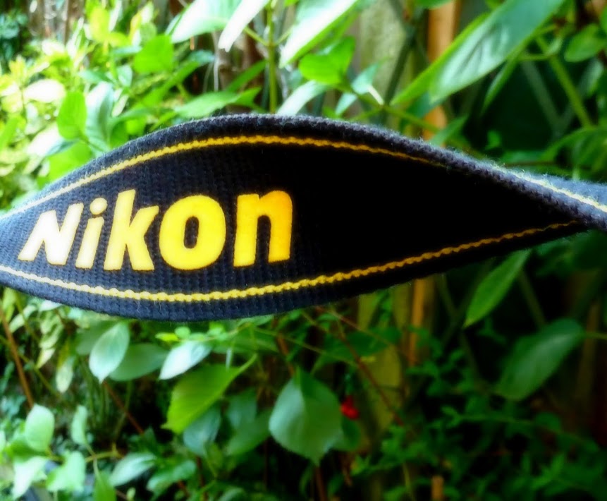
twisted #1....original idea & gotta love it cos it's Nikon The yellow contrasts against the greenery nicely but maybe holding it a little further away from the green stuff would have made it stand out a little more ?
twisted #1....original idea & gotta love it cos it's Nikon
- Messages
- 1,417
- Name
- Judi
- Edit My Images
- Yes
Hi again d00d ..... I prefer this to the previous one .... good original idea too

- Messages
- 9,095
- Name
- Mandy
- Edit My Images
- Yes
Fresh - I like the tulips nice bright reds, I feel the composition could be a little better.
- Messages
- 4,088
- Name
- Graham
- Edit My Images
- Yes
fresh milk - meh....
but the tulips are ace, yep, as andy says great POV and reds, can;t see how the composition could have been uch improved, looks like a shot from low down in amongst a load of tulips.
The big one 2/3 along on the bottom needs to go though.
but the tulips are ace, yep, as andy says great POV and reds, can;t see how the composition could have been uch improved, looks like a shot from low down in amongst a load of tulips.
The big one 2/3 along on the bottom needs to go though.
- Messages
- 1,408
- Name
- Elaine
- Edit My Images
- Yes
Twisted - great idea leaving the cork on the corkscrew, works really well! I also like the fresh milk - a different take on the theme 

- Messages
- 1,353
- Name
- Chris
- Edit My Images
- Yes
Can't add much crit to the tulip shot, but I do like the idea of it. Spoilt by sky and for me being a bit too close to the foremost flower
- Messages
- 9,075
- Name
- David
- Edit My Images
- Yes
Twisted - great idea leaving the cork on the corkscrew, works really well! I also like the fresh milk - a different take on the theme
thanks Elaine
- Messages
- 9,095
- Name
- Mandy
- Edit My Images
- Yes
Shape - doesn't really work for me there is nothing to draw my eye in and keep my attention.
Numbers - simple tho the number 7 looks a little drunk lol.
Numbers - simple tho the number 7 looks a little drunk lol.
- Messages
- 7,548
- Name
- susie
- Edit My Images
- Yes
Hi d00d ....shape .... well it is nice and curvy  but I suppose it lacks a bit of impact, maybe you could have really exaggerated the shape even more.
I really like this weeks one ... Is it wonky a good variety of textures and colours, including the concrete wall on the left. Well done for spotting that one....good choice for the theme.
I really like this weeks one ... Is it wonky
Last edited:
- Messages
- 8,398
- Name
- Lynne
- Edit My Images
- Yes
Hi ya
apologies for taking so long to nip in
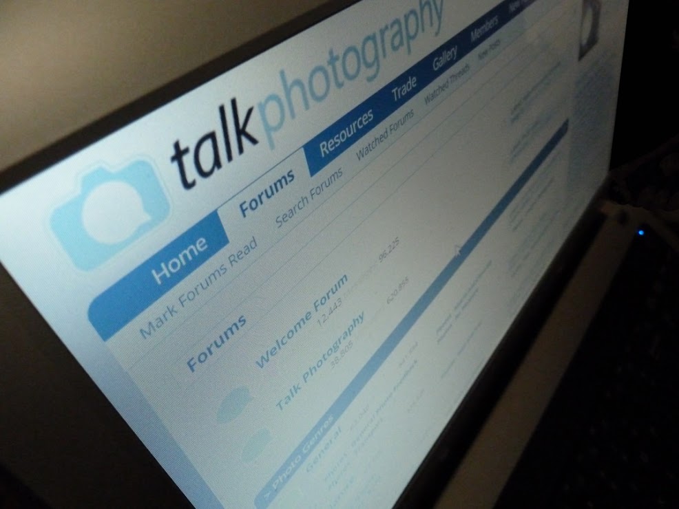
Shape.....computer screen doesn't really do much for me though I can't help feeling that it does look a bit curved,,,not sure that makes sense even to me !
Fresh...milk is original but a bit hmmmm.......Tulips on the other hand really pop , vibrant reds , like the POV but that sky is a mare....nit tried using the filters in pp yet but wondering if they would help or a bit of burning ?
Numbers.....there's so many lines going on in there it's difficult to tell if it's squiffy or not Lots of textures in the wall & door , nice n bright & sharp
apologies for taking so long to nip in
Shape.....computer screen doesn't really do much for me though I can't help feeling that it does look a bit curved,,,not sure that makes sense even to me !
Fresh...milk is original but a bit hmmmm.......Tulips on the other hand really pop , vibrant reds , like the POV but that sky is a mare....nit tried using the filters in pp yet but wondering if they would help or a bit of burning ?
Numbers.....there's so many lines going on in there it's difficult to tell if it's squiffy or not
 Lots of textures in the wall & door , nice n bright & sharp


