weekly Jason's 52 in 2014 - SUPPORT Added - We've made it to the end together :-)

It ain't gonna be easy for you, but the joy of a newborn baby :)

Regarding crit, you have aq valid reason here - just make the odd comment now and again.

Crertainly Dreamy, and colourful. The butterfly really adds to the dreamyness.

No real crit, just on my work's PC the colour of the labels looks a bit flat.

Stick with it.

Cheers.
 
Hi Jason,

Can't help but think with Dreamy you've made it hard for yourself by compositing the letters onto the BG.

Surely it would have been easier to have taken it against some floorboards and a blue wall, ?? But the end result is effective, and looks like it was actually taken against a blue wall with floorboards!
 
Hi Jason ....
I really like the idea of the word dreamy on the little pegs strung up against a blue sky, but I'm sorry I don't like the floorboards, I would have liked it just to be floating in the breeze. I do hope you don't give up and manage to hang on, although I can appreciate how busy you must be at the moment.
 
I have no idea what others mean in some of the above replies as PP is not my strength, so will have to agree with what they say!
However, I like the idea you've gone for and I think it works really well. I like the colourfulness of the photo.
 
works well enough for a quicky... well processed, bit of contrast and detail all that was needed here.
 
It ticks the vertical box certainly Jason but i can't quite help but feel it needs a little bit more to lift it photographically.
 
works well enough for a quicky... well processed, bit of contrast and detail all that was needed here.

Thanks Graham mate for the comments....I am happy enough overall but truth be known, I am really struggling with getting exposures right. Check the SOOC image and you'll see its really naff. Feel that the need to 'overprocess' and bring back details detracts from the overall image :(

Well taken Jason - plenty of verticals to fit the theme and the background is simple enough not to detract. Good detail and balance... on to the next week now!

Thanks Paul....hope to visit your page soon (y)

Dreamy ... nicely staged.


Thanks David.....a lot of photoshoppery required to achieve that staging....lol ;)

It ticks the vertical box certainly Jason but i can't quite help but feel it needs a little bit more to lift it photographically.

Hi Iain.....Could'nt agree more. Im under no illusion that this is mediocre as best...see comments in response to Graham re exposure above.

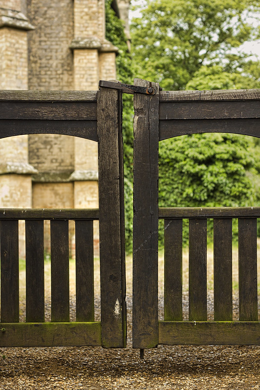
Hi, vertical on thing to detail in the gate. I'd like to see closer Crop and would shallower depth of field.

Cheers.

Agreed re shallow depth of field....this was shot at f4.....and I thought it was 1.8...oops :eek:

Hi Jason -

Dreamy nice and simple fits the theme well nice colours in there butterfly really adds to it

Vertical - not your best image Jason lacks impact but fits the theme bloody babys hey

Thanks Craig for the comments......tell me about.....dont know if Im coming or going.. Currently working 12 hours days and then doing the night shift feeds.......dont know how much longer I can go without a full nights sleep.......though like I always say; its SELF INFLICTED...ha...ha
 
Hi Jason

Dreamy...... like the idea & would look lovely in a nursery...soft pastel type colors , , butterfly add's a touch but the floorboards...not sure about them,maybe if they were whitewashed or if the blue from the top half of the shot covered them ?

Vertical...on theme with plenty of verticals , but as Iain say's , needs a little something more....

Don't beat yourself up about the 52 , take & post shots as you can.....sounds like life is hectic for you (y)
 
Hi Jason,
vertical.... your gate fits the theme well, plenty verticals there :)

Thanks Judi for the comments :)


Hi Jason

Dreamy...... like the idea & would look lovely in a nursery...soft pastel type colors , , butterfly add's a touch but the floorboards...not sure about them,maybe if they were whitewashed or if the blue from the top half of the shot covered them ?

Vertical...on theme with plenty of verticals , but as Iain say's , needs a little something more....

Don't beat yourself up about the 52 , take & post shots as you can.....sounds like life is hectic for you (y)

Thanks Lynne for the comments....all valid points especially regarding the floorboards....and a great idea about hanging in a nursery - just so happens I've got one of those ;)

I do intend to stick it out.....but feeling guilty about lack of commenting on threads :(
 
Cracking lightpainting. It's really brought out the colours, tones, textures and detail. First thing I thought of was Rembrant.

Crit, just a few minor points, there are a few hot spots on the fruit and a little close on the RHS.

Cheers.
 
Hi Jason, It looks great. Good choice of colour for the background cloth as it fits with the fruit beautifully. Only minor crit I wold make as it might benefit from being slightly warmer (minor adjustment to colour temp). Well done.
 
Vertical - Fits the theme for me, nice sharp and in focus well done.

Yum - plenty of yummy fruit in there, superb take for the theme i really like the composition on the image and the detail in the fruit is nicely held.
 
I like this Jason (y)
It has an old masters feel about it, just like something one would see in an old still life oil painting.
Lovely colour tones too.
 
Wild - Nice and mysterious, good composition.

Dreamy - Very nice, bright and cheery with good contrast between the floor and wall.
 
Wow Jason... Yum is superb. I don't know how the lightpainting technique works, but I love the effect - it is very old masters-esque as others have said. Wonderful. Perhaps a darker rug might work better, but otherwise I don't have enough knowledge/understanding of what goes into these sorts of shots to offer any helpful critique!
 
Dreamy - Nice simple but well though out image. This would go down well on image selling sites

Vertical - I like the idea of using the gate but I feel the background either needed throwing a bit more OOF or have something to add some interest

Yum - A very classy image, beautifully lit with the colours vibrant but not too over-saturated
 
Cracking lightpainting. It's really brought out the colours, tones, textures and detail. First thing I thought of was Rembrant.

Crit, just a few minor points, there are a few hot spots on the fruit and a little close on the RHS. Cheers.

Hi Andy. You're right about the hot spots, though after so many attempts to get the lighting even, and without hotspots, I gave up and settled for this one ;)

Hi Jason, It looks great. Good choice of colour for the background cloth as it fits with the fruit beautifully. Only minor crit I wold make as it might benefit from being slightly warmer (minor adjustment to colour temp). Well done.

Hi Richard, I did a warming photo filer in PS and too felt like it need to be warmer, but retrained myself for fear of altering the colours too much. Thanks for the comment (y)

Vertical - Fits the theme for me, nice sharp and in focus well done.

Yum - plenty of yummy fruit in there, superb take for the theme i really like the composition on the image and the detail in the fruit is nicely held.

Thanks Mandy....I can really recommend light painting for subtle lighting of subjects with a black background

I like this Jason (y)
It has an old masters feel about it, just like something one would see in an old still life oil painting.
Lovely colour tones too.

Thanks Iain....Means a lot.....I must say I tried hard on this one to keep the colours as realistic and true to life as possible

Thanks Mark mate....glad you like them......and thanks for the comments. They are much appreciated.

Hi Jason

love it....well light ,well arranged & good detail , really pops off the screen at you :clap:...as per Iain & Andy.......very Old Masters

Thanks Lynne :) I do admit this is one of my more pleasing attempts....was worried about the arranging as artistic flair is not within me, but think it worked out ok. Thanks for stopping by (y)

Great image for Yum Jason... good lighting and enough interest in the image to keep the eye interested...

enough interest and enough fruit .......Im still eating some of it until today :eek:. Thanks for the comments Colin

Hi Jason,
That's brilliant for Yum. I love it. I'd give that 1st prize at a Show if it was on display. Looks very edible indeed.

Thanks Simon....was yummy indeed, especially the melon. was expecting it to taste like water but was ripe and full of flavour - strangely though kids were not keen on it at all.

Wow Jason... Yum is superb. I don't know how the lightpainting technique works, but I love the effect - it is very old masters-esque as others have said. Wonderful. Perhaps a darker rug might work better, but otherwise I don't have enough knowledge/understanding of what goes into these sorts of shots to offer any helpful critique!

Thanks Paul. Goolgle lighting painting and you'll no longer be in the dark ;) all you need is a dark room, torch, remote release and a camera in manual bulb mode (y)

Hi Jason,
Yum, love it nice colours too very yummy :)

Thanks Judi....was nice to detox on a healthy subject for once.....the night before this was Friday which is pie night.....check out my flickr pic of this subject....and you'll know why I'm overweight ;)

Dreamy - Nice simple but well though out image. This would go down well on image selling sites

Vertical - I like the idea of using the gate but I feel the background either needed throwing a bit more OOF or have something to add some interest

Yum - A very classy image, beautifully lit with the colours vibrant but not too over-saturated

Hi Peter. Thanks for the comments catchup....really not required, but is ;) appreciated. Regarding yum picture - colours are vibrant I agree, and the best part is that absolutely no saturation was add - testimony to the virtues of light painting I guess? Thanks againg for stopping in and commenting (y)

Hi Jason ....I love this one, very eye catching, the black background is perfect for the shot, it reminds me of the fruit painted on Royal Worcester porcelain.....as Peter said very classy.

Thanks Susie, glad you like it ;) As a side note; class is not something I've ever been blessed with..lol
 
The fruit is very nice but as I'm a little late commenting it's all been said already.

Loud :clap:, i don't really know what else to say.
 
Cracking job here Jason, seamless blend of the multiple images abd musical notes. Well lit shot of your son too, with a great expression!

Blending is super good, even round his hair which must have been hard.

Only one question? Why no t-shirt? No problem for him not to have one on, but I can't find a reason to specifically have had him without?
 
Loud, i don't personally like images like this, but its technically well done and fits the theme really well.
 
The fruit is very nice but as I'm a little late commenting it's all been said already.

Loud :clap:, i don't really know what else to say.

Thanks Mark mate :)

Cracking job here Jason, seamless blend of the multiple images abd musical notes. Well lit shot of your son too, with a great expression!

Blending is super good, even round his hair which must have been hard.

Only one question? Why no t-shirt? No problem for him not to have one on, but I can't find a reason to specifically have had him without?

Hi Graham....No reason or symbolism whatsoever for having no T-shirt on - Pic was shot on the weekend when the kids were running in and out the house in between sessions in their swimming pool.....I guess in hindsight some people may find it inappropriate, though honestly could'nt imagine why ?

Loud, i don't personally like images like this, but its technically well done and fits the theme really well.

Thanks mate....as they say....each to their own hey

Yum - a great effort Jason, back round works, composition is spot on lighting really suits

Loud - excellent PP skills again there :clap::clap:

Thanks for the stopping in Craig....always appreciate your comments (y)
 
Hi, I do like the fruit shot nice strong colours
loud not sure i like the BG to be honest, its nicely done but not sure it needs to be so elaborate, good idea with your son though
 
Hi Graham....No reason or symbolism whatsoever for having no T-shirt on - Pic was shot on the weekend when the kids were running in and out the house in between sessions in their swimming pool.....I guess in hindsight some people may find it inappropriate, though honestly could'nt imagine why ?

That's cool Jason, (y) No suggestion of inappropriateness at all.

Makes sense if he had no top on, and you took the picture.. Just couldn;lt imagine the scenario happening where you set up and take the shot, and then say "hmmm, actually, could we do it once more but without the t-shirt on!"
 
Hiya Jason,

Yum, lighting, composition, colours, great shot, (y) the only thing to catch my eye and don't know why it bothered mi :thinking:...... was the crossing of the pear stalk and grape stalk top right :)

Loud- excellent :clap: :LOL:
 
Back
Top