weekly Marsha's photo 52 2012 is complete. NSF Dieters!

Art – Absolutely gorgeous image. The pp and composition are superb. Big well done from me.

Colour – Very nice. My only issue is losing the rim of the second glass but the lighting overall is very good.

Reshoot – A very natural shot. She looks so proud of winning that medal. You’ve really captured the story in that shot.
 
Hi, Marsha, missed a few :nono:

Art, I like it. I did something similar and it didn't go down to well :D Liking the muted pinks and it's well composed, overall, tad off the top for me.

Colour, oooooohhhhh, they are cracking glasses. You've done really well to get separation between the glasses and the BG. What you've done really well with it the lack of glare from any light.

Win, fan...tas...tic.... subject. Look at her face and how she's cradling her medal. Such pride. No crit, I can't.

Cheers.
 
I bought this christmas tree decoration last week just haven't had the time to figure out a contraption to hold it up! Well I finally got it done tonight!


Apart from the grubby paper needing some levels work and some dirt removing this is as shot, ok so the shadow needed a levels tweak too to make it a tad darker!

All C&C welcome :)
 
I thought of this as soon as the theme was announced and thankfully got this shot pretty quickly, just needed to sheild the other lights to reduce any glare!

Pretty dull I know but it's Christmassy too :D

More importantly it's on time, JUST!


All C&C welcome please.

And now my internet mice are working I may be able to get around to your threads again.
 
Hi Marsha :)

Shadow is very very nicely composed, with the shadow showing off shape in the dancer that you can't see otherwise. I really can't fault it!

Glow is bang on theme (why only "just"?), and well taken. It's not dong a lot for me "artistically" though, even though its nicely composed. Maybe a bit of nice bokeh in the background, from the other lights, would have made all the difference?
 
Hi Marsha - shadow - you've lost the shadow at the top but not sure how you'd fix it - stronger light or maybe move the light higher and/or closer?

glow - perhaps some black card or material behind the light to make the bg more plain? I think it needs to be a clear bg (bokeh as Mark says?) or no bg. You've kinda got it half n half. Maybe you could use pp to clean the bg a bit? I do like the rays of light coming off the bulb though :clap:
 
Shadow is very very nicely composed, with the shadow showing off shape in the dancer that you can't see otherwise. I really can't fault it!

Glow is bang on theme (why only "just"?), and well taken. It's not dong a lot for me "artistically" though, even though its nicely composed. Maybe a bit of nice bokeh in the background, from the other lights, would have made all the difference?

Hi Mark, it was awkward getting the angle of the dancer and the shadow, one angle had the foot at the back looking very odd!
I posted glow at 2359 :D that's why only just!i wanted some bokeh from the other lights, but because they were so close and bright they completely dominated the background rather than compliment it! I think I need to buy a second set and have the tree in the background blurred:thinking:

- shadow - you've lost the shadow at the top but not sure how you'd fix it - stronger light or maybe move the light higher and/or closer?

glow - perhaps some black card or material behind the light to make the bg more plain? I think it needs to be a clear bg (bokeh as Mark says?) or no bg. You've kinda got it half n half. Maybe you could use pp to clean the bg a bit? I do like the rays of light coming off the bulb though :clap:

Cheers Summer. It was quite difficult getting the shadow solid throughout. Too low and the shadow was too long, too high and it's too short, too many bursts of flash (done manually with the camera set on bulb) meant no shadow at all, not enough flash and the background was completely grey :bonk: So I settled for slightly lost at the top!
I quite liked the background as it is:coat: 
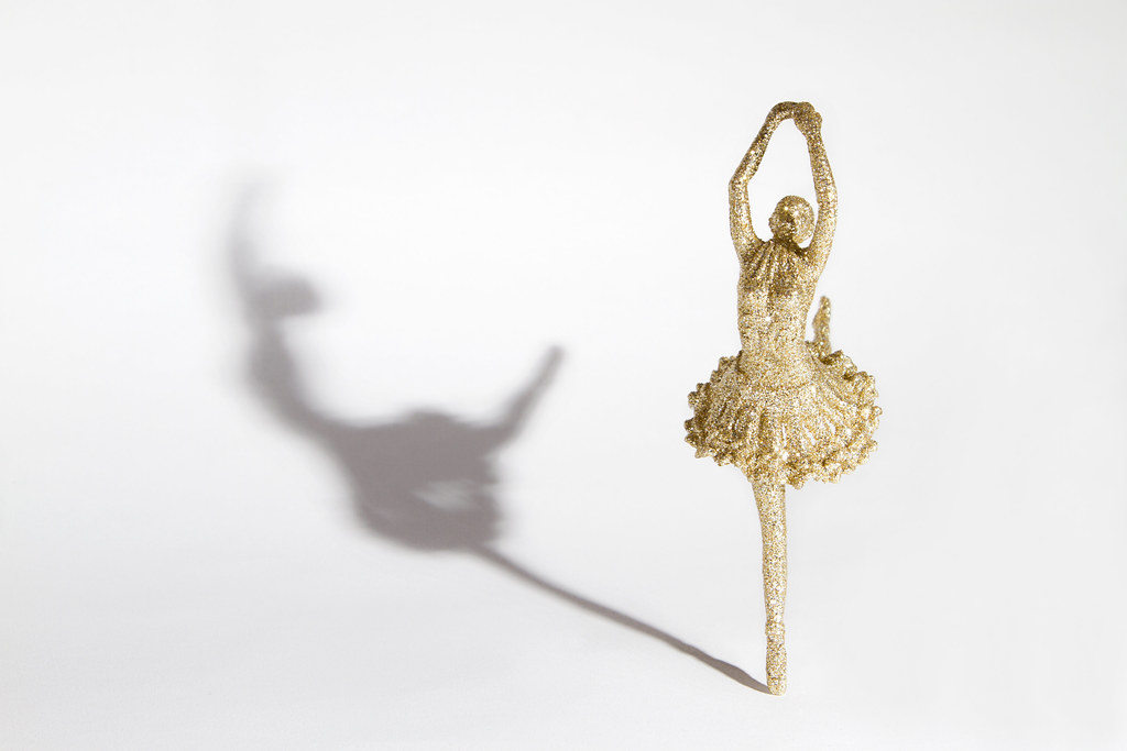
I could have used card but thought it might be boring! Looks like I need to try again:)

Hiya Marsha. Shadow I like. Nice bit of pp work there, the shadow stands out nicely. Glow, a little dull as you say, but I like the rays of light.

Thanks Michael:)
 
Shadow, like it. Very elegant. Nice long shadow. Slight vignette, maybe?

Glow, another good one. Simple and well exposed. Cracking star burst.

Cheers.
 
posiview said:
Shadow, like it. Very elegant. Nice long shadow. Slight vignette, maybe?

Hi Andy. Do you mean there's is a slight vignette or it needs one?

posiview said:
Glow, another good one. Simple and well exposed. Cracking star burst.
Thanks, I thought that too. I tried again this aft with some lights behind but it just looks messy:thinking:
 
Hi Marsha

Shadow - very creative. Good capture of the gold in the figure and the shadow is well caught - I like the fact that it starts very sharp and dark at the foot and then softens and lightens to the top. Andy's idea of adding a slight vignette would be interesting to try.

Glow - good idea and the light s very well captured with starburst. B/g is ok for me but agree with your idea of having another set of lights further back
 
Hi Marsha :wave:
Shadow, is a lovely take on the theme. I think the shadow itself is fine as, its how a shadow would fall, fading away the further away from the subject it gets. I can imagine any stronger light and you would risk blowing detail in the figure. So how did you get the dancer to stand in the end? :thinking:

Glow works well for me too. I like the starburst effect from the light, the background works too. Good work (y) Iain
 
shadow is really good and yes how did you get it to stand witchcraft I'm thinking :eek:

Glow works well too nicely exposed (y)
 
Shadow - very creative. Good capture of the gold in the figure and the shadow is well caught - I like the fact that it starts very sharp and dark at the foot and then softens and lightens to the top. Andy's idea of adding a slight vignette would be interesting to try.

Glow - good idea and the light s very well captured with starburst. B/g is ok for me but agree with your idea of having another set of lights further back

Cheers Alan I didn't think about a vignette but then I rarely use them! If I get a chance Andy I'll see what it looks like!

Hi Marsha :wave:
Shadow, is a lovely take on the theme. I think the shadow itself is fine as, its how a shadow would fall, fading away the further away from the subject it gets. I can imagine any stronger light and you would risk blowing detail in the figure. So how did you get the dancer to stand in the end? :thinking:

Glow works well for me too. I like the starburst effect from the light, the background works too. Good work (y) Iain

Many thanks Iain and I pretty much used your idea that you used on your bike figure, tied up with cotton and cloned out later;)

shadow is really good and yes how did you get it to stand witchcraft I'm thinking :eek:

Glow works well too nicely exposed (y)
Thanks Allan. Oh and it's amazing what you can do with some Duplo Lego, a net curtain pole, some cotton and the clone stamp tool:
A99B0CAB-4426-428C-A8BD-B447C64AD4C1-1345-00000101B6664263.jpg
 
Hi Marsha

little catch up from me

Shadow....good to see your set up shot & amazing use of the clone tool (y) Like the angle , the shadow falls at the right angle for me is just strong enough...no crit from me :clap:

Glow...love that starburst , good focus & nicely christmassy (y) I like the bokeh as well , not too overpowering & the tones suit the feel of the image :)
 
Shadow, works great Marsha, simple (or at least looks it) and the shadow is clear. It does help show the shape that's missing... An interesting use for Duplo... very clever.

Glow, that little light is most definitely doing that. The diffraction spikes add to the glowing feeling... as does the dust on the glass of the bulb :D...
 
Shadow - Nice one. The shadow works well for the figurine. Looks nicely lit as well

Glow - Nice and simple and yet effective. I like the addition of the star burst effect.
 
Shadow - a lovely elegant shadow and great to see someone else has a Blue Peter set up!!:)

Glow - Again as others have said I love the starburst, the background doesn't worry me as it makes you look at the bulb and the "glow":):)
 
:LOL: I like the set up shot Marsha very Blue Peter ;)
You've got to work with whatever you have lying around, adapt, adjust and overcome we say in the military!

Shadow....good to see your set up shot & amazing use of the clone tool (y) Like the angle , the shadow falls at the right angle for me is just strong enough...no crit from me :clap:

Glow...love that starburst , good focus & nicely christmassy (y) I like the bokeh as well , not too overpowering & the tones suit the feel of the image :)
Hi Lynne, I only had to clone out the cotton so really not that much effort. The set up shot shows a shadow from the big light above, but that wan't on for the photo itself!
Glad you like them both.

Shadow, works great Marsha, simple (or at least looks it) and the shadow is clear. It does help show the shape that's missing... An interesting use for Duplo... very clever.

Glow, that little light is most definitely doing that. The diffraction spikes add to the glowing feeling... as does the dust on the glass of the bulb :D...

Shadow - Nice one. The shadow works well for the figurine. Looks nicely lit as well

Glow - Nice and simple and yet effective. I like the addition of the star burst effect.
Thanks John and Peter.

Shadow - a lovely elegant shadow and great to see someone else has a Blue Peter set up!!:)

Glow - Again as others have said I love the starburst, the background doesn't worry me as it makes you look at the bulb and the "glow":):)

Cheers Sarah, the Blue Peter set up is the way ahead, when I'm not breaking myself tripping over it Duplo has it's advantages ;)
 
When the world was frozen I ventured out into the garden and took this. Alas the spiders can't seem to make perfectly round webs and every single one had areas missing. But I love this shot, the central spokes around which the web is built, plus it is ring shaped!

Apart from a slight sharpen, curves tweak and tiny crop, this is as shot.


The bright red background is actually the wooden table leg, OCF was used to highlight the frozen droplets that look like gems!

All C & C welcome.

I have the weekend up north and I'm alone next week so hoping for a major catch up with everyone else soon.
 
I'll give you this one...around ;)

It's a good one. The detail in the ice is well defined and the exposure looks good to me. The contrast FG and the BG emphasises the web. Just amazes me how strong such a delicate object can be.

Cheers.
 
When i first saw this, i thought wow, Marsha has a lot of diamonds! Can't really fault it, other than maybe the slight lack of roundness. You really must train your spiders better!
 
oh no another one I also tried, my spiders refused to make round webs too, I did get some that I might stick in my main thread later :)

anyway, very sorry but your shot doesn't work for me :( it isn't very round and the crop has taken away any context. I think either a much closer or a much wider crop would maybe look better

I also think the plain red background has taken away some context, for a spider web in the frost I would have liked to see some blurry garden in the bg?

sorry hon - even though the frost looks brilliant :)
 
Hi Marsha,

Round - I have to agree with Summer, I don't get 'round' or even spiderweb from this. Because of the way it's been shot, and with this particular background, to me, it does not look like something you might find in nature - instead, it looks like something man-made. Having said that, it is very colourful.
 
Hi Marsha

hmmmm...lovely shot for Round ( or Around ), it's christmas so what the hell , artistic licence at it's best :LOL: Love the BG color , contrasts really well , wouldn't have guessed it was a web .Think you've caught the delicateness really well :)
 
actually it does look like tinsel Lynne :)
 
I'll give you this one...around ;)

It's a good one. The detail in the ice is well defined and the exposure looks good to me. The contrast FG and the BG emphasises the web. Just amazes me how strong such a delicate object can be.
Thanks Andy. I was amazed that they could still be hanging with the weight of so much ice on them:bonk:

When i first saw this, i thought wow, Marsha has a lot of diamonds! Can't really fault it, other than maybe the slight lack of roundness. You really must train your spiders better!
I know Mark, I will be having a word with them about their poor web constructions! Oh and I wish I had this many diamonds too:D

Yes, slight lack of roundness but good shot nonetheless. Very good b/g to show up the detail and quite fascinating to look at.
Thanks Alan.

oh no another one I also tried, my spiders refused to make round webs too, I did get some that I might stick in my main thread later :)

anyway, very sorry but your shot doesn't work for me :( it isn't very round and the crop has taken away any context. I think either a much closer or a much wider crop would maybe look better

I also think the plain red background has taken away some context, for a spider web in the frost I would have liked to see some blurry garden in the bg?

sorry hon - even though the frost looks brilliant :)
Hi Summer, no problems. I took this definition of round :

ring-shaped, as a hoop.
curved like part of a circle, as an outline.

So no not completely round, plus the weight of the ice has dragged them down somewhat. This is also why there's no 'garden' behind as the only surviving webs were the ones clinging to tables and fences and everything else was white with frost:bonk:
I do have a shot further back though, I will upload that to Flickr when I get a chance. This was as close as I could get without getting the tripod out though!

Round - I have to agree with Summer, I don't get 'round' or even spiderweb from this. Because of the way it's been shot, and with this particular background, to me, it does not look like something you might find in nature - instead, it looks like something man-made. Having said that, it is very colourful.
Hi Nat, this is rather abstract, which is why I rather liked it as it's a bit different!

hmmmm...lovely shot for Round ( or Around ), it's christmas so what the hell , artistic licence at it's best :LOL: Love the BG color , contrasts really well , wouldn't have guessed it was a web .Think you've caught the delicateness really well :)
Cheers Lynne, I was tempted to do a 'can you guess what it is?' thing :LOL: It is very Christmassy, still trying to get in the Christmas spirit so it all helps!

michael23 said:
lovely pic that Marsh, the red bg looks orange on my screen, but it really sets the web off. Very nicely lit.

Cheers Michael. Sorry I'm a bit behind on things, any news on the baby front yet?
 
michael23 said:
Don't worry about being behind, I am still 2 pics behind! Baby due tomorrow, but no sign, looks like he's waiting a bit....
I'm getting there slowly! Best I catch up before starting it all again!

I hope he doesn't keep you waiting too long? Jack kept me waiting an extra 12 days, I wasn't amused!
 
Just looked through all 30 pages of your thread and some absolutely gorgeous shots - and love the 'twist' on the theme with some of them :) Great work and looking forward to the last ones :)
 
really nice shot of the spiders web not sure about the round thing though but you know that after all the other comments
 
Hi Marsha, :wave:
I will buck the trend here about interpretation of round, I didn't take it to necessarily mean circular, in the sense that you can look round a corner ;)

Your image has curves within it so for me it meets the theme.

I really like it, nature at its most artistic well spotted. I do feel the background colour is a little overpowering though, how does it look as a B&W conversion or even just desaturated a little?

Not long to go now before we can all start again :LOL:
 
It's abstract, different and works for me for the theme... the background really makes the ice crystals stand out too, but like Iain, think it's perhaps a little over powering...
 
Back
Top