weekly Phil-D's TP52 - 2014 week 52 Support added (archive shot)

Sorry - on re-reading my post, Phil, it sounded incredibly harsh which it wasn't mean to be!! I do like the photo :)

No oligopoly needed Paul, I certainly didn't read it as harsh, just good honest crit, which is good (y) .....re-reading I think my post needed a :) emotion :)

Edit- oligopoly :confused: :LOL:.......obviously meant apology :)
 
Last edited:
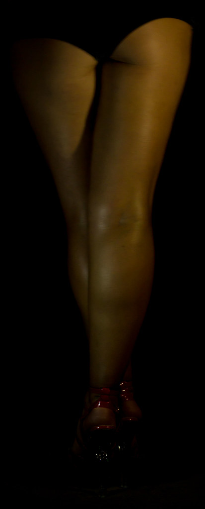
Thought I needed to put a lot more effort into this week theme, jump right outside my comfort zone and try something I've never tried before...........skin and low key lighting :eek:

What a blooming nightmare :banghead::LOL:

Hats off to mi model again, (although I had to talk her into it :bat:). I had this idea of just exposing nothing but her legs and the red of the shoes. Her knickers were black and I wanted them to blend into the black bg completely (which I sort of achieved)

I'm not all that happy with the out come, its ok but given another go I think I could get better results. I've definitely learned from doing it. Lighting was done with torches and tissues used as diffusers taped onto tripods :D

My own crit would be...

1, I'm not a lover of the harsh shadow on the inside of the left thigh

2, it needed a little more light on the left a*se cheek to emphasise the shape of the knickers to match the right side, this might also have help to diffuse the harsh shadow??

3, its a little soft which I think is more than likely down to her slight movement over the 8 second exposure

No pp other than adjustments in ACR

Honest crit more than welcome but please don't feel you have to comment, I'm still way behind :oops: :$

Edit- just thought I'd add, she really is that brown :rolleyes:

She's asked me to leave it private on flickr :)

2nd Edit- seeing as it's private on flickr settings were 8 second exposure, f 5.6, ISO 400

So here we have

Half of my other half, half naked :D


Half of my other half
by Phil D 245, on Flickr
 
Last edited:
Good shot Phil and it's always great to get out of the comfort zone a bit...

For me, it's perhaps just a touch too dark to see enough detail? What I really mean is the whole image is way over in the left of the histogram, with no highlights to speak of (bar teeny weeny reflections on the shoes?)

What I think works well (to my eyes, at least) when doing a low key shot is have something to anchor it back to the right - whether it's strong side lighting and blowout of the edges on that side, I just think it needs something to balance the dark? The option would be to really play with the tone curve and get some of the mid-browns up to light-browns...

Just a thought, but a great start to low-key stuff and looking forward to seeing more experimentation in this style as it can be very powerful. (y)
 
Phil, you have your own crit re the lighting but without a more expensive and complicated set up I think you've done a great job. Highlights are good and give good depth and shape with the shadow.

Bit more light on the shoes might have brought a bit of colour and a possible alternate focal point. iyswim. Wonder if a landscape orientation with a bit of negative space might work too?

Overall though its a great job, and top marks to your model. Brave lady. :clap:
 
Good shot Phil and it's always great to get out of the comfort zone a bit...

For me, it's perhaps just a touch too dark to see enough detail? What I really mean is the whole image is way over in the left of the histogram, with no highlights to speak of (bar teeny weeny reflections on the shoes?)

What I think works well (to my eyes, at least) when doing a low key shot is have something to anchor it back to the right - whether it's strong side lighting and blowout of the edges on that side, I just think it needs something to balance the dark? The option would be to really play with the tone curve and get some of the mid-browns up to light-browns...

Just a thought, but a great start to low-key stuff and looking forward to seeing more experimentation in this style as it can be very powerful. (y)

Thanks Paul, advice taken on board :), I did wonder if it may come across a little dark to some, I've had a similar problem before, both viewing and displaying images, where they look ok on my cheap lappy :confused:

Phil, you have your own crit re the lighting but without a more expensive and complicated set up I think you've done a great job. Highlights are good and give good depth and shape with the shadow.

Bit more light on the shoes might have brought a bit of colour and a possible alternate focal point. iyswim. Wonder if a landscape orientation with a bit of negative space might work too?

Overall though its a great job, and top marks to your model. Brave lady. :clap:

Thanks Graham, I really wasn't set up right at all, no dark room so had to wait till it got dark, not enough space ( furniture ect) hence the tighter crop than I wanted and to top it off, a very irritable model :LOL:

This week was certainly more about experimenting and trying a new technique than achieving a perfect image :)

Hi. Half, can't really see any detail and your Flickr is marked as private.

Naked selfies are the future :)

Chests.

Cheers Andy....there's already too many naked selfies on here ;) :D

And I can't see her ever letting me photograph her chests :p
 
Good take on theme Paul... and for the record... nice legs ;)
Would agree with the above re lighting etc but as you said yourself you weren't happy outside yer comfort zone...
 
I agree with the other comments. Good take on the theme but a little more light, especially below the knees, would have made a big difference.
 
Hi Phil

Skill....archive shot or not I love that . those smoke trails are awesome :clap:

Half.....not gonna crit as couldn't have done half as good a job & a big :clap: to your better half for modelling
 
Hi, half nice idea but don't know why the 8 second exposure, not an easy thing to do stand still for 8 seconds, so better lighting
top marks for her for posing :clap:
 
Good take on theme Paul... and for the record... nice legs ;)
Would agree with the above re lighting etc but as you said yourself you weren't happy outside yer comfort zone...

Cheers Colin

I agree with the other comments. Good take on the theme but a little more light, especially below the knees, would have made a big difference.

Thanks Elaine :)

Hi Phil

Skill....archive shot or not I love that . those smoke trails are awesome :clap:

Half.....not gonna crit as couldn't have done half as good a job & a big :clap: to your better half for modelling

:wave: Lynne, thanks, I'm a lot more envious of your PP skills :p :D

Hi, half nice idea but don't know why the 8 second exposure, not an easy thing to do stand still for 8 seconds, so better lighting
top marks for her for posing :clap:

Cheers Alan, I think next time I need a better working area, more light just seemed to show more of the surroundings. Agree though, 8 seconds is a long time to stand still in that position, but I certainly learnt from having a go and quite enjoy doing something different :)
 
Last edited:
Went over to the Humber to photograph the bridge yesterday. I've been over before, but once I'd got there, I struggle for inspiration
dunno.gif


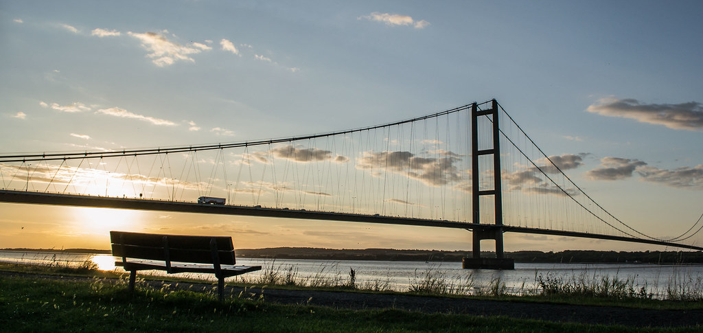
Here's a couple I ended up with. Not sure on the first, can't just put mi finger on it, can't decide if it works for me or not :thinking:

Took the 2nd just as the sun was directly behind the road way to try and stop it blowing and give a little more detail in the shadows. It didn't really work but its had a bit of adjustment in ACR :)

Was hoping for a nice colourful sunset but it wasn't to be, sky cleared and the sun just went down with hardly any colour:banghead:

As always, honest crit and comments most welcome

The Humber Bridge, an architectural feat


TP52 Week 31 Architectural
by Phil D 245, on Flickr


TP52 week 31
by Phil D 245, on Flickr
 
Last edited:
Hi Phil, #2 is a lovely sunset shot. You did well to wait until the sun was behind the bridge, it makes a great silhouette. However the composition and contrasts between the technical design and construction of the bridge and the rough boulders on #1 definitely make that my favourite! Perhaps a little more colour depth or contrast to the boulders, but that's a minor crit - it's an excellent shot!
 
Re lighting, it may be you can adapt your light source just to light up the area you want (her legs) without spilling onto the background? If using a flash (I certainly prefer as it's 100% controllable) then you can obviously shroud it to avoid spillover. Even using natural light, it's possible to use curtains etc. and choice of position to get it more or less just where you want it. Side lighting might help in that regard, here.

I'm sounding like I know what I'm talking about when I don't really, but these have been my experiences to date. The problem with using long exposures is that - as you've found - it generally gets a fair percentage of the exposure using ambient light which is everywhere...

Re: architectural... I like your first shot a lot. It's a similar idea to my Strong shot of a bridge, really highlighting the expanse of unsupported structure. Composition good although it might have been even stronger to get the vanishing point further right/down in the frame? Nice shot though. Your second one is also good and quite different... nice sky, blowout isn't too bad/distracting and the silhouette works well. Not sure the bench adds anything in itself but I agree another point of interest is probably beneficial - not sure what else it could have been other than a passing car? Good jobs!
 
Hi Phil, #2 is a lovely sunset shot. You did well to wait until the sun was behind the bridge, it makes a great silhouette. However the composition and contrasts between the technical design and construction of the bridge and the rough boulders on #1 definitely make that my favourite! Perhaps a little more colour depth or contrast to the boulders, but that's a minor crit - it's an excellent shot!

Thanks Elaine, I did wonder if the 1st may appeal more to some, but tbh, it wouldn't have been my first choice and I nearly didn't put it up :D..... I can also see exactly what you mean about needing more contrast on the rocks.........not sure I'd know how to do that though without adjusting the rest of the image :confused: :)

Re lighting, it may be you can adapt your light source just to light up the area you want (her legs) without spilling onto the background? If using a flash (I certainly prefer as it's 100% controllable) then you can obviously shroud it to avoid spillover. Even using natural light, it's possible to use curtains etc. and choice of position to get it more or less just where you want it. Side lighting might help in that regard, here.

I'm sounding like I know what I'm talking about when I don't really, but these have been my experiences to date. The problem with using long exposures is that - as you've found - it generally gets a fair percentage of the exposure using ambient light which is everywhere...

Re: architectural... I like your first shot a lot. It's a similar idea to my Strong shot of a bridge, really highlighting the expanse of unsupported structure. Composition good although it might have been even stronger to get the vanishing point further right/down in the frame? Nice shot though. Your second one is also good and quite different... nice sky, blowout isn't too bad/distracting and the silhouette works well. Not sure the bench adds anything in itself but I agree another point of interest is probably beneficial - not sure what else it could have been other than a passing car? Good jobs!

Thanks Paul, again, another vote for the shot that would have been my 2nd choice :p but I did think it might be that way :)

Re the lighting, all ideas appreciated and taken on board, I'm here to learn :)

As for a passing car! :eek: it was just a footpath along side the estuary .......any passing cars would've ended up in the sea :D
 
Last edited:
Hi, first bridge shot for me i like the perspective agree with Paul about the vanishing point though,
dont think I would have included the bench its kind of distracting in the second image
 
Hi Phil
Skill - on theme and some good colours . You have caught nice angles - pity bottom left plane is a but shrouded.
Half - can't add to anything that has been said - but on theme 3 times - also in the half light :)
Architecture - #1 - strong image. Good sky, excellent pov - agree with others re the vanishing point.
#2 - like the comp - good sky , nice silhouette - not sure that the bench adds and would like to have seen the RHS tower of the bridge.
 
Hi Phil,
Your loud and skill shots are superb no crit from me .
I love your half image, brilliant idea well executed, a tad dark, brave girl :)
Humber bridge...#2, one of my favourite places, 2 weeks ago I was there taking pictures for my grand daughters prom night, needs a little bit of levelling the water is running up hill! but you caught it well love it :)
 
Half- Not sure about this shot, I find it very dark, although it fits the theme well and I respect your partner for allowing you to take the shot.

Architectural - Love the sunset shot, great silhouette I personally like the bench and the light on the grasses around it.
 
Architecture, #1 for me. Well composed and good detail.

The light is a little harsh..pity you didn't have some nice warm sunset colours.

Cheers.
 
Hi, first bridge shot for me i like the perspective agree with Paul about the vanishing point though,
dont think I would have included the bench its kind of distracting in the second image

Thanks Allan

Half - good idea for the theme, I am not an expert in that kind of shot so don't really know what to say.

Architectural - I think the first image works for me, good work.

Thanks Manday

Hi Phil
Skill - on theme and some good colours . You have caught nice angles - pity bottom left plane is a but shrouded.
Half - can't add to anything that has been said - but on theme 3 times - also in the half light :)
Architecture - #1 - strong image. Good sky, excellent pov - agree with others re the vanishing point.
#2 - like the comp - good sky , nice silhouette - not sure that the bench adds and would like to have seen the RHS tower of the bridge.

Thanks Alan

Hi Phil,
Your loud and skill shots are superb no crit from me .
I love your half image, brilliant idea well executed, a tad dark, brave girl :)
Humber bridge...#2, one of my favourite places, 2 weeks ago I was there taking pictures for my grand daughters prom night, needs a little bit of levelling the water is running up hill! but you caught it well love it :)

Thanks Judi, its the angle its shot at that gives the appearance of the water running up hill ;) :)

Half- Not sure about this shot, I find it very dark, although it fits the theme well and I respect your partner for allowing you to take the shot.

Architectural - Love the sunset shot, great silhouette I personally like the bench and the light on the grasses around it.

Thanks Carol :)

Architecture, #1 for me. Well composed and good detail.

The light is a little harsh..pity you didn't have some nice warm sunset colours.

Cheers.

Cheers Andy

Architecture - no 1 for me. The composition of no 2 doesn't quite work for me.

Cheers Richard

Interestingly, I'm the reverse! I like the variation of colours given by the sunset and the almost silhouette nature of the bridge.

Thanks Simon

All comments very much appreciated, thanks :)

Its funny, I did think that opinions on these two shots would be slit, but I can't be swayed :p its the bridge in the sunset with the bench every time for me :D
 
Ok, first joker of the year (excluding archive images :whistle:). Took 7, 15second exposure shots of the ISS the other night. It past over about half ten so there was still a bit of twilight left in the sky.

It took me a few attempts to download a program to stack them but got there eventually :rolleyes:

My own crit would be that the telegraph pole is a little distracting :banghead: but in my defence it said it was an overhead pass west to east, if this had been the case I'm sure it wouldn't have been as low in the sky and would have missed the pole completely. Looks more like a medium pass to me :confused: :thinking:

Also I could have done with making the ISS stand out a little more in PP before the stack and possibly clone out some of the cloud in the separate images

No comments or crit required on this one thanks, its a joker and I'm still behind with comments miself............but I'm still here :p :D

Week 32- Joker played - ISS Pass and moon


First attempt at the ISS
by Phil D 245, on Flickr
 
Nicely done Phil.. Think I'd rather see a joker played with a good image, or a lesson learned than an uninspired attempt at a theme you don't like.

Good work getting this to work, nice color in the sky too. Can't decide if the vertical perspective would work better corrected or not.... Think I think not actually.

Also there's a white diagonal line through the shot.. Sure it would clone out easily though. ;)
 
It's a toughie, Phil... I think the distraction for me is not the telephone pole, but the house! Getting closer to the pole and making that the foreground object (and losing the house) would lead to a stronger composition... also more of a story about communication - guys up in ISS, us using simple fixed lines to talk to each other.

Lovely shot of the sky though. I'd probably prefer either proper star trails or none... it's a bit betwixt & between. But I love the idea of stacking and as Graham says, if you're going to play a Joker, throw it right out there on the middle of the table... and your shot does that. Great job, still more to learn (but not as much as me with this sort of thing... I'm a complete novice) but a very good submission.

Isn't the diagonal line the ISS? So cloning out would remove the subject?
 
Nicely done Phil.. Think I'd rather see a joker played with a good image, or a lesson learned than an uninspired attempt at a theme you don't like.

Good work getting this to work, nice color in the sky too. Can't decide if the vertical perspective would work better corrected or not.... Think I think not actually.

Also there's a white diagonal line through the shot.. Sure it would clone out easily though. ;)

Cheers Graham :p :D

For a joker I think it's a pleasing image and I have to agree that the telegraph pole and cables is a bit of a distraction.

Thanks Mandy :)

It's a toughie, Phil... I think the distraction for me is not the telephone pole, but the house! Getting closer to the pole and making that the foreground object (and losing the house) would lead to a stronger composition... also more of a story about communication - guys up in ISS, us using simple fixed lines to talk to each other.

Lovely shot of the sky though. I'd probably prefer either proper star trails or none... it's a bit betwixt & between. But I love the idea of stacking and as Graham says, if you're going to play a Joker, throw it right out there on the middle of the table... and your shot does that. Great job, still more to learn (but not as much as me with this sort of thing... I'm a complete novice) but a very good submission.

Isn't the diagonal line the ISS? So cloning out would remove the subject?

Cheers Paul, strange (in a good way) how we see things differently. I set up where I did thinking the ISS was going to be more vertical in the image (overhead pass) but it was lower than I expected hence why the pole is in front of the actual pass :banghead:. If I was to remove anything it would be the pole, the house and the position of the moon I prefer.
 
I actually think that the house and pole add a bit of context to show the position of the ISS in the sky. It's just a pity that it cut straight through the telegraph pole, but you've already explained that you thought it was going to be higher in the sky, so good effort in adverse conditions (y)
 
Hi Phil

Half - can't add to anything that has been said - well done for getting out of your comfort zone
Architecture - good image Good sky, great pov - wont mention the vanishing point. :)

Joker - sky looks superb really nice colours in there I quite like the house and the poles in there
 
I actually think that the house and pole add a bit of context to show the position of the ISS in the sky. It's just a pity that it cut straight through the telegraph pole, but you've already explained that you thought it was going to be higher in the sky, so good effort in adverse conditions (y)

Thank you Elaine :)

Hi Phil

Half - can't add to anything that has been said - well done for getting out of your comfort zone
Architecture - good image Good sky, great pov - wont mention the vanishing point. :)

Joker - sky looks superb really nice colours in there I quite like the house and the poles in there

Cheers Craig
 
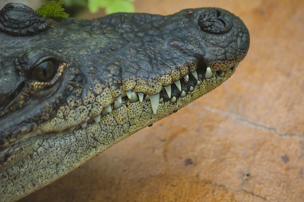
Taken at Tropical World in Leeds today, I thought these had to qualify for 'Sharp' :D

Getting the shot was a bit of a PITA, the place was full :banghead:

I would have liked a different POV and for it to have had its gob wide open, but apart from jumping in, prodding it with a stick then showing it some leg to gnaw on, I was stuck with this :p

Possibly a bit more dof,but it would have meant higher f number, and higher ISO to keep the shutter speed above 200th of a second....... but I was wanting the emphasise on the teeth anyway ;)

No crop, its as shot at 195mm, just a bit of adjustment in ACR and converted to jpeg

Honest crit and comments welcome, but again, please don't feel you have to :)

Sharp


TP 52 Week 33 - Sharp!
by Phil D 245, on Flickr
 
Last edited:
Hi phil, I like it would have liked a little more of the head in the frame but as you have explained that i will forgive you, focus on the front set of teeth is spot on (y)
certainly fits the theme, as for jumping in and prodding it thats what the wife is for :LOL:
 
That's quite scary-looking Phil :eek: I think the dof is just right for the theme - drawing the eye straight to the sharp pointy teeth.
 
Wow... I think that qualifies!! Well done you for pushing the boat out (not literally, I hope) and getting that :)

DOF choice is bang on for me. Sure. it would be stronger if it were facing you rather than looking away but you were not exactly able to move it around... well done to get what you did. Focus and lighting good although (I'm starting to sound like a broken record here), I reckon it could do with a slight tweak up in the exposure stakes? Cracking image though.
 
Back
Top