and help to keep the site free for all
You are using an out of date browser. It may not display this or other websites correctly.
You should upgrade or use an alternative browser.
You should upgrade or use an alternative browser.
How to edit for black and white
- Thread starter Hawthorn
- Start date
- Messages
- 15,725
- Edit My Images
- No
FWIW
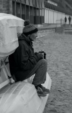
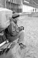
Not specific to B&W but for me the image is very flat and lacking in contrast.....................so had a quick look at its and with some simple contrast adjustments the whole image has more 'punch'.
If you stated what software you have I surmise some more detailed guidance would be forthcoming?
ooops! forgot to add my edit....
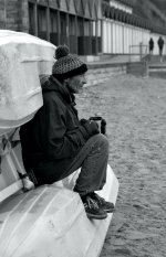
A slight added edit where I lasso'ed the face and used a curves preset of 'lighter'
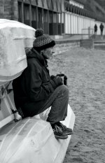
PS I think this is the very first time I have used the lasso and such local adjustment in PS.............sometimes I surprise myself
Not specific to B&W but for me the image is very flat and lacking in contrast.....................so had a quick look at its and with some simple contrast adjustments the whole image has more 'punch'.
If you stated what software you have I surmise some more detailed guidance would be forthcoming?
ooops! forgot to add my edit....

A slight added edit where I lasso'ed the face and used a curves preset of 'lighter'

PS I think this is the very first time I have used the lasso and such local adjustment in PS.............sometimes I surprise myself

Last edited:
- Messages
- 23,526
- Name
- Toni
- Edit My Images
- No
Do you have the colour version available - all the work I do in mono relies on differentiating between the luminance of different colours (chrominance) as though I were shooting with a filter on the lens. I do sometimes do dodge and burn too, but it's highly effective to use the red/pink of skin to stand out against differently coloured backgrounds. Example.
And this is a very good point too.
FWIW
Not specific to B&W but for me the image is very flat and lacking in contrast.....................so had a quick look at its and with some simple contrast adjustments the whole image has more 'punch'.
And this is a very good point too.
- Messages
- 479
- Name
- MARINO
- Edit My Images
- No
I agree with @ancient_mariner,
Try his suggestion, it’s the fastest way.
Most photo editing programs have such an adjustment.
Sometimes the face colour can be different (like yellow), depends on the white balance of the shot.
Try his suggestion, it’s the fastest way.
Most photo editing programs have such an adjustment.
Sometimes the face colour can be different (like yellow), depends on the white balance of the shot.
- Messages
- 3,839
- Name
- Richard
- Edit My Images
- Yes
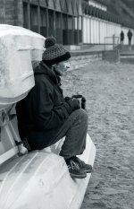
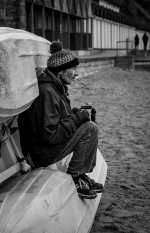
Did this in LR on my phone in about 2 minutes
Add an S curve to the tone curve
Contrast +15
Highlights -35
Shadows +50
Blacks -15
Texture +10
Clarity +10
Vignette -10
Subject Select mask -
Exposure +20
Contrast +5
Clarity +20
Radial gradient on face, feathering 100%
Exposure +45
Another big radial gradient covering the whole subject, then inverted
Highlights -7
Blacks -30
Not perfect at all but as was said above the image it quite flat so you need to put some contrast into it

Last edited:
- Messages
- 9,773
- Name
- wayne clarke
- Edit My Images
- Yes
Really, really appreciate everyone editing my image. You have all made it look so much better than I could of hoped. I use Affinity Photo but I've only had a few months and I've not tried B&W edits. The chap in the photo is my hobo-looking husband, hence me wanting to save a rather badly exposed photo.
- Messages
- 3,839
- Name
- Richard
- Edit My Images
- Yes
If this thread shows you anything, it's that the original image is only the starting point and we all interpret and edit that image differently. There's no right or wrong way, just what looks right to you. It's a good photo, nicely composed it's just very flat and dull, but that's what editing software is for. For me it works better in B&W than colour.
Last edited:
woof woof
I like a nice Chianti
- Messages
- 39,674
- Name
- Alan
- Edit My Images
- No
The Online Photographer has done a few pieces on digital B&W, for example this one...
If you go to his main page and search "editing black and white" or something similar you'll see more from him.
Hope that helps.
If you go to his main page and search "editing black and white" or something similar you'll see more from him.
Hope that helps.
Thanks, will check this out!The Online Photographer has done a few pieces on digital B&W, for example this one...
If you go to his main page and search "editing black and white" or something similar you'll see more from him.
Hope that helps.
- Messages
- 23,526
- Name
- Toni
- Edit My Images
- No
Really, really appreciate everyone editing my image. You have all made it look so much better than I could of hoped. I use Affinity Photo but I've only had a few months and I've not tried B&W edits. The chap in the photo is my hobo-looking husband, hence me wanting to save a rather badly exposed photo.
I use Nik Silver Efex (the original free version) for black and white work. I'll post up results in a bit.
- Messages
- 2,150
- Name
- Steve, Coventry, England
- Edit My Images
- Yes
I use affinity photo, just adjust the contrast and brightness to get the overall picture looking how you like, then zoom the face to fill the workspace and use lasso select to select just the face (10px brush size would be OK, and if you select some background, just use the alt plus mouse to erase that part)Really, really appreciate everyone editing my image. You have all made it look so much better than I could of hoped. I use Affinity Photo but I've only had a few months and I've not tried B&W edits. The chap in the photo is my hobo-looking husband, hence me wanting to save a rather badly exposed photo.
Then adjust contrast and brightness of the face to how you like it then filters-sharpen-clarity and add about 20%
Deselect and check the whole image again and make some fine adjustments to contrast and brightness if wanted.
Much quicker to do than to write
- Messages
- 23,526
- Name
- Toni
- Edit My Images
- No
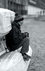
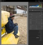
OK, I took your base image into Adobe Lightroom and set black and white points plus lifted clarity and sharpness a little:
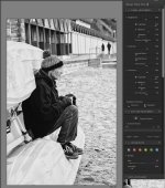
Then I moved the image into Sliver Efex, adjusted contrast, highlights and shadows, colour filter and backed off structure a little to reduce the crunchiness.
Finally back into Lightroom to set the white point and export for web.
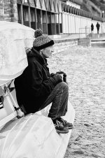
It looks a bit crunchy because it started with a low resolution picture, and a larger image would appear smoother. It's a little tricky to make the face stand out because the steps behind have a very similar tonality to the face - blurring the background as @swanseamale47 did would help here, but I've tried to keep the editing as simple as possible.
Nik software suite is available here, including Silver Efex (the only one of the suite I use) https://www.techspot.com/downloads/6809-google-nik-collection.html

Then I moved the image into Sliver Efex, adjusted contrast, highlights and shadows, colour filter and backed off structure a little to reduce the crunchiness.

Finally back into Lightroom to set the white point and export for web.

It looks a bit crunchy because it started with a low resolution picture, and a larger image would appear smoother. It's a little tricky to make the face stand out because the steps behind have a very similar tonality to the face - blurring the background as @swanseamale47 did would help here, but I've tried to keep the editing as simple as possible.
Nik software suite is available here, including Silver Efex (the only one of the suite I use) https://www.techspot.com/downloads/6809-google-nik-collection.html
Last edited:
- Messages
- 169
- Name
- Lewis
- Edit My Images
- Yes
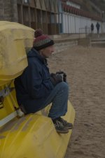
This was my thought. I'd like to see the color versionDo you have the colour version available - all the work I do in mono relies on differentiating between the luminance of different colours (chrominance) as though I were shooting with a filter on the lens. I do sometimes do dodge and burn too, but it's highly effective to use the red/pink of skin to stand out against differently coloured backgrounds. Example.
And this is a very good point too.
- Messages
- 23,526
- Name
- Toni
- Edit My Images
- No
This was my thought. I'd like to see the color version
Post #8
- Messages
- 15,725
- Edit My Images
- No
Post #8 above, though not a full sized imageThis was my thought. I'd like to see the color version
- Messages
- 169
- Name
- Lewis
- Edit My Images
- Yes
I posted the above comment before I read through all the posts or saw all the edits. I too started to edit the original and then realized that all the edits really already show the possibilities. So some advice? Don't worry about failing or not getting it right. Just play and have fun with it. In addition to this site Google and Youtube are your best friends to help learn these things. Find some other pictures and get right to the B&W process and see what you come up with. Share them here and I'm sure lots of us will jump in to help. Good luck and happy new yearReally, really appreciate everyone editing my image. You have all made it look so much better than I could of hoped. I use Affinity Photo but I've only had a few months and I've not tried B&W edits. The chap in the photo is my hobo-looking husband, hence me wanting to save a rather badly exposed photo.
- Messages
- 169
- Name
- Lewis
- Edit My Images
- Yes
Thanks, I saw. I need to read new threads all the way through before commenting. I appreciate itPost #8
- Messages
- 23,526
- Name
- Toni
- Edit My Images
- No
It's worth saying BTW that some software is MUCH better at mono conversions than others. I find Nik Silver Efex to be the best for me, followed by On1 Photoraw. Lightroom is poor by comparison because it's a general editor without specialised tools. No idea about Affinity - I have it (bought during Covid) but never used in the end.
Also worth pointing out that it's good to prepare your image for conversion, rather than doing all the work after. So the first thing I did was to adjust black and white points, which made the image much punchier and more interesting and a better starting point for an exciting mono image.
Also worth pointing out that it's good to prepare your image for conversion, rather than doing all the work after. So the first thing I did was to adjust black and white points, which made the image much punchier and more interesting and a better starting point for an exciting mono image.
Last edited:
Thankyou. I hadn't thought about preparing it first. Off to learn about adjusting the black and white points...It's worth saying BTW that some software is MUCH better at mono conversions than others. I find Nik Silver Efex to be the best for me, followed by On1 Photoraw. Lightroom is poor by comparison because it's a general editor without specialised tools. No idea about Affinity - I have it (bought during Covid) but never used in the end.
Also worth pointing out that it's good to prepare you image for conversion, rather than doing all the work after. So the first thing I did was to adjust black and white points, which made the image much punchier and more interesting and a better starting point for an exciting mono image.
- Messages
- 169
- Name
- Lewis
- Edit My Images
- Yes
Toni, I used to feel exactly like you about Nik and such. I'm still using Googles version and toyed with the idea of upgrading to the newest version of Nik then didn't. Are you still using the original or have you upgraded to the DXO version? If so, was it worth the price of the upgrade? ThanksIt's worth saying BTW that some software is MUCH better at mono conversions than others. I find Nik Silver Efex to be the best for me, followed by On1 Photoraw. Lightroom is poor by comparison because it's a general editor without specialised tools. No idea about Affinity - I have it (bought during Covid) but never used in the end.
Also worth pointing out that it's good to prepare your image for conversion, rather than doing all the work after. So the first thing I did was to adjust black and white points, which made the image much punchier and more interesting and a better starting point for an exciting mono image.
- Messages
- 23,526
- Name
- Toni
- Edit My Images
- No
@PhotoVanGogh I'm still using the old, free version. It's far from perfect, but I'd heard the paid version from DXO wasn't better in the areas of greatest weakness (halos around high contrast objects) so didn't think it worth buying.
- Messages
- 4,517
- Name
- droj
- Edit My Images
- No
Latterly in particular, there have been some bizarre results posted above. Which don't help at all, unless they're unwitting illustrations of pitfalls?
Of course you need some basic instincts, to appraise the results you might be getting from any process. Play around for sure - nothing to lose - but always feel able to regroup, go back to start and begin again. That's easy with digital as long as you protect the original (keep it saved out separately to your adjusted versions).
If you start from an RGB colour original ex camera, there are two basic avenues - adjustments of strength in at least each of the 3 colour channels (more being available in 'colour mixer'), and adjustment of the tones which could well be global. Depends on the apps you've got, but look for colour mixer, and tone curves. Things like Lightroom & Photoshop, & their equivalents, provide these.
You can employ such adjustments experimentally by banging sliders about in different sequences and seeing what happens.
A further but complicit stage could be local adjustments using layers & masks, isolating areas of the image to work on, but that may be an area too complex at this stage.
Then, finally, you can save out your version of the moment to go to print (or just to web|).
Hope this ain't too bamboozling!
Last edited:
- Messages
- 169
- Name
- Lewis
- Edit My Images
- Yes
Yeah, I was hoping after all these years that there would have been improvements. I might just move on and see what I can see. Thanks@PhotoVanGogh I'm still using the old, free version. It's far from perfect, but I'd heard the paid version from DXO wasn't better in the areas of greatest weakness (halos around high contrast objects) so didn't think it worth buying.
- Messages
- 23,526
- Name
- Toni
- Edit My Images
- No
Yeah, I was hoping after all these years that there would have been improvements. I might just move on and see what I can see. Thanks
There's a Nik group on Flickr and I've asked the question there. Up to version 6 of the software now.
- Messages
- 9,773
- Name
- wayne clarke
- Edit My Images
- Yes
I have to agree about Silver Efex, it's the best I've tried (not tried On1) On large images I find it a little slow on my PC though. I something use a gradient map if I'm in a rush.It's worth saying BTW that some software is MUCH better at mono conversions than others. I find Nik Silver Efex to be the best for me, followed by On1 Photoraw. Lightroom is poor by comparison because it's a general editor without specialised tools. No idea about Affinity - I have it (bought during Covid) but never used in the end.
Also worth pointing out that it's good to prepare your image for conversion, rather than doing all the work after. So the first thing I did was to adjust black and white points, which made the image much punchier and more interesting and a better starting point for an exciting mono image.
- Messages
- 9,773
- Name
- wayne clarke
- Edit My Images
- Yes
I've tried repruducing SE in photoshop and I cant get it quite the same. Theres more going on in SE than just a BW conversion, it's doing something with contrast and I suspect some sort of clarity-ish effect that PS BW just cant match. With time and using more than just the BW in PS you could probably get close, but I gave up after spending ages playing with colour test charts trying to get a match. Maybe thats just me though.I find Silver Efex very easy to use. My CS2023 may be able to match or even better it but maybe requires greater knowledge and more faff. I sometimes use Analogue Efex too.
woof woof
I like a nice Chianti
- Messages
- 39,674
- Name
- Alan
- Edit My Images
- No
I've tried repruducing SE in photoshop and I cant get it quite the same. Theres more going on in SE than just a BW conversion, it's doing something with contrast and I suspect some sort of clarity-ish effect that PS BW just cant match. With time and using more than just the BW in PS you could probably get close, but I gave up after spending ages playing with colour test charts trying to get a match. Maybe thats just me though.
It's not just you.
I've tried reproducing Silver efex and other Nik effects in PS and it just takes me too long to even get close plus in Nik filters I can often apply changes to specific areas probably quicker than I can in PS.
I suppose if you can get the effect you want in PS you can then create a filter to apply to any new picture but you can do that in Nik too.
- Messages
- 4,517
- Name
- droj
- Edit My Images
- No
I'm against a formulaic approach - I see each image as an individual product requiring individual treatment.I suppose if you can get the effect you want in PS you can then create a filter to apply to any new picture but you can do that in Nik too.
Last edited:
- Messages
- 23,526
- Name
- Toni
- Edit My Images
- No
I'm against a formulaic approach - I see each image as an individual product requiring individual treatment.
I'm like that too to a limited extent, but for me that approach came apart badly when trying to assemble a body of work that needed to look connected. There are 5 presets I created in SE that are my starting point depending on image and required end result, and provided I don't go wild with adjustments they ensure that my picture will all work together an look related (from a processing POV).
- Messages
- 9,773
- Name
- wayne clarke
- Edit My Images
- Yes
I supose it is a sort of formulaic effect, but I just like the SE "look", to me it's a good BW film feel.
sk66
Advertiser
- Messages
- 8,677
- Name
- Steven
- Edit My Images
- Yes
I find the best way to do mono conversions is by adjusting the individual color channels... especially if you are trying to maximize tonality/gradation.
This was done in LR from the color image. The majority was done by desaturating all of the colors and individually adjusting their luminance and hue in the color mixer tab... I did also use basic exposure/clarity adjustments and a couple of masks as well. Just clicking the B&W button in the basics tab almost never generates the best results; any "one button conversion" will generally be lacking IMO.
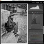
This was done in LR from the color image. The majority was done by desaturating all of the colors and individually adjusting their luminance and hue in the color mixer tab... I did also use basic exposure/clarity adjustments and a couple of masks as well. Just clicking the B&W button in the basics tab almost never generates the best results; any "one button conversion" will generally be lacking IMO.

Last edited:
woof woof
I like a nice Chianti
- Messages
- 39,674
- Name
- Alan
- Edit My Images
- No
I'm against a formulaic approach - I see each image as an individual product requiring individual treatment.
I did this and realised that I was wasting a lot of time creating what could already exist at least in part as a starting point so I changed my approach and what I now have is a series of presets for different lighting conditions, subjects and indeed also for different lenses which give a sufficiently different look. These presets are useful as a known starting point and indeed for some pictures that starting point may also be the end point or near enough the end to save significant time.
woof woof
I like a nice Chianti
- Messages
- 39,674
- Name
- Alan
- Edit My Images
- No
I'm like that too to a limited extent, but for me that approach came apart badly when trying to assemble a body of work that needed to look connected. There are 5 presets I created in SE that are my starting point depending on image and required end result, and provided I don't go wild with adjustments they ensure that my picture will all work together an look related (from a processing POV).
Yup.
Treating everything as a one off is one way to do it but if you like a look or want a style then it becomes time consuming and you risk either spending time duplicating what's already been done or drifting. It might not matter either way, it all depends what you are going for, uniqueness or some sense of identity.
- Messages
- 4,517
- Name
- droj
- Edit My Images
- No
A problem with all methods of adjustment is that there can easily arise a discrepancy between aesthetic and meaning. An aesthetic on its own, whether achieved laboriously or just by pressing a few buttons, might easily escape the realm of genuine human meaning, and be crude and / or shallow. The best answer (and there's never just one) is in the synthesis of medium, tools and meaning.
Last edited:
- Messages
- 169
- Name
- Lewis
- Edit My Images
- Yes
I've never thought of or even heard of taking that approach. I might have to play with that and see what I can get.I find the best way to do mono conversions is by adjusting the individual color channels... especially if you are trying to maximize tonality/gradation.
This was done in LR from the color image. The majority was done by desaturating all of the colors and individually adjusting their luminance and hue in the color mixer tab... I did also use basic exposure/clarity adjustments and a couple of masks as well. Just clicking the B&W button in the basics tab almost never generates the best results; any "one button conversion" will generally be lacking IMO.
View attachment 411128


