To me it looks heavily over-sharpened and/or over-clarity'd. As said above, it could benefit either from a bit more space around it, or - if you are after the detail - getting closer to show off the texture more. Your composition is kind of a halfway house. Agreeing with ah5168, I think a few steps back or a wider angle would suit better.
The sky looks like it's been pulled down to add contrast/tone but the halo'ing around the chimney and roof apex makes it seem a bit unreal. The smudgy smeary "cloud" is in stark contrast to the hyper detailed rock giving the image an unrealistic feel (which may be the whole point!)
All "in my opinion" of course, so please take what you like & leave the rest.

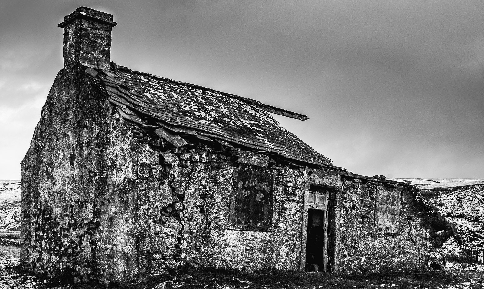 Gayle Moor flickr (1 of 1) by Peter Stephens, on Flickr
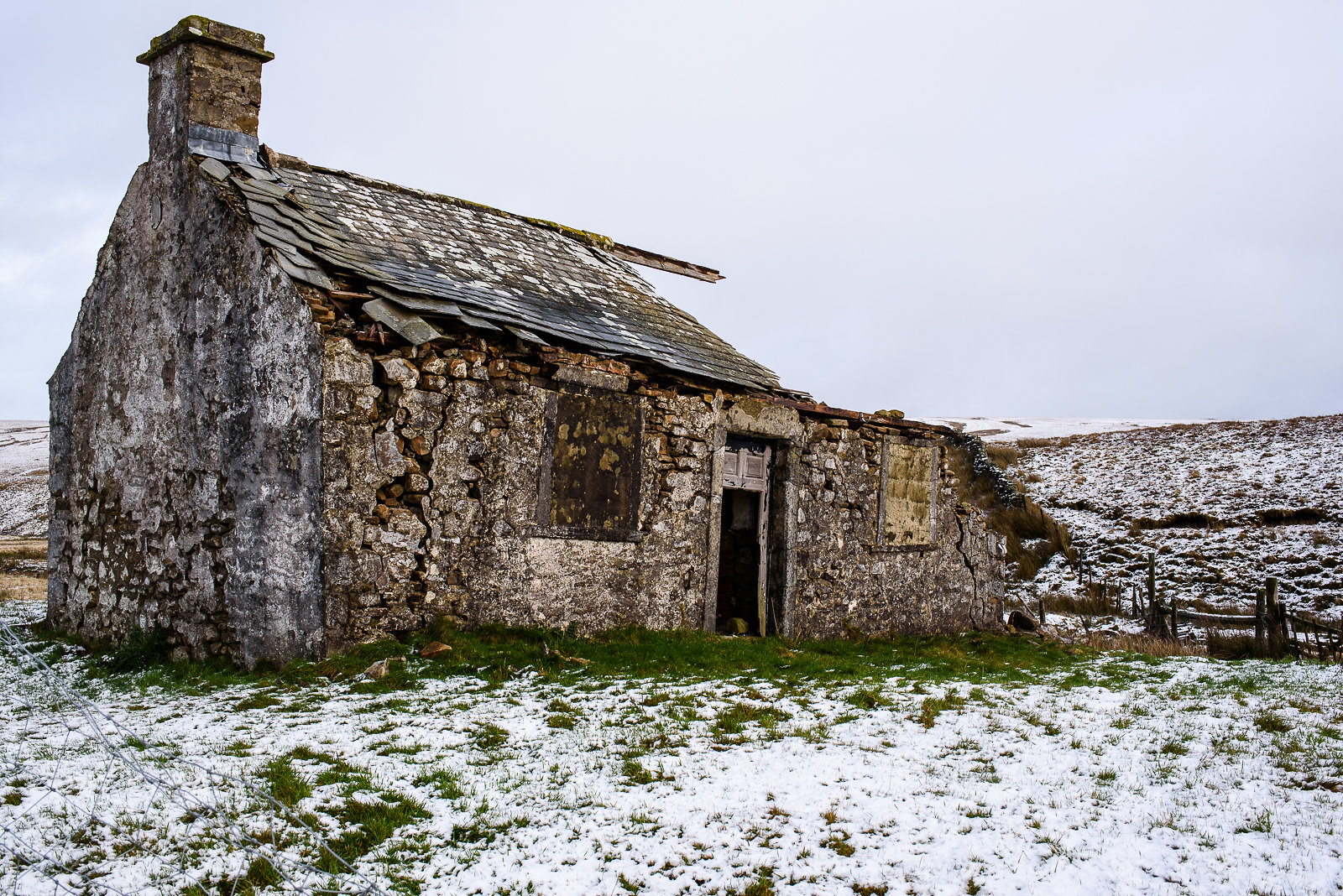 Gayle Moor flickr nef LR std settings (1 of 1)
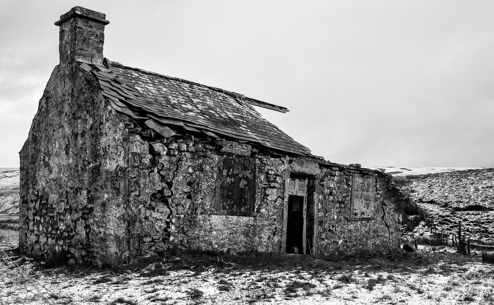 Gayle Moor flickr SEF 43 (1 of 1)