

- Messages
- 137
- Name
- Sam
- Edit My Images
- Yes
When I went to France a coup,e of months ago, I decided to start a small project on Abandonment. I have a couple of images to start off with...
I have posted a couple of these before, but thought I would include them with the project.") .
.
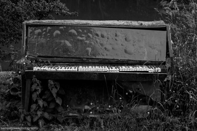 Abandoned Piano by Samuel Jones, on Flickr
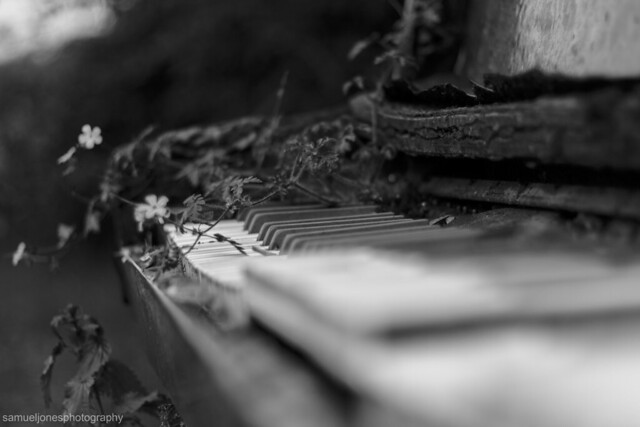 Piano Close-up by Samuel Jones, on Flickr
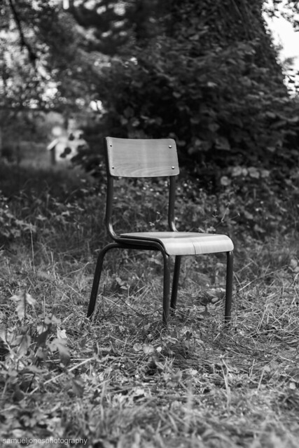 Abandoned Chair by Samuel Jones, on Flickr
 Abandoned Trolly by Samuel Jones, on Flickr
I have posted a couple of these before, but thought I would include them with the project.
.Abandoned Piano by Samuel Jones, on FlickrPiano Close-up by Samuel Jones, on FlickrAbandoned Chair by Samuel Jones, on FlickrAbandoned Trolly by Samuel Jones, on Flickr Piano Colour 2
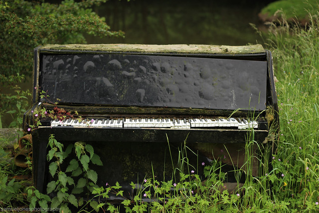 Piano Colour