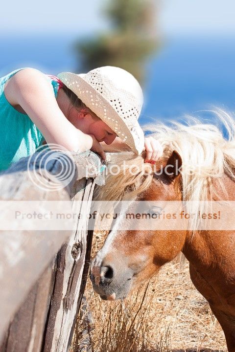
Hi All
I am an absolute beginner and am trying to teach myself how to improve my photography, mainly from the internet. I would really appreciate any feedback on this image to help me learn where I need to improve most and where I am on the right track. The photo was taken as a memory of a holiday with my girlfriend but I would really like to improve these from thoughtless snaps to well composed and captured images that I would want to look at again and possibly get printed to hang somehwere in the house.
Camera: Canon 40D
Lens: 18-55mm Kit lens

The things which I do not like about the shot are -
- The exposure on her right arm, I think it is overexposed
- The tree in the background, I wish I had taken this with a faster lens at a lower aperture to blur it slightly more but I dont have one yet.
The thing that I really like about the photo is the contrast between the orange horse and the blue sea, it looks appealing to me and is the main reason I kept it in colour instead of B and W.
Any comments and criticisms will be greatly appreciated, especially as I realise it is a very average photo but we all have to start somewhere!
Dan
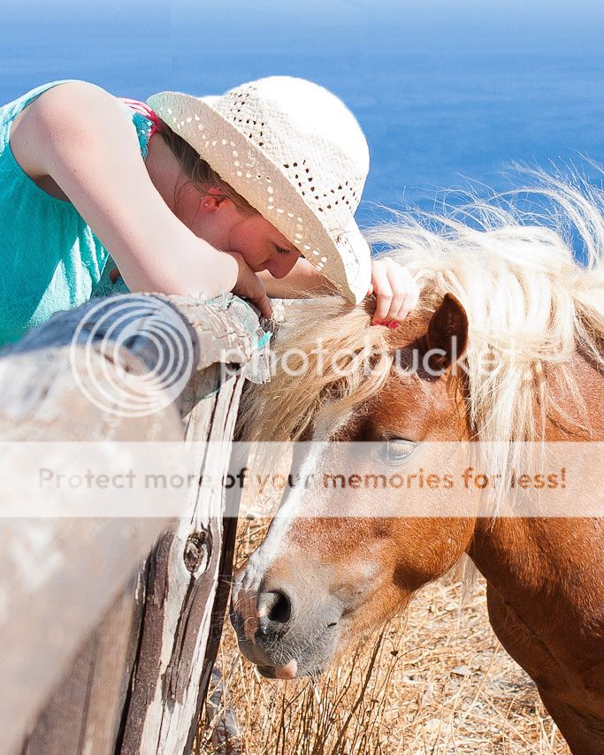
Last edited:
")