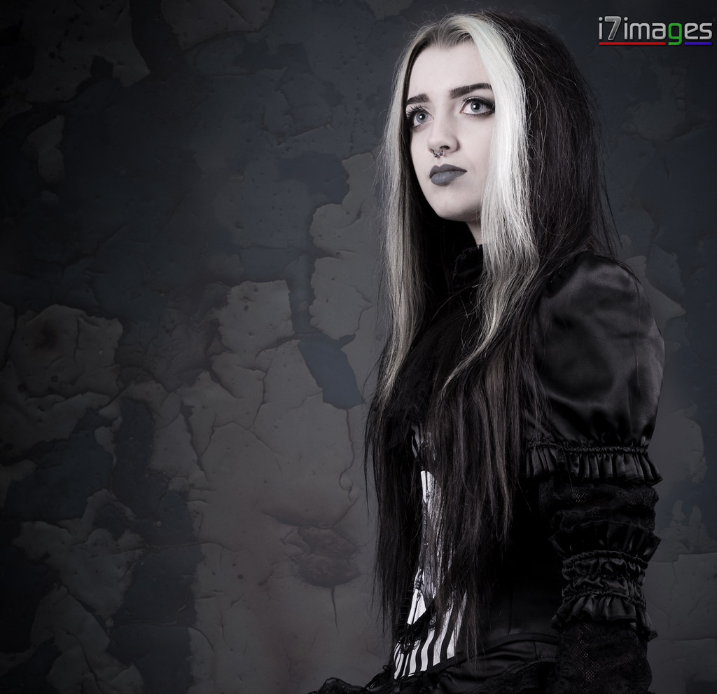
Critique Alternative Model Caoili

I quite like this. Only thing I would think about is the depth of field.
I think it might be improved with the background being out of focus to concentrate your attention more on the model.
Maybe a touch less light on her face to bring out more modelling of her features.
To me, it looks like her hair on the right (highlights) have been blown. (but it could be my monitor :) )
 
Only thing I would think about is the depth of field.
I think it might be improved with the background being out of focus to concentrate your attention more on the model.

I agree with Ken. Less DOF or move her away from the background. I like the shot, the low angle works well.
 
Taking up Ian's point, the low angle suits the model. It gives a sense of aloofness, or maybe majesty, to the shot.
It works well.
I adjusted my monitor a bit and there is more detail than I first saw in her face, but a wee bit more would be nice!
Re the background, it doesn't add anything to the portrait so a bit less detail would concentrate your attention on the model.

(Not bad after celebrating a 60th birthday of a friend!)
 

I like the DoF as the details in the BG are not distracting me
from the subject but give my eyes somewhere else to wander
within the shot.


The BG, like the whole rendition, is missing a more theatrical
mood to it. Mind you, I think the values renditions are very ok
but a sense of directivity would add the final touch.
 
Thanks for the reply's guys. I'll take on board what yous are saying about the dof for my next shoot.
 
This is cool.

The first thing I noticed was the logo; the second was the slightly odd skin tone & texture. I’m not sure the partial desaturation works. I keep trying it myself and only occasionally get results which I’m happy with. I haven’t yet worked out when it works and when it doesn’t. I suspect pure B&W would be better here.

The lighting is very nice, the exposure is spot on for the details in the hair and the blacks of the jacket, the low angle works well. It looks as though the background may have been added in PS – it’s doesn’t quite sit with the model but perhaps a shallow DoF would help.

The composition and crop are curious – not wrong, just curious. I try to avoid cropping at the wrist and I wouldn’t position her so close to the edges of the frame with as much negative space as there is.

Lastly.. and I only mention this ‘cos it’s another thing I’m trying to get to grips with myself..

It looks as though she’s interacting with something just out of the frame. I kind of want to see what it is – and that makes for a slightly unfulfilling image. I reckon that looking out of the frame works best when you’ve got a particular story you want to tell, or when the model’s gaze is slightly defocused. If the model doesn’t make eye contact with the camera then it can work better if their point of focus is included in the frame, even if there’s nothing in particular for them to look at.
 
I really like the image of her but I'd echo some of the other sentiments. I find the background really distracting it looks like a composite and it lacks depth and realism for it to be an interesting texture. If it is a composite I'd tone down the contrast and blur it a good bit. If it's an actual background some selective gausian blurring probably needed.

I'd like to see a bit more contrast in her face a curves layer for contrast with a vibrance layer to make the skin more porcelainy white would help it imo. Not sure I'm a fan of the square crop when shes as thin and turned like that, a vertical 6x4 or 4x5 crop would be more my choice for her.

And yeah lose the logo, if you want it for branding make it smaller and bottom of image. If you want it for theft deterent just remove it altogether as that'll be zapped in 2 seconds by anyone who wants to.
 
I agree with the others about the logo, I can understand why you wanted to include one, but where it is spoils the image for me. Again agreeing with the others, the hand should either be included or cropped out.

As far as the photograph is concerned I don't have a problem with the type of background, or the way you have processed the image, as I think it suits what you are trying to convey with the model. However I would remove the dark area on the left hand side, leaving the lighter portion as it is, to me the dark area is contributing nothing to the image.

You are right to be pleased with the image, as you say and others have commented, there are things that can be improved but they are comparatively minor.
 
Back
Top