Beer bottle shot

Messages
655
Edit My Images
Yes
Hi
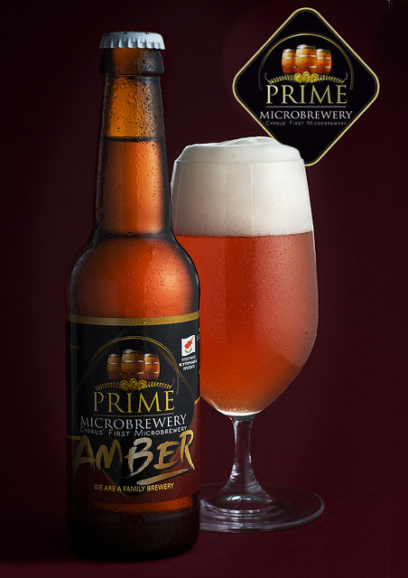
Prime is the first microbrewery on Cyprus, from where I got the beer during my holidays. I used one Quantuum Up 200 light behind the diffusion to the right, few white cards and a silver card behind the bottle and the glass. I wanted something simple, with earthy feeling with a commercial potential. Please provide critique.


24335470335_f6a8b8b04d_z.jpg
 
I'm only on my mobile but looks really good from here, it definitely makes me want to try it
Lighting, colours and condensation all good too :)
Technical I'll leave to those more experienced
 
Can't say much technical but I like the lighting and composition of the image. I feel the bottom left of the bottle feels like its sinking into the shadows a bit but its only my 2p.
 
Nice, I would always remove the condensation from the label, makes it a bit sharper.
 
remove the condensation from the label, makes it a bit sharper.

Never heard or seen that before!
I am not sure a AD would go for that!
The dark line down the middle of both glass and bottle is really hard to get rid of
…should not have been there in the first place!

•••
I think the overlap is good but the take is cropped too tight.
 
Last edited:
That looks really great to me. I have taken photos of bottles not like this one ! But I do know the problems. It is not easy to get proffessional looking results like this.
Well done :)

Gaz
 
Very professional looking result, nicely done. I would like to see this in higher res though, at this size I can see a faint black line around the bottle but I'm not entirely sure why I can see this, almost makes it look like its a composite which hasn't been clipped/masked properly.
 
Thank you everyone for the constructive criticism. The condensation was applied and i am not really sure if it looked natural with a clean label. I will research this.
The black line is something i actually like. It is a gap between the diffuser on the right and the white card on the left. Easy to remove during the shoot. Not much i can do about it now.
The dark bottom left is something i did intentionally to move the attention to the centre. Interesting to hear that it doesnt neccesarily work.
Appreciate all the comments. Thank you.

sorry I meant "most" of the condensation, just put a small amount on in post in the right places.
 
Very nice overall.
The "dark line" is the gap between the reflectors... or rather, we are seeing the reflectors in the glass. You need *much* larger modifiers/reflectors/etc for curved reflective surfaces.
The lower left where the label/corner falls off is too dark. The "amber" is a bit lost and is very important to the image.
 
I don't know much about the technical side of pic, but it sure does make me thirsty for a beer !!
 
…it sure does make me thirsty for a beer !!

Don't you have enough with the practical and unlimited supply to wine? ;-)
 
I like the composition of the bottle and glass overlapping, and the lighting is good. However, there are usually subtle messages in advertising images that sell the viewer a story or a message throughout. If the top had been off the bottle and the bottle empty, maybe with a palm print in the condensation it would link in better with the full glass. As it is, a full capped bottle beside a full glass actually separates the two rather than making them one.
 
It looks great to me, just the bottle seems a bit too dark on the left, and the black lines on the glass seem a bit odd, maybe different lighting setup would make it better, and quite a good point the pint being full together with the bottle separates them and creates a gap in the story it is trying to tell
 
I would lighten the label a touch to bring out the branding.
Another option would be to take the cap off the bottle and remove some liquid as though it had been poured
 
Back
Top