Burnsall Bridge - Winter's Sunset (3 options)

Jimmy_Lemon

TPer Emeritus
Messages
12,090
Name
Tom
Edit My Images
Yes
I can decide on the processing for this shot, so am going to post three variations...and comments on preference and any reasons why would be gratefully received :)

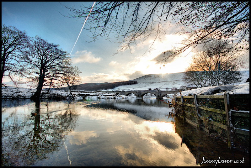
1. Single Exposure with contrast and saturation boosts.

Burnsall Bridge - Winters Sunset by Tom Holmes, on Flickr

2. 3 exposures "Fused" with Photomatix and then contrast and saturation changes as image 1.

Burnsall Bridge - Winters Sunset by Tom Holmes, on Flickr

3. 3 exposures "Tonemapped" with Photomatix with colour temperature changed to create warmer sunset colours.

Burnsall Bridge - Winters Sunset by Tom Holmes, on Flickr


So...yeah....any opinions?
 
Wow, all three shots are amazing, but its No 3 for me all the way :clap:
 
#3 by a country mile........but does it need a tilt to the left?
 
Love it. It really is a fantastic photo. But colour-wise I'll be awkward. I would prefer something between #2 and #3. :LOL:

Something like this.....


I see you have the edit box ticked, hope you don't mind.
 
#3 by a mile for me

What a lovely tranquil scene. Some may not like the plane trail but I quite like it
 
3 for me as well Tom. I like the warmth of this contrasting with the snow. It makes for a more interesting shot in my mind as it looks warm yet it must have been bloody freezing!! Great shot demonstrating in my mind a different way to use contrast to massive effect.
 
Love No 3 superb in fact they are all fine good job (y)
 
wow thanks everyone, seems number 3 it is then :) I thought I would get some people saying the original with limited processing was far better.....guess they didn't find this thread yet ;)

Tatty, thanks for the edit :) I do like that!
 
yes, 3 for me too! :)

I'd probably lose the con trail though ;)

Tom, please could you tell me how you did that?

thanks
Maria
x
 
Agree with everyone else. Number 3

Thanks :)

yes, 3 for me too! :)

I'd probably lose the con trail though ;)

Tom, please could you tell me how you did that?

thanks
Maria
x

Thanks Maria....I am tempted to clone out the con trail but the sky has so many colour gradients in it my first attempt failed misserably.

The processing was just basic "HDR" or tonemapping using Photomatix, a good guide on how to this is here - http://www.vanilladays.com/hdr-guide/ - I altered the colour temperature in Photomatix (it is one of the options). I have tried altering the white balance outside Photomatix to get a similar effect and it doesn't work as well, for some reason it just seems to give the right sunset look.
I am sorry that is a bit vague but to be honest the settings and method alter with every shot, some work some don't, some require a lot more work some just seem to fall into place....it is just a case of playing around and seeing what happens :)
 
Absolutely number 3 ALL the way. I also would probably pull in the tones a little and just lower the temperature a fraction but even as it is, it's beautiful.
 
Which ever is a fantastic image, but like the 0others think 3 has the edge & wow factor
 
I'm going to be a bit grumpy now and say I can't get past the con trail or the blown sky around the sun.

On my monitor I'm not sure I see the advantage of the fusing of images :shrug:

Regarding the two different colour-ways, depends what you are trying to achieve, 2 is giving the overall cold feeling one would expect if there whilst 3 is overly warm and reminds me of chocolate boxes circa 1960's ;)

Sorry :confused:
 
Last edited:
I'm going to be a bit grumpy now and say I can't get past the con trail or the blown sky around the sun.

On my monitor I'm not sure I see the advantage of the fusing of images :shrug:

Regarding the two different colour-ways, depends what you are trying to achieve, 2 is giving the overall cold feeling one would expect if there whilst 3 is overly warm and reminds me of chocolate boxes circa 1960's ;)

Sorry :confused:

I'm with you Tina - too much blown and that unfortunate plane trail kills it :(

DD
 
Absolutely number 3 ALL the way. I also would probably pull in the tones a little and just lower the temperature a fraction but even as it is, it's beautiful.

Thanks for the input :)

I prefer tatty's edit - 3 is a little over the top for my liking.

Fair enough :) thanks for the comment

Which ever is a fantastic image, but like the 0others think 3 has the edge & wow factor

Cheers :)

I'm going to be a bit grumpy now and say I can't get past the con trail or the blown sky around the sun.

On my monitor I'm not sure I see the advantage of the fusing of images :shrug:

Regarding the two different colour-ways, depends what you are trying to achieve, 2 is giving the overall cold feeling one would expect if there whilst 3 is overly warm and reminds me of chocolate boxes circa 1960's ;)

Sorry :confused:

Dont need to be Sorry Tina, good to get an opposing opinion :)


I'm with you Tina - too much blown and that unfortunate plane trail kills it :(

DD

Good to see you back Dave :) Unfortunately the sun was uber bright and right behind a very reflective cloud, I tried stopping down 3 stops and it still blew, so went for a balanced foreground with some major blown highlight (but less thanks to the wonder photomatix ;) ). The plane trail really doesn't bother me, but guess it does some people :)
 
Love the last shot. Great colour and leading lines.
 
one word covers them all

contrail


??
 
Back
Top