
You are using an out of date browser. It may not display this or other websites correctly.
You should upgrade or use an alternative browser.
You should upgrade or use an alternative browser.
Creative Still Life
- Thread starter Just Dave
- Start date
big soft moose
Tinker, Tailor, Soldier, Spy...
- Messages
- 20,964
- Name
- Pete
- Edit My Images
- Yes
umm
what is it ?
and why is it NSFW ?
what is it ?
and why is it NSFW ?
robhooley167
Sir, my fingers are stuck together
- Messages
- 4,147
- Name
- Rob
- Edit My Images
- Yes
OP
Just Dave
In Memoriam
- Messages
- 29,876
- Name
- Dave
- Edit My Images
- Yes
umm
what is it ?
and why is it NSFW ?
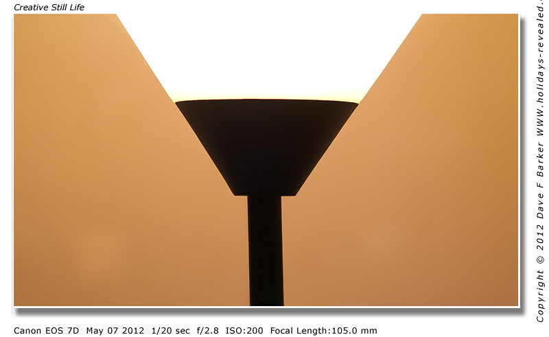
A Standard Lamp do you think I should take the NSFW off and use Crit Then Pete, well maybe not after Robs post now LOL
Its based on the image on the right Ive never seen the one on the left, I got the idea from a Dutch Photographers Blommers and Niels Schumm
")
Last edited:
big soft moose
Tinker, Tailor, Soldier, Spy...
- Messages
- 20,964
- Name
- Pete
- Edit My Images
- Yes
without robs post it would only be nsfw to those with feelthy minds.... so yeah best leave it on 
OP
Just Dave
In Memoriam
- Messages
- 29,876
- Name
- Dave
- Edit My Images
- Yes
without robs post it would only be nsfw to those with feelthy minds.... so yeah best leave it on
thanks PeteLOL you lot will argue about anything
(edited by mod now safe for everyone
Actually I quite like it Dave (with or without the Bikini suggestive
Very retro and reminiscent of 60's style pictures.
Thanks for editing it Chris
I like its simplicity
Very clever Dave, I like or a lot, but tbh the link was better lol
Thanks Darren and
to the link
OP
Just Dave
In Memoriam
- Messages
- 29,876
- Name
- Dave
- Edit My Images
- Yes
Really don't know what to make of it Dave! I don't dislike it, but really not sure.
Is this your cubist period?
Yeah Baz not my usual style just trying something different for a change
- Messages
- 1,828
- Name
- Scott
- Edit My Images
- Yes
Wow .... This really is unusual and very unique .... For a photo its very creative and so 60's style.
Took a moment or 2 to figure it out as it first looked like you had done this in Photoshop without a camera even being in sight!!
I like it Dave, you might have started something off here
Took a moment or 2 to figure it out as it first looked like you had done this in Photoshop without a camera even being in sight!!
I like it Dave, you might have started something off here
OP
Just Dave
In Memoriam
- Messages
- 29,876
- Name
- Dave
- Edit My Images
- Yes
Wow .... This really is unusual and very unique .... For a photo its very creative and so 60's style.
Took a moment or 2 to figure it out as it first looked like you had done this in Photoshop without a camera even being in sight!!
I like it Dave, you might have started something off here
Thanks Scott
Last edited:
OP
Just Dave
In Memoriam
- Messages
- 29,876
- Name
- Dave
- Edit My Images
- Yes
- Messages
- 6,230
- Name
- Charles
- Edit My Images
- No
Aye well Dave, keep taking the tablets and it'll soon pass.
... have to agree that the marinov link looks good though.
... have to agree that the marinov link looks good though.
Chaz Photos
Jack Elam
- Messages
- 6,282
- Name
- Chaz
- Edit My Images
- Yes
Well for me there is no detail in any part of the image and it might have been just drawn in a graphic package, the blocks of colour have no texture in no shaping down with shadows. I am sorry to say for me it is not working at all. Photography is all about painting with light, this also means shadow, and there is none.
Oh and as the image has white at the edge then a black stroke would have been better not a white one.
Oh and as the image has white at the edge then a black stroke would have been better not a white one.
OP
Just Dave
In Memoriam
- Messages
- 29,876
- Name
- Dave
- Edit My Images
- Yes
the white bit looks like a bit missing...a top would have helped...even in black
not keen on the tan colour though
red has more impact
No I wanted it like that Geof, the tan represents skin
get a life Dave!!
I'll try
Aye well Dave, keep taking the tablets and it'll soon pass.
... have to agree that the marinov link looks good though.
Thanks Charles, I think I took to many tablets
OP
Just Dave
In Memoriam
- Messages
- 29,876
- Name
- Dave
- Edit My Images
- Yes
I'll be honest Dave, this one is not really doing all that much for me :shrug: I can see the merits of what you were doing though
Matt
No probs matt, I was just trying graphic rather than photo look, (BTW it is a photo not PS) thats not got much PP took ages to get it right in cam, suggestive erotics not my normal stuff just gave it a go
OP
Just Dave
In Memoriam
- Messages
- 29,876
- Name
- Dave
- Edit My Images
- Yes
Well for me there is no detail in any part of the image and it might have been just drawn in a graphic package, the blocks of colour have no texture in no shaping down with shadows. I am sorry to say for me it is not working at all. Photography is all about painting with light, this also means shadow, and there is none.
Oh and as the image has white at the edge then a black stroke would have been better not a white one.
Thanks for your comments Chaz
Think your missing the point here Chaz its meant to look like a graphic,(makes you look twice) with solid blocks of colour, I also wanted it to be texture-less to enhance the bold blocks of colour, it took me ages to work out how to get the shot without shadows, and different tones, as said I also wanted it to run off into the border at the top, to further add a puzzle into it
- Messages
- 1,556
- Name
- Graham
- Edit My Images
- Yes
Very interesting, different and well executed image Dave, theme taken from a very suggestive original. You certainly put a lot of effort into it. 
- Messages
- 2,115
- Name
- Dex
- Edit My Images
- Yes
I really like it, always thought the original was actually a lamp, that the second thing ive learnt today that i never knew.
D
Deleted member 34016
Guest
I like it Dave- as said very retro, even art decco
Ypu have too much free time on your hands buddy
Les
Ypu have too much free time on your hands buddy
Les
- Messages
- 1,525
- Name
- Darrell
- Edit My Images
- Yes
Well for me there is no detail in any part of the image and it might have been just drawn in a graphic package, the blocks of colour have no texture in no shaping down with shadows. I am sorry to say for me it is not working at all. Photography is all about painting with light, this also means shadow, and there is none.
Oh and as the image has white at the edge then a black stroke would have been better not a white one.
To be honest i think the graphic type look, was daves intention, did you look at the link from where the inspiration came from?
It is a very clever photo, although not really my cup of tea, but the colours are spot on
overall well done dave, but i do prefer the link
OP
Just Dave
In Memoriam
- Messages
- 29,876
- Name
- Dave
- Edit My Images
- Yes
I like it. Has a bit of trompe l'oeil about it. You can't tell its a 3d object it looks like a 2d poster.
Thanks Sue
To be honest i think the graphic type look, was daves intention, did you look at the link from where the inspiration came from?
It is a very clever photo, although not really my cup of tea, but the colours are spot on
overall well done dave, but i do prefer the link
Thanks Darrell, pleased you can see my thinking
and
Last edited:
OP
Just Dave
In Memoriam
- Messages
- 29,876
- Name
- Dave
- Edit My Images
- Yes
I like it a lot Dave
Thanks Rob it took me ages to get it all to look flat