
You are using an out of date browser. It may not display this or other websites correctly.
You should upgrade or use an alternative browser.
You should upgrade or use an alternative browser.
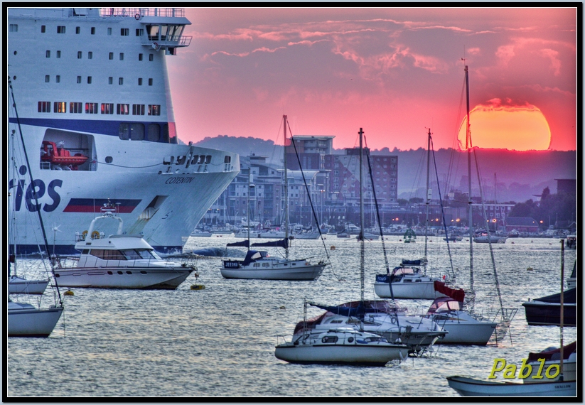
Ferry heading into the Sun. Can anyone improve the photo with the untouched photos?
- Thread starter Redspider
- Start date
- Messages
- 1,778
- Name
- James
- Edit My Images
- Yes
like this a lot
- Messages
- 410
- Name
- Oscar Dewhurst
- Edit My Images
- No
I really like it 
I'm no expert though.
I'm no expert though.
Les McLean
In Memoriam
- Messages
- 6,793
- Name
- Les
- Edit My Images
- Yes
An excellent composition, but the processing seems way out, the boats/ship look as though they have had bleach applied?
- Messages
- 4,379
- Edit My Images
- Yes
An excellent composition, but the processing seems way out, the boats/ship look as though they have had bleach applied?
I must agree with this ^ , sort the processing out as you gotta a great shot there
OP
- Messages
- 1,631
- Edit My Images
- Yes
An excellent composition, but the processing seems way out, the boats/ship look as though they have had bleach applied?
I must agree with this ^ , sort the processing out as you gotta a great shot there
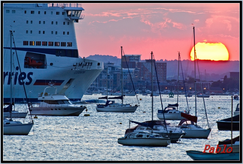
Thanks very much. Is this better?
- Messages
- 643
- Edit My Images
- Yes
Not really my type of processing and the horizon looks a bit wonky, but other than that I really like the shot.
OP
- Messages
- 1,631
- Edit My Images
- Yes
Not really my type of processing and the horizon looks a bit wonky, but other than that I really like the shot.
Thanks for your thoughts. The first one was a photomatix HDR. The second one is one of the three photos on it's own in Lightroom, mainly a little more exposure, some contrast.
- Messages
- 1,175
- Name
- Nick
- Edit My Images
- Yes
I was looking at those flats this afternoon on the way back in from today's racing and found myself wondering where you were when you took this shot.
Were you on Brownsea or on a boat?
Were you on Brownsea or on a boat?
- Messages
- 253
- Name
- Andrea
- Edit My Images
- No
he composition and the light are good, but the processing is not so good, both in the first and in the second versions...In the second I prefer the more balanced contrast, but all around the Sun are visible too many artifacts...
OP
- Messages
- 1,631
- Edit My Images
- Yes
I was looking at those flats this afternoon on the way back in from today's racing and found myself wondering where you were when you took this shot.
Were you on Brownsea or on a boat?
I was opposite the car park at Sandbanks.
he composition and the light are good, but the processing is not so good, both in the first and in the second versions...In the second I prefer the more balanced contrast, but all around the Sun are visible too many artifacts...
I didn't notice that. I will look tomorrow & see if anything can be done. Thanks for your thoughts.
- Messages
- 1,175
- Name
- Nick
- Edit My Images
- Yes
I was opposite the car park at Sandbanks.
oh, nowhere near where I thought it was taken from. What lens were you using?
EdinburghGary
Reply not Report
- Messages
- 19,065
- Name
- Gary
- Edit My Images
- Yes
Processing is killing what would otherwise be a terrific shot. Keep it simple I say, even if it means you have some under exposure on the boats.
Gary.
Gary.
OP
- Messages
- 1,631
- Edit My Images
- Yes
Nikon 300mm f4 prime with Kenko 1.4.oh, nowhere near where I thought it was taken from. What lens were you using?
Yes you are right.Processing is killing what would otherwise be a terrific shot. Keep it simple I say, even if it means you have some under exposure on the boats.
Gary.
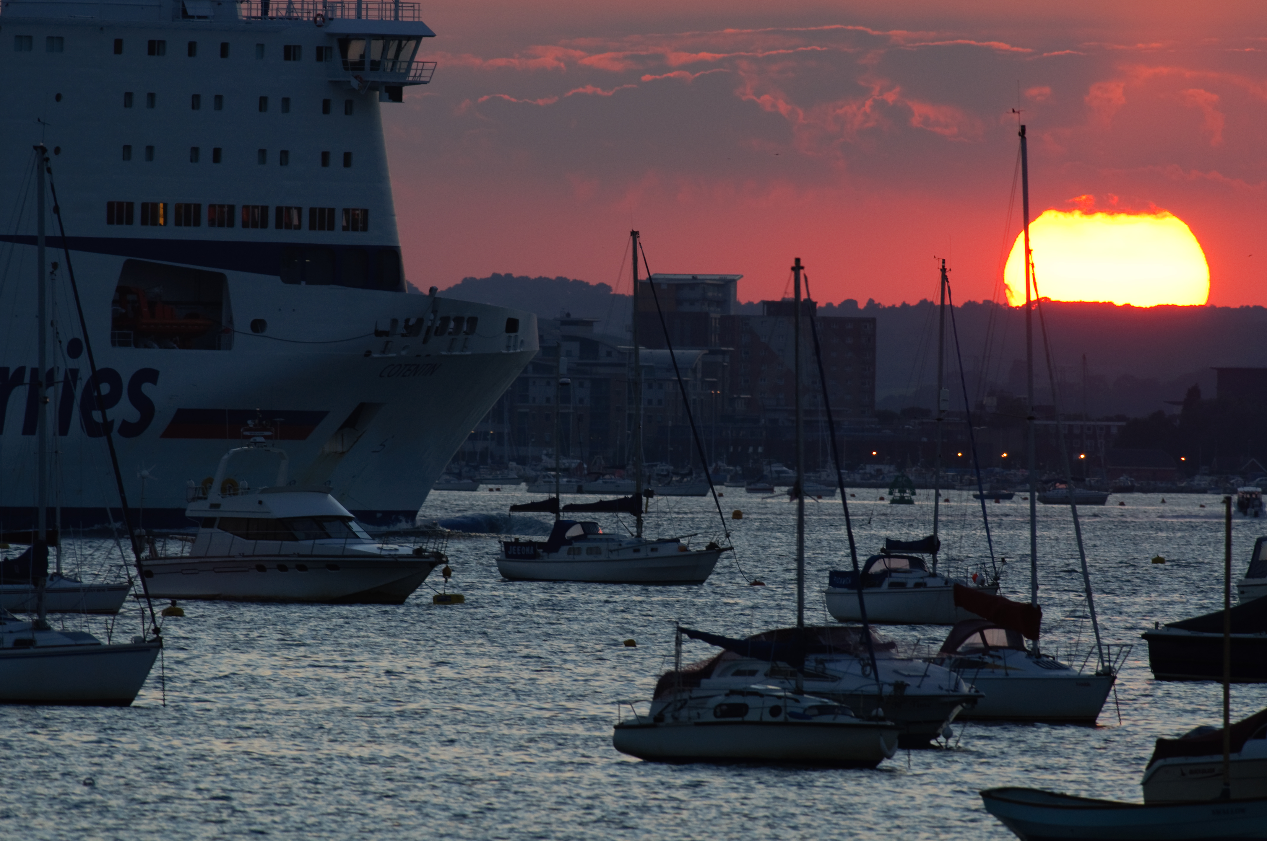
As I said before I was taking some bracket shots of the Panorama with my 18-105vr lens. I thought I would get a couple of shots of the sun whilst it was big on the horizon, After changing over the lens to the 300mm & adding the kenko 1.4 I noticed the Ferry, I took a split second decision to take the Ferry & Sun together but still had the bracket feature on so I got the 3 brackets but at a lower light than I would have got had I had time to change the settings, so I have what I have. I converted the 3 bracket shots from nec to raw, so if you click on the small photo you will have the full size shots. Does anyone want to use 1, 2 or 3 of the shots to get a better photo that I can get? I only have Lightroom at the moment.
There is slight movement from both the ferry & the sun between the shots.
1

2

3
Last edited:
- Messages
- 2,940
- Name
- Marie
- Edit My Images
- No
I think the first two bracketed shots may be too dark, so I've just taken #3 and played around with dodging/burning. Also darkened the sky area.
Dont know if its to your taste or not though?

Dont know if its to your taste or not though?
OP
- Messages
- 1,631
- Edit My Images
- Yes
I think the first two bracketed shots may be too dark, so I've just taken #3 and played around with dodging/burning. Also darkened the sky area.
Dont know if its to your taste or not though?
It looks fine apart from being a little dark. Is it possible to brighten it, but keeping the sun a yellow'red, as it was? I can brighten up the original raw if that helps.
What exactly is dodging/burning?
- Messages
- 21,341
- Edit My Images
- Yes
have you tried the contrast masking process? I think it would suit this shot.
http://www.talkphotography.co.uk/forums/showthread.php?t=30650
http://www.talkphotography.co.uk/forums/showthread.php?t=30650
- Messages
- 2,940
- Name
- Marie
- Edit My Images
- No
How's this?

Dodging and burning:
http://www.dpchallenge.com/tutorial.php?TUTORIAL_ID=30
PS Actually, if you want I can take the more yellow sun from the darker shot and blend it into this one.
Dodging and burning:
http://www.dpchallenge.com/tutorial.php?TUTORIAL_ID=30
PS Actually, if you want I can take the more yellow sun from the darker shot and blend it into this one.
Last edited:
- Messages
- 643
- Edit My Images
- Yes
My personal take on it would be something a lot less dramatic. It won't go down well as everyone seems to like extremely contrasty shots, but here it is anyway..

On my laptop the whites look a bit yellow, but on my PC monitor they look alright, so sorry if it looks a bit off.
On my laptop the whites look a bit yellow, but on my PC monitor they look alright, so sorry if it looks a bit off.
OP
- Messages
- 1,631
- Edit My Images
- Yes
have you tried the contrast masking process? I think it would suit this shot.
http://www.talkphotography.co.uk/forums/showthread.php?t=30650
That is good, but I don't have photoshop at the moment.
How's this?
Dodging and burning:
http://www.dpchallenge.com/tutorial.php?TUTORIAL_ID=30
PS Actually, if you want I can take the more yellow sun from the darker shot and blend it into this one.
That is better, just read the dodge/burn link, very good, I will have to get Photoshop. If you can take the darker sun, & add to this photo for the colour the sun had at the time, it should look good.
My personal take on it would be something a lot less dramatic. It won't go down well as everyone seems to like extremely contrasty shots, but here it is anyway..
On my laptop the whites look a bit yellow, but on my PC monitor they look alright, so sorry if it looks a bit off.
Holy Sunglasses.
Thanks but that puts the cat amongst the Pigeons.I like the original. More natural. Great capture though. (I'm no expert either!)
- Messages
- 2,940
- Name
- Marie
- Edit My Images
- No

I've straightened up the horizon as well
- Messages
- 643
- Edit My Images
- Yes
Holy Sunglasses.
Lol, it only looks bright cos everyone else has masses of shadow in theirs. :razz:
Each to their own I suppose though, I just can't get passed the cartoony feel to some of these HDR techniques tbh.
EdinburghGary
Reply not Report
- Messages
- 19,065
- Name
- Gary
- Edit My Images
- Yes
Can you post the raws?
OP
- Messages
- 1,631
- Edit My Images
- Yes
Can you post the raws?
I think so. I will try this afternoon.
Chaz Photos
Jack Elam
- Messages
- 6,282
- Name
- Chaz
- Edit My Images
- Yes
This is how I would do it

OP
- Messages
- 1,631
- Edit My Images
- Yes
I think so. I will try this afternoon.
I have a Flickr account but it doesn't recognise the Raw photos, any ideas?
Canon togger that is very good. Chaz photos I like this although it's a little Redish.
EdinburghGary
Reply not Report
- Messages
- 19,065
- Name
- Gary
- Edit My Images
- Yes
I have a Flickr account but it doesn't recognise the Raw photos, any ideas?
Canon togger that is very good. Chaz photos I like this although it's a little Redish.
What size are they each? Search for "Free File Storage" or "File Uploader" on Google. I reckon with the raws, much better results might be possible in terms of edits.
Gary.
OP
- Messages
- 1,631
- Edit My Images
- Yes
What size are they each? Search for "Free File Storage" or "File Uploader" on Google. I reckon with the raws, much better results might be possible in terms of edits.
Gary.
They are just under 10kb each. I could convert to Tiff. But I will look for "free file storage' etc later.
EdinburghGary
Reply not Report
- Messages
- 19,065
- Name
- Gary
- Edit My Images
- Yes
Tiff is no good. I presume you mean 10mb?
Gary.
Gary.
OP
- Messages
- 1,631
- Edit My Images
- Yes
Tiff is no good. I presume you mean 10mb?
Gary.
Yes :bonk:
- Messages
- 643
- Edit My Images
- Yes
I just find it amazing how so many people have a diferent take on the one theme...
I personally think the original posted image is the killer shot, allthough if it had canon_togger's sky it would be knockout.
kev.
I'm beginning to wonder just how bright my version when viewed on a callibrated monitor and what some of the other versions look like also.. they just don't seem right to me.

- Messages
- 2,940
- Name
- Marie
- Edit My Images
- No
I'm beginning to wonder just how bright my version when viewed on a callibrated monitor and what some of the other versions look like also.. they just don't seem right to me.
Well on my monitor your version looks whiter than a white thing from Whiteville.
Does that help?
- Messages
- 643
- Edit My Images
- Yes
Well on my monitor your version looks whiter than a white thing from Whiteville.
Does that help?
I'm sensing some kind of theme in your comment, I shall mull it over for a while and report back.
Shall try and get my monitor sorted and tone it down from now on. Strange that nobody has said anything for so long though!Chaz Photos
Jack Elam
- Messages
- 6,282
- Name
- Chaz
- Edit My Images
- Yes
Well yes its a late evening sun so the colour temp will be like that so your white will not be white if you think back to film day you have daylight film taking this, so you would have a good colour in your sunset with digital your camera is trying to take it out and make it look like daylight. You have to fool your camera at time and take control.I have a Flickr account but it doesn't recognise the Raw photos, any ideas?
Canon togger that is very good. Chaz photos I like this although it's a little Redish.
I added a warming filter to it BUT if I had the RAW then I set the whitlight to Daylight and you get something like this.
- Messages
- 3,667
- Name
- Jo Fisher
- Edit My Images
- Yes
Using Corel Paint Shop Pro x2:
1.Open Image then right click >copy >right click> paste as new layer.
2.On selected layer: Adjust > Brightness & Contrast > Brightness=0 Contrast =12
3.Freehand select the sky and land with buildings > Selections >Invert
4.Selecting the water/boats layer; Adjust > Brightness &Contrast > Levels (from left to right) Shadow 0 Midtone 73 Highlights 255
5. Select eraser tool, and erase the layer outline that overlaps the sky (tidying up)
6. Keeping the same layer selected. Adjust > Sharpen > Highpass Sharpen > Radius= 250.00, Strength =100, Blend Mode= Hardlight
7. Keeping the same layer selected, double check for layer overlap, and tidy using eraser if needed.
8. Using freehand selection tool select the land in the background with the buildings only. Right click on selection >copy > Paste as new layer. Then move into correct position, and tidy edges using the eraser tool.
9. Adjust > Brightness & Contrast > Clarify > Strength 10.6
10. Layers > Merge > Merge All(flatten).
11. Resize and save as normal.
All that (which takes about 5 mins with practise) gives you this:
Though having uploaded, I realise I forgot to straighten the horizon
Last edited: