First time at Product photography

Messages
1,697
Name
jason
Edit My Images
Yes
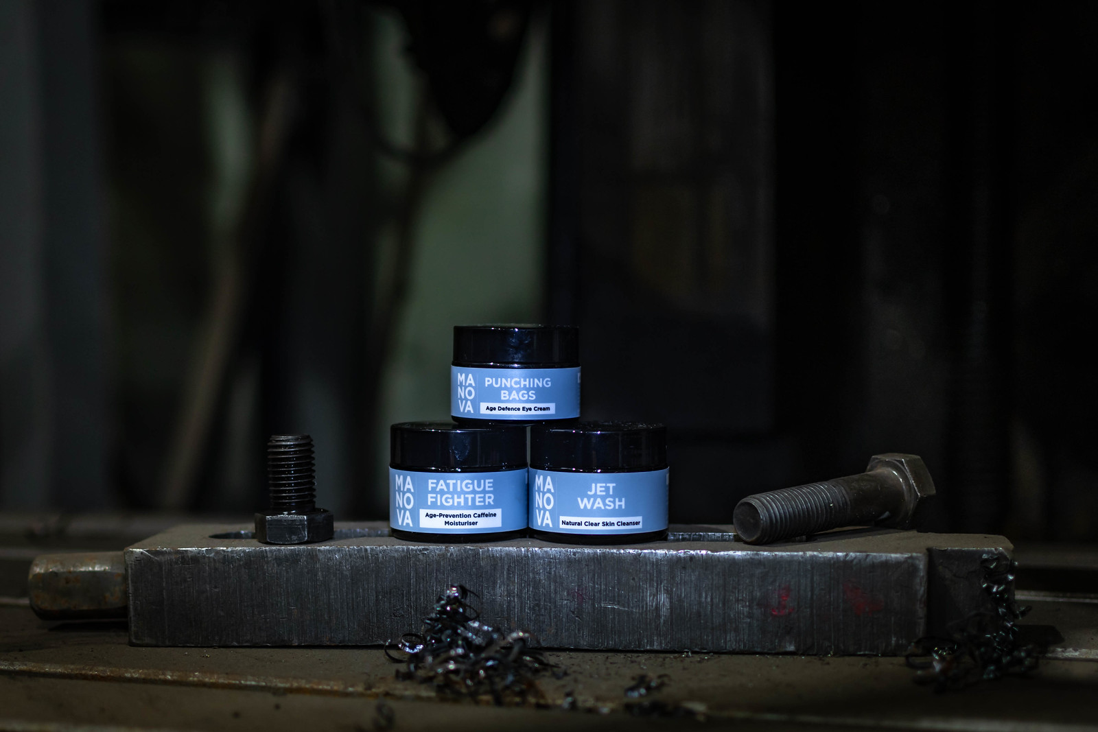
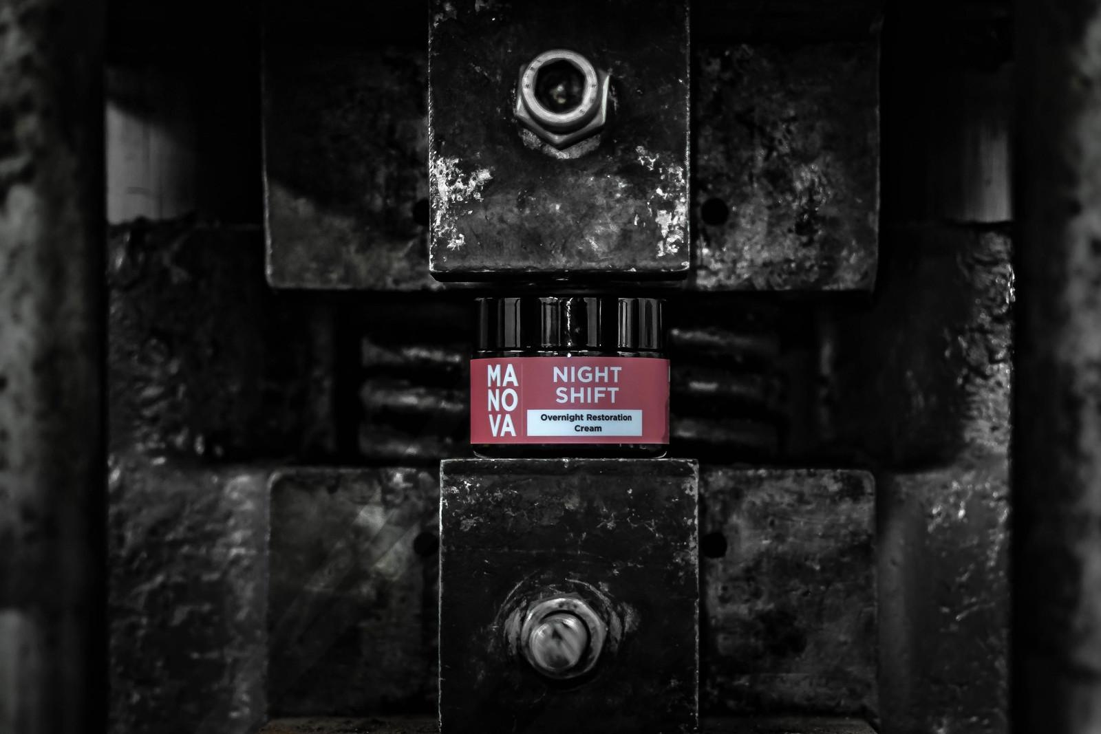
I was helping a friends son who is trying to launch his own business in male cosmetics. I came up with the style of photos as i thought they suited the brand. I lit the product with a small LED torch as i dont have any specialist lighting/flash equipment. I believe the photos are just to be used in social media, alongside a descriptor panel.
Any advice on what i did right and wrong please? There are other photos in the album, with some close up edits. Thanks.
JAY_2811 by jason greenwood, on Flickr
JAY_2829 by jason greenwood, on Flickr
JAY_2853 by jason greenwood, on Flickr
 
If it were my job, this is what I would be thinking... (and it is only an opinion)...

The lids seem to disappear into the background, making the product half the size and the product definitely needs to fill the frame a bit more.

I think you also need more lighting to pick out lid edges and create more separation from the backgrounds.

T
 
I agree, the dark lids are a problem. The very first thing that struck me, in the top image, is that bit of swarf in the foreground -- my eye went right to it.

I do like the engineering theme though.
 
I agree with the comments on the lid and back ground.

I do wonder about the theme. First thought is that a male buying these products is not likely to relate to engineering, though the label design is dull and industrial, so "fits" there, so I fully agree that a background change may be an answer (the link above to the test one does not work), the product needs to stand out more and have more impact.

Try working near a window (with a tripod), can have quite good effects without needing more lighting. Some pieces of styrofoam make useful inexpensive reflectors.
 
Just my view, I think the theme may not be right, I'm an engineer, younger males aren't interested in this work anymore and the guys still in this line of work don't use this type of product. The lathe in the last image over powers the jars.

'High end' car or sports/gym theme may be better?

Agree with the jars being dark too

Nice to see a colchester lathe though :LOL:
 
I actually like the idea, the gritty look, but as above the jars are lost a bit, the black lids need lighting to bring them out.
 
Just my view, I think the theme may not be right, I'm an engineer, younger males aren't interested in this work anymore and the guys still in this line of work don't use this type of product. The lathe in the last image over powers the jars.

'High end' car or sports/gym theme may be better?

Agree with the jars being dark too

Nice to see a colchester lathe though :LOL:
I agree, a good idea but I doubt whether it will appeal to the buying audience.
Also, having a (deliberately) confusing set doesn't really work with the symmetrical arrangement of the jars, it needs to be one or the other, not both.
But the biggest single problem is the lighting, which frankly is terrible - all photography is about lighting, with product photography lighting is the main ingredient.
 
First of all ten out of ten for giving it a go.

However having looked at your friends website his mission seems to be saving the planet by reducing pollution in the oceans and atmosphere, so I don’t understand how a machine shop environment fits into that vision. I also don’t understand how a machine shop relates to the actual product branding either. But as I said credit for having a go.
 
Back
Top